
























The process of building one usually starts with a lot of questions. Who are you, who are you talking to, and what do you want people to feel? From there, designers turn those answers into visuals. These are colours, typography, imagery, icons and a set of rules. The rules keep everything consistent wherever the brand shows up. Done well, a strong brand identity makes a company instantly recognisable and trustworthy. You see an ad and know who it is from before you read the name.
The logo that almost destroyed a brand
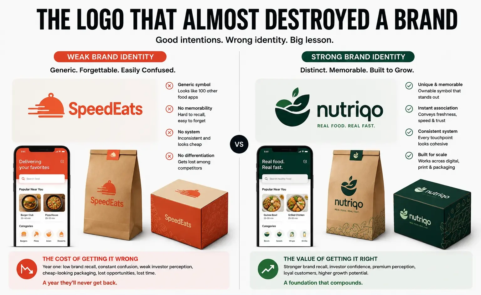
Take a made-up example: a food delivery startup with decent funding and a good product. They go to a freelancer for their brand identity, and the freelancer gives them a logo that looks fine. Trendy, minimalist, whatever. The problem is that it is generic. You could show it to a hundred people. They would guess it was a food app because of the colours (orange-ish red). But they wouldn’t remember it specifically.
In year one, nobody recognises their brand. Investors and friends confuse them with competitors. Their packaging looks cheap because the identity has no system. By year two, they have the budget to do it right and redesign. They get a new logo, full visual system, brand guidelines, everything. It takes four months and serious money.
They never get back what they lost in year one.
This is why brand identity design matters. It is strategy, expressed through pixels and typography.
What is brand identity design? It is more than a logo
People confuse brand identity with logo design constantly. The logo is maybe 10% of it.
Brand identity is colour palette, typography, imagery style, iconography, tone of voice, patterns and spacing rules. It is how your brand looks and sounds across every touchpoint. It’s the visual and verbal language people recognise instantly. Want to go deeper on where brand identity fits in the bigger picture? Read our breakdown of brand vs. branding vs. brand identity. These are three terms people use interchangeably but shouldn’t.
Look at Tata Steel’s website, copy from a startup like Rupa, or anything from ITC. There is a consistency, and it isn’t accidental. That is brand identity working.
The logo anchors it, but it does not create recognition on its own. Recognition comes from many things working together. They are the logo, colours, typeface, photography treatment, website copy and social media style.
Get any one of those wrong and the whole thing feels off. A beautiful logo with terrible fonts doesn’t work. Neither does a perfect colour palette with a generic logo. Neither does a tight visual system with inconsistent messaging.
The elements that matter, and why some companies ignore them
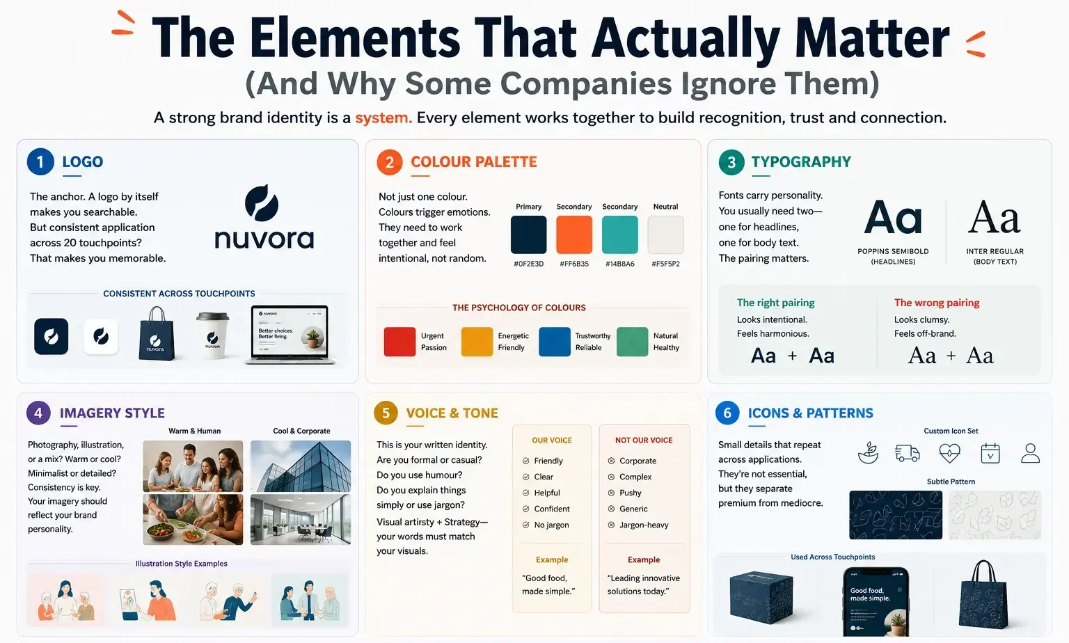
- The logo is the anchor, but a logo by itself doesn’t make you recognisable. It makes you searchable. A logo plus consistent use across 20 touchpoints makes you memorable.
- The colour palette is usually a primary colour, 1-2 secondary colours and a neutral. The psychology is real: colours trigger emotions. Reds and oranges feel urgent or fun, blues feel trustworthy and greens feel natural. More important, the colours need to work together and feel intentional. Random colour choices feel cheap. Considered ones feel premium.
- People ignore font choice, which is a mistake, because fonts carry personality. A playful sans-serif says something totally different from a serious serif. You usually need two fonts, one for headlines and one for body text, and the pairing matters. Some fonts fight each other and some complement each other perfectly.
- Imagery style needs consistency. Do you use photography, illustration or a mix? Are your photos warm and human, or cool and corporate? Are your illustrations minimalist or detailed? If your brand is warm and approachable, your imagery should reflect that.
- Voice and tone are the written identity. Are you formal or casual? Do you use humour? Do you explain things simply or use jargon? This matters a lot for websites and social media, but most people get it wrong. They design a visual identity and then hire a copywriter who writes in a totally different voice. The visual style has to match consistent messaging.
- Icons and patterns are small details that repeat across applications. A health app might use custom icons instead of generic ones. A brand might have a subtle repeating pattern in the background. These aren’t essential, but they separate premium from mediocre.
Why Most Businesses Get Brand Identity Wrong
Businesses make three main mistakes.
First, they lead with the logo. “Make us a cool logo” is how most briefs start, but that is backwards. You should start with strategy. Who are we? What is our positioning? Who is our customer? What do we stand for? The logo emerges from that. A logo designed in a vacuum looks cool but doesn’t represent anything real.
Second, they treat it as a one-time thing. Brand identity gets designed once. A guideline document gets created. Then everyone ignores the guidelines. You see the logo on the website but a totally different colour on LinkedIn. Instagram uses one font and email uses another. This inconsistency kills recognition. Without consistent application the identity becomes noise.
Third, they confuse brand identity with brand strategy. These aren’t the same. Strategy is the big idea: who you are, what you stand for, why you exist. Identity is how you visually express that strategy. You can’t skip strategy and jump to identity. Too many companies do. They end up with pretty visuals that don’t mean anything.
How to develop brand identity design (the right way)
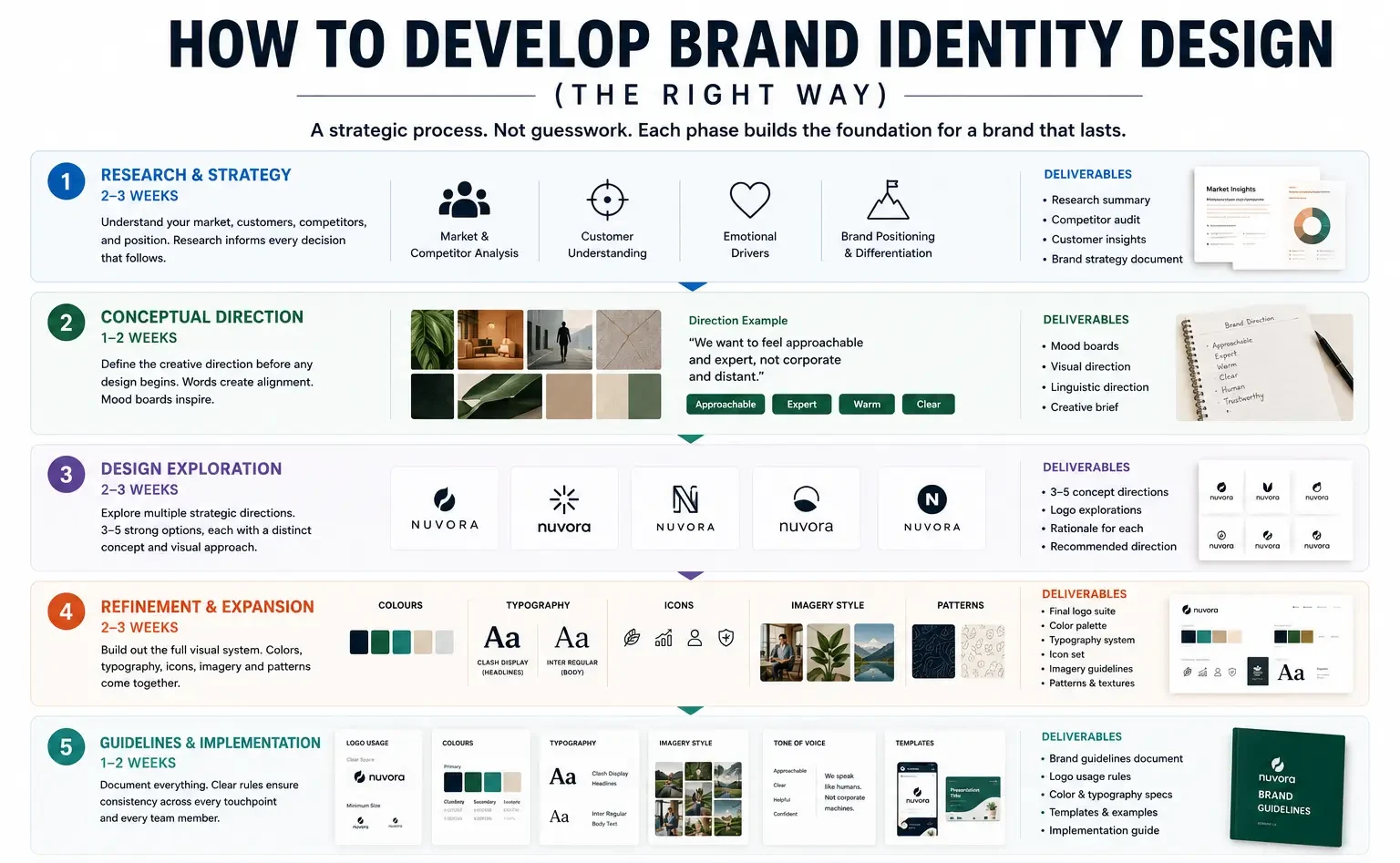
Phase 1, research and strategy (2-3 weeks). Understand your market. Who are your competitors and what are they doing visually? Who’s your actual customer? What emotions are you trying to trigger? What’s your market position? This research informs everything that follows. Most companies skip this or rush it. Don’t. Our brand strategy and positioning service is built entirely around this foundation.
Phase 2, conceptual direction (1-2 weeks). Before the designer even opens Illustrator, there should be written direction. It includes mood boards, inspiration images and linguistic direction such as “we want to feel approachable and expert, not corporate and distant.” The designer needs words as much as design briefs.
Phase 3, design exploration (2-3 weeks). The designer creates options, but not 47, because that is noise. Typically it is 3-5 solid directions. Each one represents a different strategic angle. Then you pick the strongest one and refine it.
Phase 4, refinement and expansion (2-3 weeks). Once direction is locked, the designer extends it. They develop the colour palette fully and choose secondary fonts. They create icon sets, decide on photography style and design patterns. This is where the system comes together.
Phase 5, guidelines and implementation (1-2 weeks). Document everything in brand guidelines. How to use the logo (clear space, minimum sizes). Colour specifications (hex codes, Pantone, CMYK). Typography rules. Imagery approach. Tone of voice. Templates for common formats (social media, email, presentations). Do not skip this step. Without guidelines, the identity falls apart when someone else applies it.
Brand identity design examples from India
Here are two made-up examples to show how this works.
The first is a D2C (direct-to-consumer) personal care brand in Bangalore. They come in with a vague brief: “we want to be premium but accessible.” Three weeks go into understanding their customer. They are women 25-40, income 15+ lakhs, in metro cities, already buying premium skincare. Competitors are all going luxury and exclusive. So the brand is positioned differently. It offers premium quality at an approachable price. It is transparent about ingredients.
The identity reflects that. It has a minimalist logo (not flashy). It has a clean but warm colour palette (soft sage green and cream instead of the gold and black of other premium skincare brands). The fonts are straightforward. The photography is honest and shows real skin (not Instagram filters). The brand voice is expert but conversational, not condescending.
The identity alone does not do the work. It works together with packaging, content and everything else being aligned. But a clear identity means everything else can be consistent.
The second is a B2B software company in Pune with a logo that looks like 47 other software companies. They rebuild completely. The new identity is more distinctive. It has an unusual colour combo, bolder typography and a consistent illustration style that feels ownable. Suddenly they stand out. When people see their ad or visit their website, the identity feels intentional, not generic.
The messy part is the implementation, which is slow. They design the logo and guidelines, then take eight months to apply them across their website and collateral. During that time, mixed messaging weakens the impact. When they finally have a fully aligned brand across channels, the effect is obvious. But that lag costs them momentum.
Common mistakes to avoid in identity projects
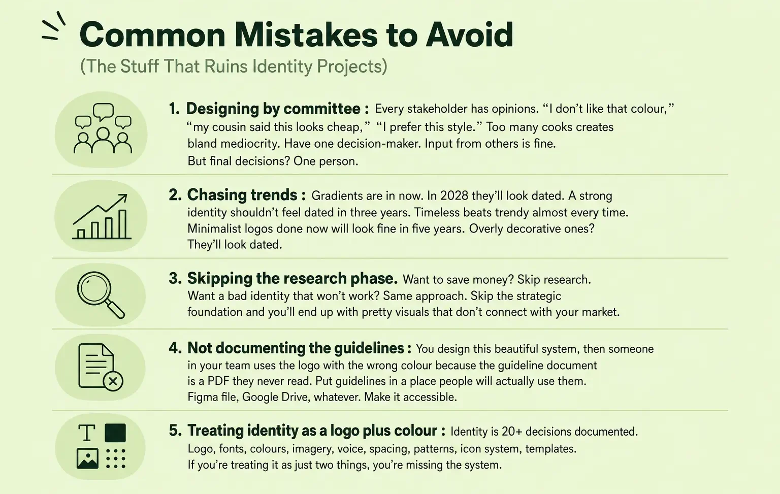
- Designing by committee is a common trap. Every stakeholder has opinions: “I don’t like that colour,” “my cousin said this looks cheap,” “I prefer this style.” Too many cooks create bland mediocrity. Have one decision-maker. Input from others is fine, but the final decision should be one person’s.
- Chasing trends is another. Gradients are in now, and in 2028 they will look dated. A strong identity shouldn’t feel dated in three years. Timeless beats trendy almost every time. Minimalist logos done now will look fine in five years, while overly decorative ones will look dated.
- Skipping the research phase saves money and gets you a bad identity that won’t work. Skip the strategic foundation and you will end up with pretty visuals that don’t connect with your market.
- Not documenting the guidelines is a mistake too. You design a beautiful system. Then someone on your team uses the logo in the wrong colour. The guideline document is a PDF they never read. Put guidelines where people will actually use them, such as a Figma file or Google Drive. Make them accessible.
- Treating identity as a logo plus colour misses the system. Identity is 20+ decisions documented. They cover logo, fonts, colours, imagery, voice, spacing, patterns, icon system and templates. If you treat it as just two things, you are missing the rest.
How long brand identity design takes
Realistically, it takes four to twelve weeks from start to finish.
Weeks 1-2: research and strategy. Understanding the brief, the market and the customer.
Weeks 2-3: concept direction. Written and visual direction.
Weeks 3-5: design exploration. Multiple directions and feedback rounds.
Weeks 5-8: refinement. Colour palette development, font pairing, imagery direction and icon design.
Weeks 8-12: guidelines, templates and implementation support.
Are you being told it can be done in two weeks? Then either the scope is minimal (just a logo, no system), or someone’s rushing and quality will suffer.
The difference between brand identity and brand image
People mix these up, but they are different things.
Identity is what you create: logo, colours, voice and visual system. It is intentional, and you design it. Explore how AI has started reshaping how brand identity gets built, and what that means for businesses investing in it today.
Image is what your customers perceive. It’s shaped by identity but also by experience. Say your identity says “friendly and approachable” but your customer service is terrible. Then your brand image becomes “friendly but unreliable.” Identity is the promise. Image is what happens when you keep or break that promise.
You can control identity. Image is co-created by you and your customers.
Build a brand identity that works
We design brand identities, from strategy to execution.