
























Focus on your audience by using concise, benefit-driven copy and a clear call to action. Whether it’s promoting a product, service, or event, a well-designed brochure should guide readers naturally from the first page to the last while encouraging them to take the next step.
Why brochures are not dead
People keep saying print is dead. Then we show up to a trade show and watch someone pick up a well-designed brochure and actually read it. Digital got us to stop touching things. But it also made us ignore them more. A good printed brochure cuts through that.
The problem: most brochures are… well, boring. Wall of text. Every page crammed with information. Company logo on every panel. No hierarchy. No reason to keep reading.
A brochure that works does one thing: makes people want to continue to the next panel. Then the next. Then take it home. Most don’t even make it past the cover.
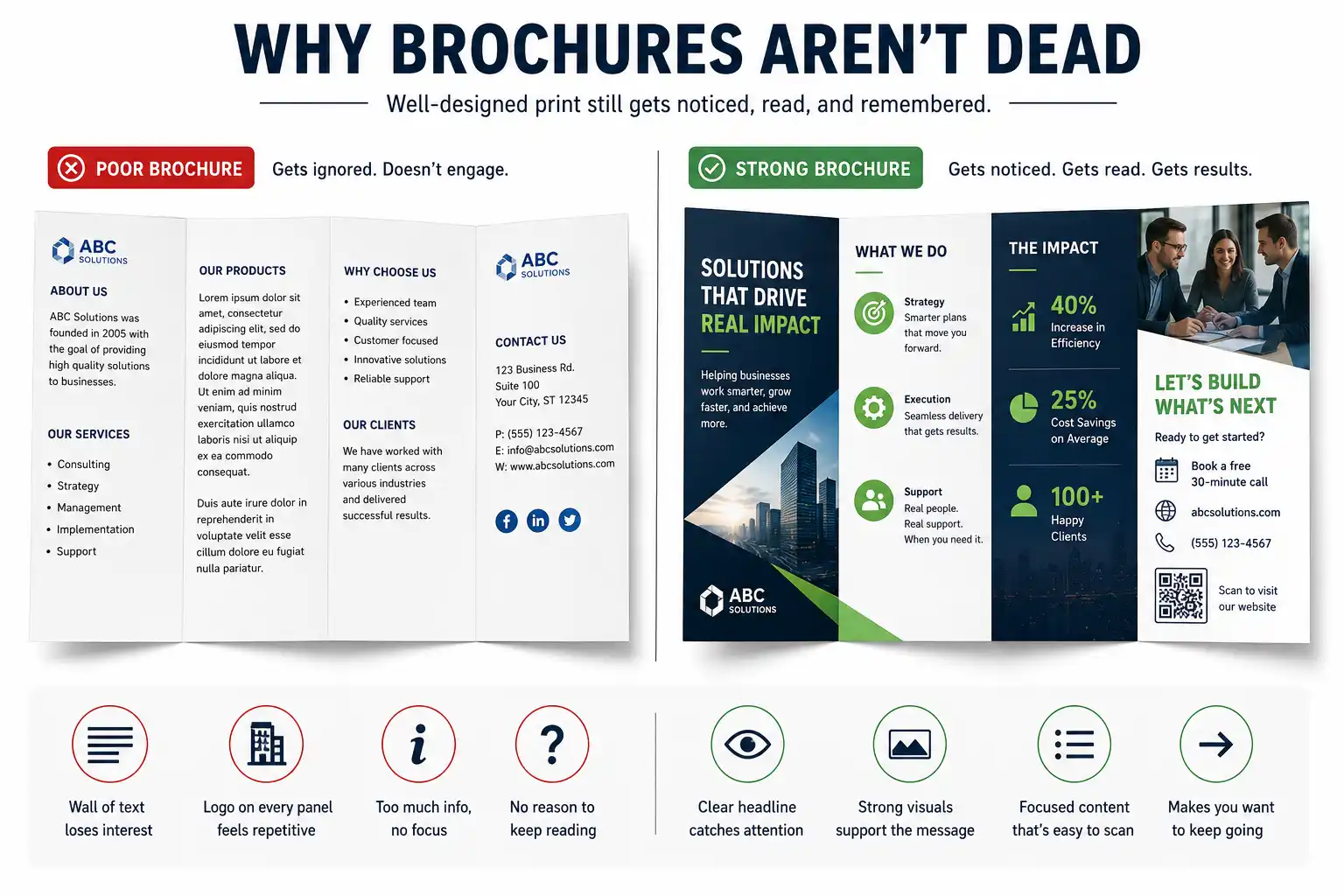
The one rule that matters most
Breathe. Give your content space. When a brochure panel looks crowded, people don’t read it. They flip past it.
This is practical advice. The eye gets overwhelmed and shuts down. So instead of jamming 500 words on a page, use maybe 100. Break it into sections. Use white space (negative space, if you want to get technical) as a design element.
Picture a brochure for a real estate developer. The first draft has far too much information. You cut the copy, keep the core message and add imagery. The client says, “This feels expensive.” That is what space does. (This is a made-up example.)
Don’t treat white space as wasted space. It’s part of the design.
Visual hierarchy
Every panel should have one clear thing the reader’s eye hits first. Then second. Then third. Without hierarchy, eyes wander. And wandering eyes usually flip the page.
Start with the big idea
The headline or main image should be the biggest, boldest thing on the page. Not your logo. Not the company name. The thing that matters to the reader.
If you’re a fitness brand? Maybe it’s an image of someone achieving something. Bold, large, unavoidable. Then the supporting text below. Logo in a corner, small.
Use contrast boldly
Big text near small text. Colour against neutral. Image against whitespace. These contrasts guide the eye. They create rhythm. A brochure where everything is the same size, same weight, same colour? Feels flatline.
Why typography matters
Two typefaces. That’s the rule. No more. One for headlines, one for body. This is practical, not dogma. Too many fonts feel chaotic. Two fonts, different weights, can create hierarchy without looking scattered.
And make sure your font is actually legible in print. Some beautiful fonts online look muddy when printed. Test before you commit. A proper brand identity design system settles this upfront. Your typeface choices should be the same across print and digital, not reinvented for each project.
Content strategy
You have maybe 3-4 pages depending on fold format. That’s not much. So what goes where?
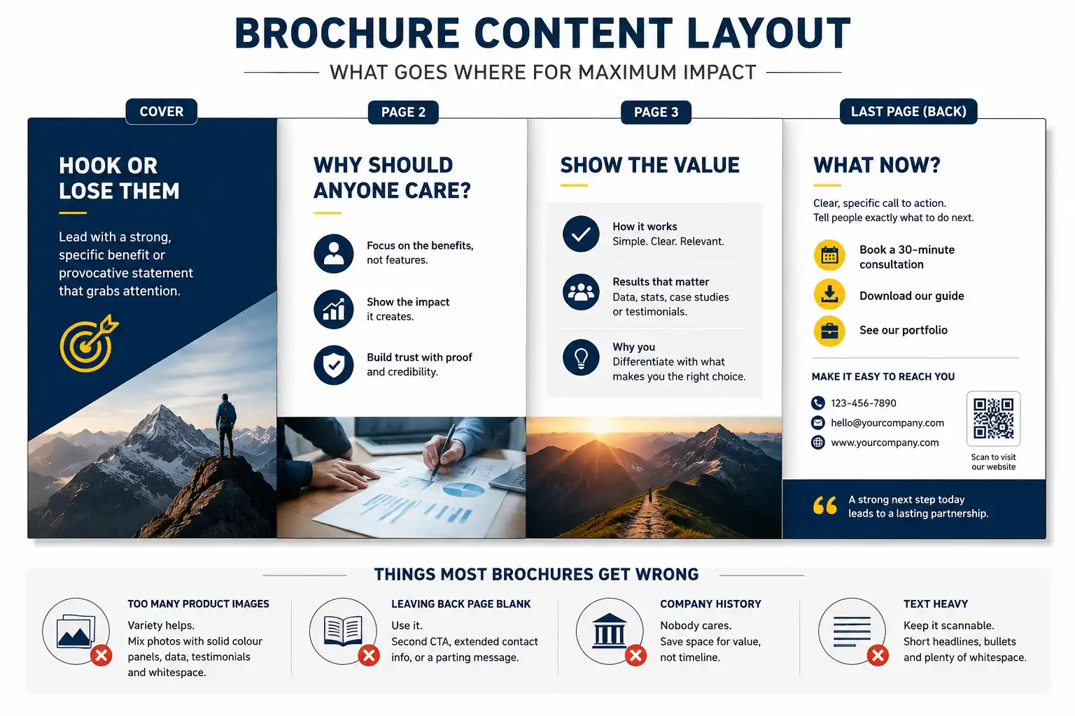
Cover: hook them or lose them
The cover is your only chance to grab interest. A generic “Welcome to [Company Name]” headline? Skip worthy. A specific benefit or provocative statement? People keep reading.
Take a financial advisory firm. The standard cover says something like “Smart Financial Planning Solutions.” A headline like “The retirement plan most people get wrong (and how to fix yours)” gives readers a reason to open it.
Pages 2-3: why should anyone care?
This is where you explain the value. Not features. Benefits. What changes for the reader if they work with you? A textiles firm might talk about their quality process, but that’s feature. The benefit? “Reduce fabric defects by 40% and cut production waste.” That’s what readers actually care about.
Last page: what now?
Clear call to action. Not “Contact us.” Something specific. “Book a 30-minute consultation,” or “Download our guide,” or “See our portfolio.” Tell people exactly what to do next.
And make it easy. Phone number. Email. QR code to your website. All visible and clear.
Things most brochures get wrong
Product images on every page. Variety helps. Mix photos with solid colour panels. Mix testimonials with data. Mix headlines with large whitespace sections.
Leaving back page blank. Use it. Second CTA, extended contact info, or a parting message. People might revisit that page weeks later.
Company history. Nobody cares. “Founded in 1995” is not a reason to work with you. Save the space for actual value.
Design principles that work every time
Great design does not follow trends. It applies old principles that improve clarity and consistency.
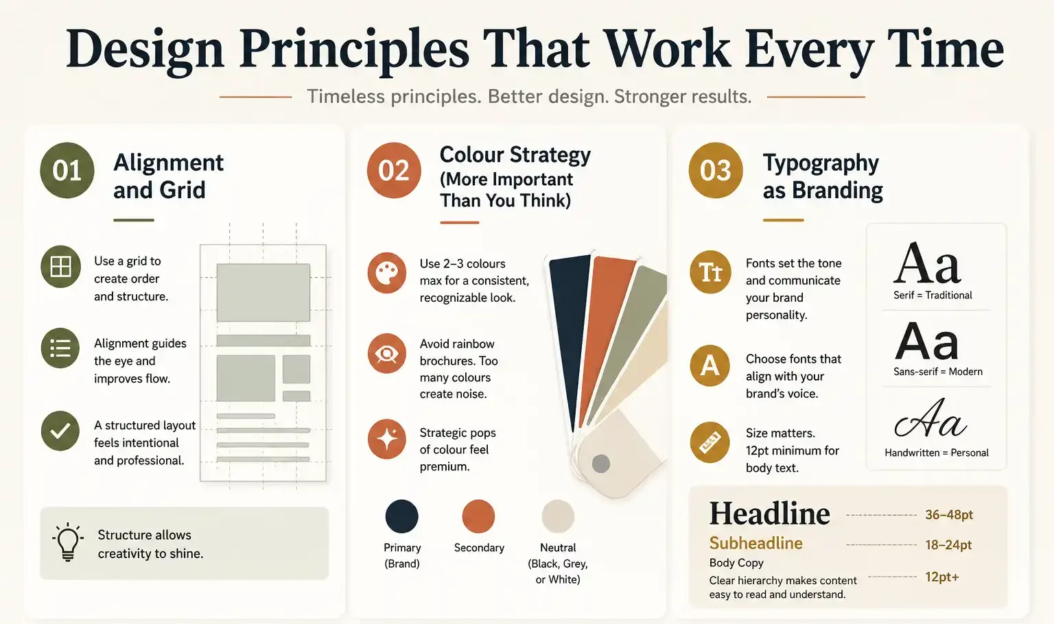
- Alignment and Grid
Everything on the page should align to an invisible grid. This creates order, makes the design feel intentional, guides the eye. If text floats randomly, images don’t align, and elements feel scattered, the whole thing falls apart.
Grids are not about being rigid. They give you structure with room to move.
- Colour strategy
Pick 2-3 colours max. One primary (brand colour), one secondary, one neutral (black, dark grey, or white). This creates consistency and a recognizable look.
Avoid rainbow brochures. Every colour competing for attention is noise. Strategic colour use? That’s design.
Also think about how your brochure sits in someone’s hand. Big bright colours everywhere can feel aggressive. Strategic pops of colour feel premium.
- Typography and your brand
The fonts you choose shape how people feel about your brand. Serif fonts feel traditional. Sans-serif feels modern. Handwritten feels personal. Pick fonts that suit your brand personality.
And size matters. Headlines should be large enough to command attention without shouting. Body text should be small enough to save space but large enough to actually read (12pt minimum, 11pt if you’re in a rush, no smaller).
Print specifications
Design is one thing. Actually printing it right is another.
Bleed: anything that goes to the edge of your brochure needs to extend slightly beyond the edge (bleed) to avoid white lines. Usually 3mm. Your designer should handle this automatically, but confirm.
Resolution: 300 DPI (dots per inch) is standard. If your images are 72 DPI web resolution, they’ll look fuzzy. 150 DPI minimum if you’re cutting corners, but 300 is right.
File format: PDF is standard. Your printer will likely ask for a PDF. Make sure all fonts are embedded so they don’t change when your printer opens it.
Paper stock: this changes everything. 80gsm feels thin. 200gsm card stock feels premium. Most standard is 150-170gsm. Heavier costs more but feels better. Get samples before you print 5,000.
Finish: matte (no shine) feels professional and is better for reading. Gloss (shiny) looks bright but can be hard to read in bright light. Satin is a middle ground.
Folding: specify your fold to the printer. Trifold. Bifold. Gate fold (opens from sides). Wrong fold makes a mess.
Pro tip: Get a physical proof before final print. Digital proofs look different than actual print. Colours shift, text looks different in person. Worth the delay to avoid 5,000 misprints.
Common mistakes that tank brochures
Even a well-designed brochure can fail if it overlooks the basics. Avoiding these common mistakes makes your brochure easier to read and more likely to win customers.
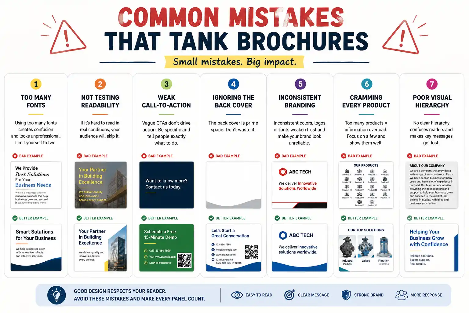
- Too many fonts. We see brochures with 4, 5, sometimes 6 fonts. It’s chaos. Limit yourself to two.
- Not testing readability. Print a draft. Hold it in your hand. Try reading it in natural light. If you squint, it’s too small. If the text blends with the background, rethink the colour choice.
- Weak call to action. “Contact us” or “Learn more” tells people nothing. “Schedule a demo,” “Call us at [number]” or “Visit [website]” are specific, and specific actions get responses.
- Ignoring the back cover. Most brochures waste it. Use it for an address, phone number, QR code, a final message or a testimonial.
- Inconsistent branding. Logo size changes. Colour isn’t quite right. Fonts don’t match the website. This erodes trust. Consistency signals professionalism.
- Cramming in every product
A manufacturing company showing 17 products? Pick 3-4. Show them well. If you try to cover everything, you cover nothing effectively.
Digital vs print: they work better together
A lot of companies think they have to choose. Digital or print. Nope.
Digital brochures work for email blasts, web downloads, sharing on social. They’re searchable, trackable (you can see who opened it), free to distribute, easy to update. But they don’t create impact the way print does.
Print brochures work for events, direct mail, leaving on desks, trade shows. They’re tangible, create a memorable impression, no screen fatigue. But they’re more expensive and harder to update.
Use the same design in both formats. Print for situations where it matters (first impression, trade show, client meeting). Digital for quick sharing and reach.
And QR codes? Use them. Bridge the two. Print brochure with QR code linking to more information online. Track how many people scan it. Connect print to digital data. We cover this joined-up approach in difference between traditional and digital marketing. Good brands do not choose between print and digital. They build the two to work together.
Before you brief a designer
Who’s reading this? What do they need to know? What’s your goal? Is this a leave-behind after a sales call? A self-mailer? A booth handout? The answer changes the design approach.
What’s your budget? This determines design complexity and print quality. Be honest about it upfront. There is no point designing something you can’t afford to print well.
How many will you print? 500? 5,000? 50,000? Design decisions change. If you’re only printing 500, you can do special finishes you couldn’t justify for 50,000.
How long will this brochure be relevant? If you’re changing services next year, don’t invest in a big print run. If it’s stable, invest more.
These questions decide much of the design approach.
They are the same briefing questions that apply to any brand strategy and positioning exercise. Who are we talking to, what do we want them to feel, and what do we want them to do next?
An advantage most people miss
In 2026, a physical brochure feels rare. That’s your advantage. When everyone’s scrolling, a well-designed, thoughtfully printed brochure stands out. It says you invested. You care enough to do this thing in person.
Done right, a brochure feels premium, not outdated.
If you want to explore brand identity design beyond brochures, or learn about our complete brochure design services, we do that work across all industries. Real estate, manufacturing, FMCG, services, nonprofits. Different industries, similar principles.
The bottom line
If you take one thing from this, take this: a brochure that gets read comes from patience and specific details, not volume or clever tricks.
Want a brochure that actually gets read?
We design brochures for brands across manufacturing, real estate, FMCG and B2B (business-to-business) services. Each one goes through strategy, design, testing and print management. Let’s make one that works for yours.