
























To get the best results, use the recommended dimensions for each platform, optimize images for fast loading, maintain consistent branding, and keep text minimal yet impactful. Following these practices helps your posts get seen and noticed.
A wrong image size can cost you reach
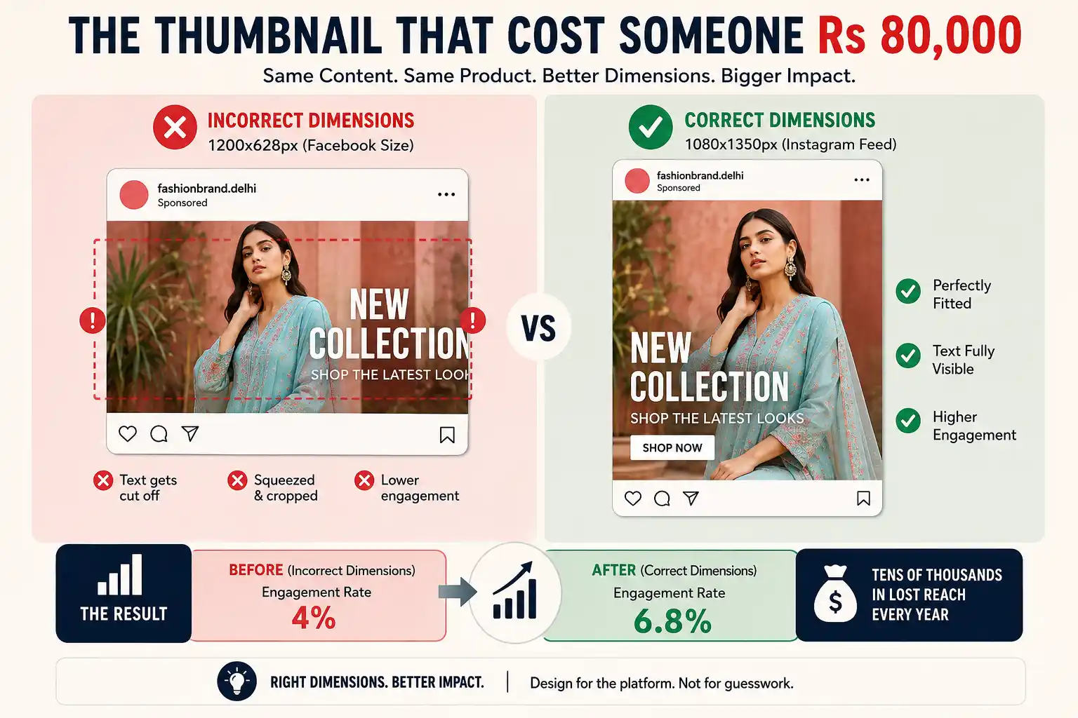
Picture a fashion brand from Delhi. It has run Instagram for six months and is growing okay, which is not terrible but not winning either.
Look at its posts. Everything is 1200x628px (Facebook size) posted to Instagram. Cropped. Squeezed. Text cut off on phone screens because it was designed for desktop.
Now rebuild those posts in proper Instagram dimensions. Same content. Same products. Same captions. Better dimensions.
Posts that fit the screen are easier to see and read.
Over a year, that is a lot of lost reach, because nobody told them that Instagram needs 1080×1350 for feed posts, not whatever Facebook wants.
This article is about not being that person.
Why design matters on social media
I know you are busy. You have a product to ship, customers to call and a dozen other things fighting for your time. Social media feels like an extra.
Bad design stops people from even trying. A blurry product photo? People scroll past. Text that doesn’t fit the frame? Invisible. Colour choices that clash with your logo? They think you’re unprofessional, even if your product is stellar.
Good design is what makes people take you seriously.
Most Indian brands mess this up because they think social media is free marketing, so it needs free-looking designs. Wrong. Your Instagram is often the first thing someone sees about you. You are competing against hundreds of other posts. Your design has a second or two to say ‘this is worth my time.’
Platform sizes: the annoying truth
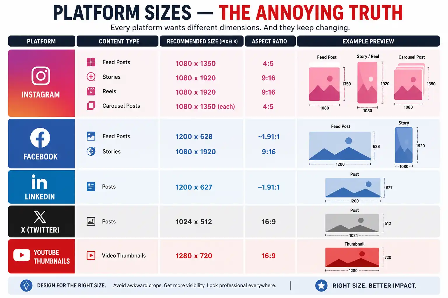
Every platform wants different dimensions. And they keep changing.
Feed posts: 1080×1350 pixels (4:5 aspect ratio). Stories: 1080×1920 (9:16). Reels: also 1080×1920. Carousel posts: 1080×1350 each.
Instagram will accept other sizes, but it’ll crop them. Usually badly. Design for 1080×1350 on feeds, and you’re fine. Everything else is just Instagram being Instagram.
Feed posts: 1200x628px ideally. Stories: 1080×1920. Facebook is less strict about it. It will stretch things rather than crop them, which is somehow worse.
Posts: 1200x627px. LinkedIn users are usually looking at bigger screens anyway, so aspect ratio matters less. But the 1200×627 size gets best display.
Twitter/X
1024×512 or 16:9 aspect ratio. They change this often, so as long as your image isn’t tiny, people will see it.
YouTube Thumbnails
1280×720 pixels. 16:9 ratio. This one’s non-negotiable if you care about click-through rate. A bad thumbnail means viewers skip your video before they even watch the intro. Our guide on YouTube SEO covers this too. A well-designed thumbnail at the right dimensions can lift a video’s click-through rate a lot.
Design principles that work
Good design is about being seen and remembered.
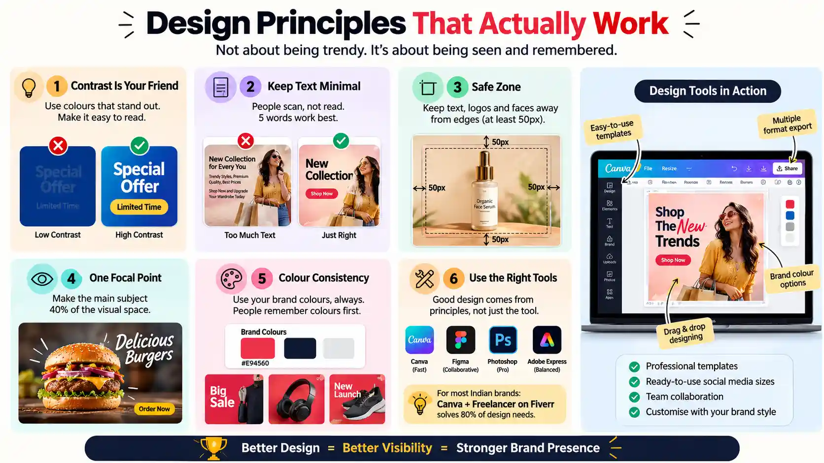
Contrast is your friend
If your background is blue, don’t put blue text on it. Sounds obvious, but dark grey text on a dark grey background is common. It is unreadable on mobile.
Keep text minimal
People don’t read on social media. They scan. Five words is a big headline. Ten is probably too much. If you’ve got a paragraph to say, put it in the caption, not on the image.
Safe zone
Don’t put critical stuff (faces, logos, text) within 50 pixels of the edge. Every platform crops differently. Different phones display differently. Leave space.
One focal point
What’s the most important thing in this image? Make it 40% of the visual real estate. Everything else is supporting cast.
Colour consistency
Use your brand colours. Always, with exact hex codes instead of ‘kind of blue’. People start recognizing your red before they read your text. That’s how you build presence.
Tools
Figma. Photoshop. Canva. Adobe Express. They all work.
Figma is collaborative, which is good if your team is bigger. Photoshop is the pro option if you’re doing heavy editing. Canva is fast for templates. Adobe Express sits in the middle.
For most Indian brands? Canva plus a freelancer on Fiverr solves most problems. Paying for custom graphics beats designing with free templates.
Most people mess up by thinking the tool does the work. A hammer doesn’t build a house. Design principles build designs. Tools just hold the pencil. Use them as a means, not as the entire strategy.
Templates vs custom: when each makes sense
Templates are fast, maybe 10 minutes per post. That is valuable if you’re posting daily and don’t have budget.
Custom designs are slow. Maybe 2-3 hours per post with a real designer. But they are unique and they are yours. If you are in a visual industry like fashion, food, beauty or real estate, that difference is big.
A mix works well: templates for routine stuff (announcements, links, simple posts), and custom work for hero content (product launches, brand stories, key images). That combination works better than going all-in on either.
A brand that mixes template posts with some custom photography looks more genuine than one using only templates.
Brand consistency across platforms
This is probably the biggest thing most brands mess up.
Your Instagram doesn’t look like your Facebook. Your LinkedIn is completely different from your YouTube. The style guide exists but nobody’s using it.
Why does this matter? Because inconsistency signals unprofessionalism. Like you’re six different companies using the same email.
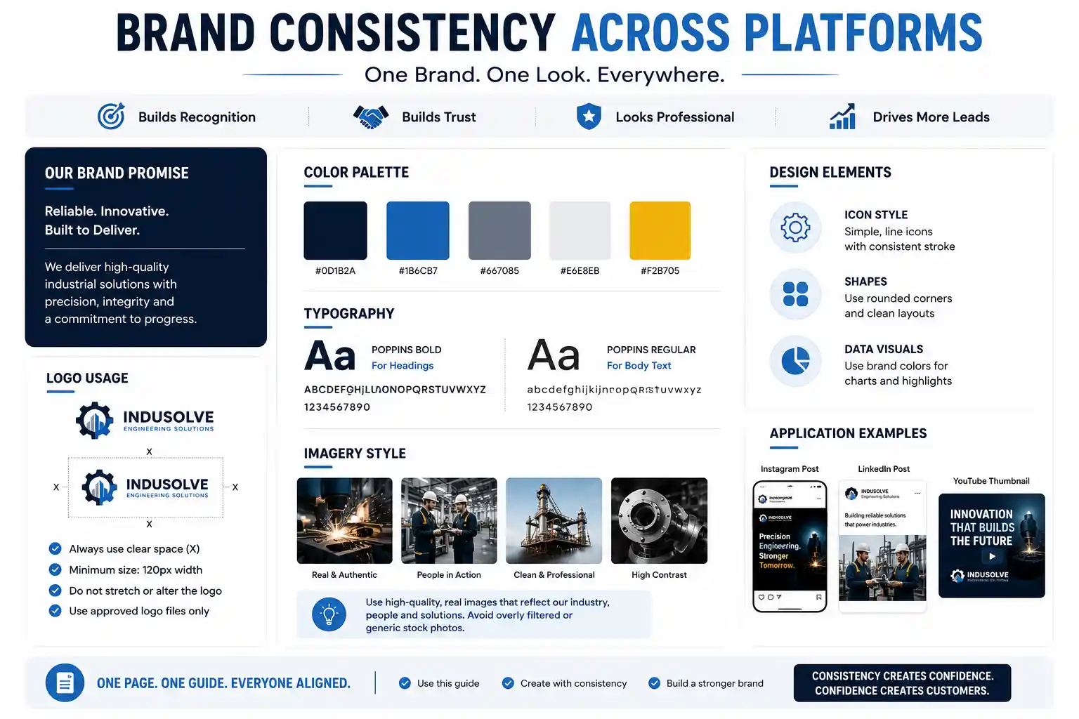
Create a design system. Document everything: colours, fonts, image style, logo placement. Keep it simple. A one-page PDF beats a 50-page design bible nobody reads. Share it with everyone making graphics. Check posts before publishing. This is where proper social media services help: you build the system once, so every piece of content that follows is consistent without starting from scratch.
A short style guide can make a brand’s Instagram and LinkedIn look like they belong together. Consistency builds confidence.
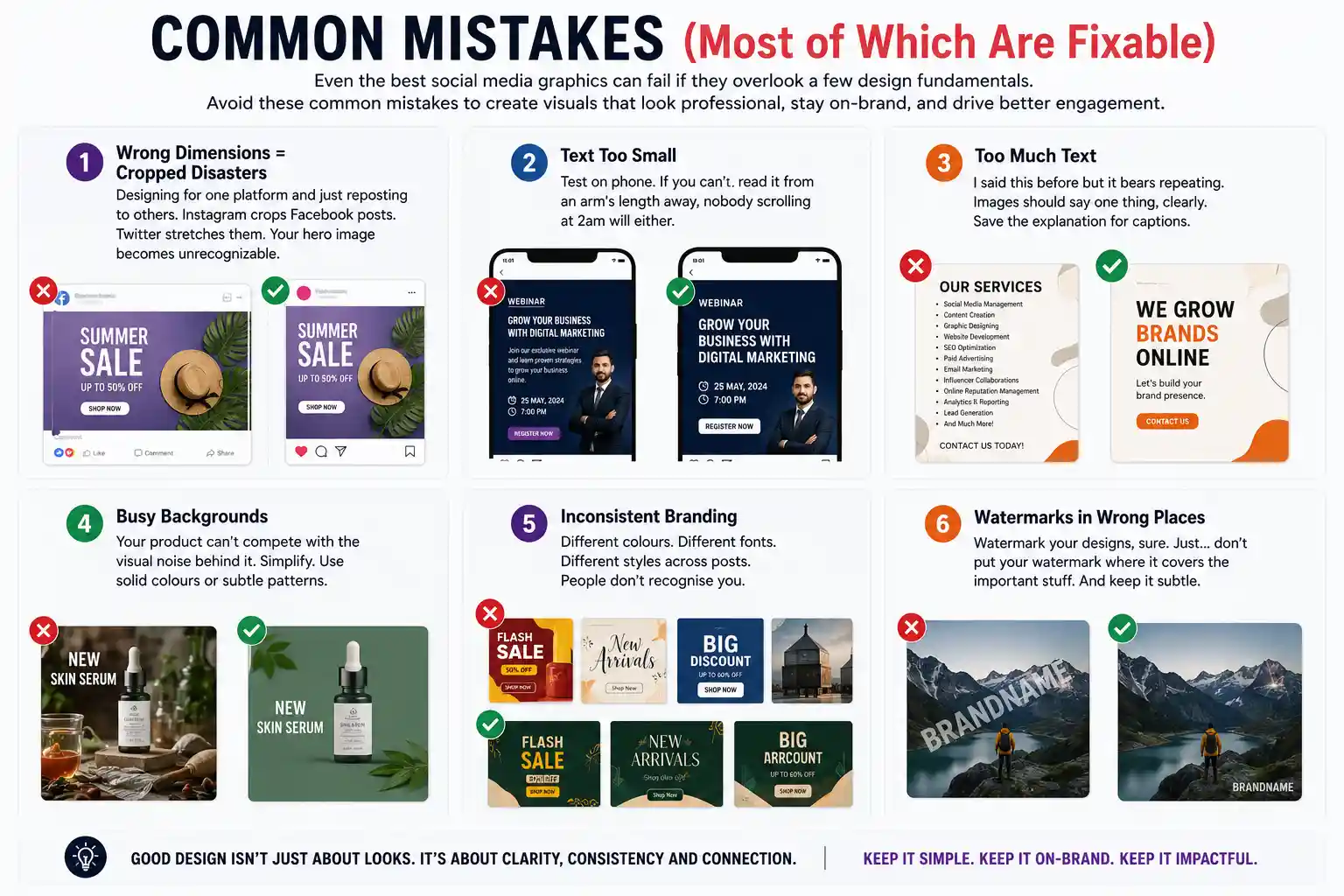
Common mistakes (most of them fixable)
Even the best social media graphics can fail if they overlook a few design fundamentals. Avoid these common mistakes so your visuals look professional and stay on-brand.
1. Wrong dimensions mean cropped images
Designing for one platform and just reposting to others. Instagram crops Facebook posts. Twitter stretches them. Your hero image becomes unrecognizable.
2. Text too small
Test on phone. If you can’t read it from an arm’s length away, nobody scrolling at 2am will either.
3. Too much text
I said this before but it bears repeating. Images should say one thing, clearly. Save the explanation for captions.
4. Busy backgrounds
Your product can’t compete with the visual noise behind it. Simplify. Use solid colours or subtle patterns.
5. Inconsistent branding
Different colours. Different fonts. Different styles across posts. People don’t recognise you.
6. Watermarks in the wrong place
Watermark your designs, sure. Just don’t put your watermark where it covers the important stuff. And keep it subtle.
What is worth investing in
Good photography. Always. A good product photo beats a mediocre design any day.
Typography. Choose fonts that fit your brand, then stick with them. Don’t change typefaces every post.
A designer who understands your brand. Might cost a bit more than grabbing someone’s portfolio from Behance, but they’ll create actual strategy, not just pretty pictures.
Templates as a starting point. Not an end product. Use them as the base, then customise.
The real problem
Most brands don’t have a design budget because they don’t think social media is real marketing. But Instagram is where your customers are. YouTube is where they learn. TikTok is where they decide whether to trust you. If you’re a brand based in Kolkata looking for local expertise, our social media marketing team builds design-led strategies that connect visuals to actual business outcomes.
Invest there, or lose to someone who does. Simple.
Making your social media designs actually good is how a brand goes from invisible to visible. They do not need to be perfect, just intentional.
Need help making your social media look good?
Our creative team builds visual strategies, from photography to design systems to brand guidelines. Let’s talk about your specific needs.