
























The red pasta sauce incident
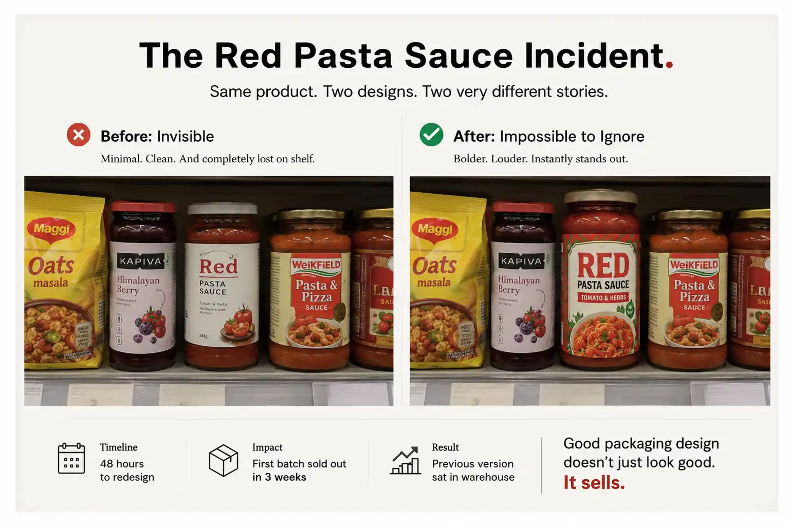
We were designing packaging for an FMCG (fast-moving consumer goods) brand’s new pasta sauce line. Italian heritage brand, real product, actually good sauce. The design was nearly done. It was clean, minimal and beautiful, with a very Delhi-style sensibility.
Two days before going to print, I reviewed it with the client in a retail setting. We saw the package on a real shelf in Mumbai, next to real competitors, and not on a computer screen.
On that shelf, the pack was invisible.
Next to Maggi Oats, Kapiva and three other sauces, our minimalist pasta sauce disappeared. The client’s distributor was buying for retail chains in tier-2 cities. He took one look and said: “People here don’t know what this is. Make it bigger. Make it louder.”
We had 48 hours to redesign. We added a larger product image. We added bolder typography and brighter border colours. Suddenly the pack showed up on the shelf and held its own next to the competitors.
The first batch with the new design moved off the shelves. The earlier version had been sitting in a warehouse.
Good packaging design has to sell, and that takes craft and strategy together.
Why packaging matters more than most people realise
Most buying decisions for everyday products are made in a few seconds.
That happens in a store, at the shelf. Someone is scanning products. In those few seconds your packaging has to catch their eye. It has to give them enough confidence to put it in the basket.
Your packaging does that job or it doesn’t.
Packaging does more than look nice. It communicates, it works on the buyer’s psychology, and it has to survive the supply chain. A good package:
- Protects the product without damaging it during distribution
- Communicates the brand story in a few seconds
- Appeals to your specific target demographic
- Justifies the price people are paying
- Handles the Indian retail environment: rough transport, temperature swings, humidity
- Complies with regulations (weights, ingredients lists, certifications)
Get most of this right and sales will move. Get it wrong and even a great product sits on shelf.
I’ve seen good products fail because the packaging said “cheap” when the product was premium. Others said “kids’ product” when they were for adults, or looked so polished they seemed fake. The same ideas come up in why partnering with a packaging design agency is essential for your business. Packaging is the last salesperson standing between your product and the customer’s basket.
The core elements of packaging design
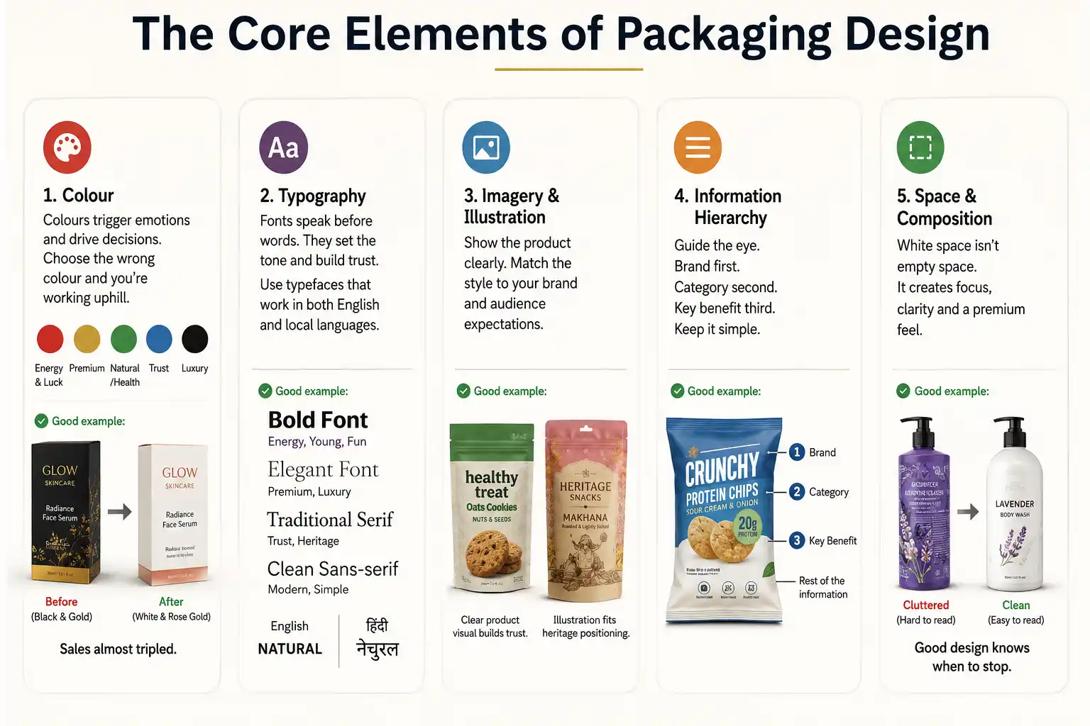
- In India, colours carry meaning. Red is energy and luck. Gold is premium. Green is natural and healthy. Blue is trust. Black is luxury. Choose the wrong colour and you’re working uphill. For one skincare line, an Indian brand first wanted black and gold. It looked sophisticated. But their customers, women aged 18-35 in tier-2 cities, associated black with funerals. We changed to white and rose gold.
Colour is psychology built into culture. This kind of cultural understanding separates good brand identity design from guesswork. Pick colours for what your customer feels.
- Font choice tells a story before anyone reads a word. A thick, bold font signals energy, which suits energy drinks, snacks and kids’ products. Thin, elegant fonts feel premium, so they suit luxury goods and high-end personal care. Serif fonts feel traditional and trustworthy, which works for Indian heritage brands. Sans-serif feels modern.
In India, your typeface also needs to handle both English and local languages (Hindi, Tamil and others). It must not look clumsy. Some clients have picked gorgeous fonts that look broken once Hindi text is added. Test both languages from day one.
- Show the product clearly. If you’re selling biscuits, people want to see what the biscuit looks like. A photorealistic picture of your actual product builds trust. Overly stylised illustrations can look cheap or confusing.
A heritage Indian brand can use traditional illustrations. A modern D2C (direct-to-consumer) brand can use minimalist icons. Know what your audience expects.
- Decide what people should see first. The brand name comes first, then the product category, then the key benefits. Everything else comes after. We’ve seen packages try to cram 15 selling points on the front, and nobody reads that.
- White space gives the design room to breathe. Packages that cram every millimetre with graphics or text look chaotic. Good packages know when to stop and use empty space on purpose.
The packaging design process: how we do it
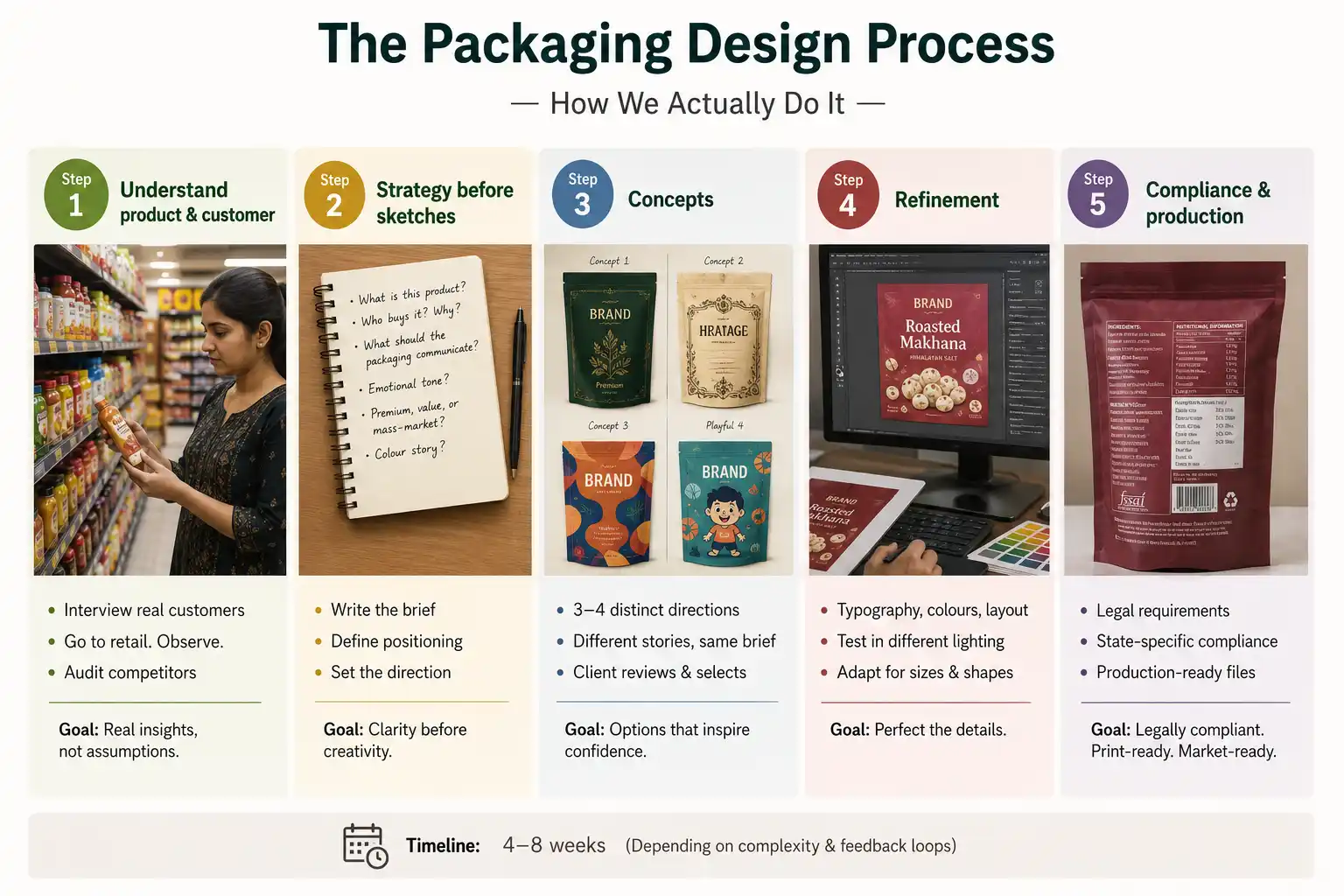
Step 1: Understand the product and the customer.
We talk to real customers. We go to retail stores and watch how people pick products: which packages they grab first, what they read and what they ignore.
We also audit competitors, to see what is already on the shelf and where the gap is.
Step 2: Strategy before sketches.
We write a brief: What is this product? Who buys it? Why? What should the packaging communicate? What’s the emotional tone? Is this premium, value, or mass-market? What colour story makes sense?
Only after we have this clarity do we start designing.
Step 3: Concepts.
We develop 3-4 distinct design directions. Each one tells a different story. One might be premium and minimal. Another heritage-focused. Another modern and playful. The client sees options, picks a direction.
Step 4: Refinement.
Once a direction is chosen, we refine. Typography gets tightened. Colours get tested in different lighting (retail is bright light, very different from how you see colour on your computer). Layouts get adjusted for different package sizes and shapes.
Step 5: Compliance and production.
We check that all legal requirements are met. These are weights, ingredients lists, manufacturing details and certifications. Different states have different rules. Get this wrong and your product can’t legally be sold.
Then we provide production files in the right format for your printing/packaging vendor.
The entire process typically takes 4-8 weeks. It depends on complexity and feedback loops.
What makes packaging work in Indian markets
India is different from Western markets in some important ways.
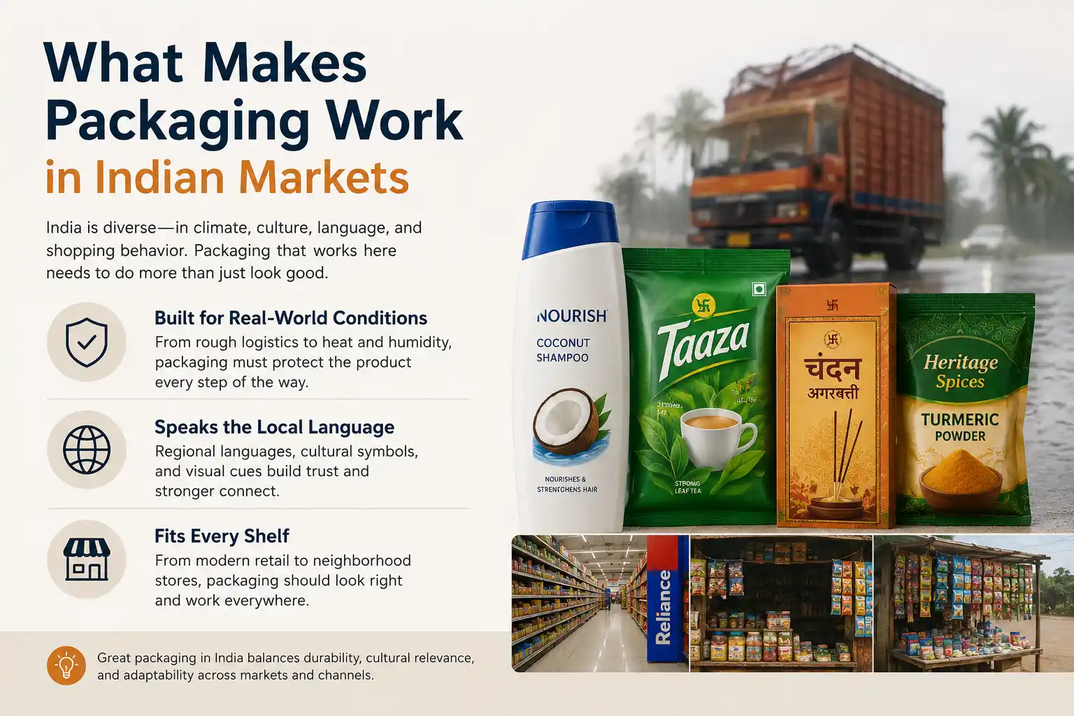
- Your packaging will be loaded onto trucks and driven over potholes. It will be stacked with other products. It will be exposed to heat and monsoon humidity. Pretty packaging that falls apart in two weeks is a liability.
We always test durability, as well as how the pack looks on screen.
- Hindi text needs more space because it is denser than English. Tamil, Telugu and Kannada each need different letter spacing. Cultural symbols matter too. A swastika is auspicious in Indian culture, in a very different context from the Western understanding of it. An evil eye is protective. Use these thoughtfully.
- A shampoo bottle that looks premium in Delhi might look overpriced in Patna, though the product and quality are the same. Packaging design shapes perception. If you’re pricing for all of India, your packaging needs to communicate value at several price points at once. That’s hard. FMCG brands face the same challenge when building digital marketing for FMCG: what works in a metro-facing campaign often needs a change for Bharat.
- A Reliance outlet looks different from a kirana shop. A supermarket shelf is different from a roadside stall. Your packaging needs to work across these places. A small package gets lost in big modern retail. An oversized package looks bulky on a kirana shelf. We design for the place where most of your volume comes from.
Terrible packaging: what not to do
- Being too clever backfires. We once had a designer create packaging that looked amazing, but people couldn’t figure out how to open it. Every customer had to ask for help, and sales fell because it was too much effort. Packaging needs to be intuitive.
- Designing packaging without seeing the real product is a disaster waiting to happen. If a chocolate bar looks different from what the customer expected when they open it, they feel tricked. The package promised something the product doesn’t deliver.
- Minimalist design is beautiful. But a minimalist package that doesn’t say what the product is or does is useless. Beauty works only if it also sells.
- Test in real retail before you print. We have caught many issues by putting the printed package on a shelf and looking at it from customer distance (about 1-2 metres). On a computer screen at 100% zoom it looks fine. On an actual shelf, surrounded by competitors, problems appear immediately.
- Changing packaging without warning customers is risky. One FMCG brand completely redesigned the packaging of a sauce customers loved. The new design was beautiful, but sales dropped because customers couldn’t find the product. They were looking for the old packaging.
Sustainable packaging and its trade-offs
Everyone talks about sustainability now. And it matters. But there’s a gap between “I want sustainable packaging” and “I understand the trade-offs.”
Sustainable packaging usually costs more. Biodegradable materials are more expensive than plastic. Paper packaging needs more material to give the same protection. It is harder to get bright colours from recycled materials.
If your brand can charge 10% more and your customers will pay it for sustainability, go for it. We’ve done sustainable packaging for eco-conscious brands, and for them it has become a selling point.
Your customers may be price-sensitive. Then your costs go up. You either pass them on to customers (who won’t pay) or watch your margins disappear.
Sustainability is good, and it is also a business decision. Some brands can do it well. Others can’t yet. Don’t force it just because it’s trendy.
There are low-cost options too. You can reduce overall packaging size. You can use less ink. You can choose recyclable materials that don’t cost more. Small things add up.
Packaging is your silent salesman
You can’t always be in the shop talking to customers, but your packaging is. It speaks first. If it speaks clearly and honestly to the people buying, sales follow.
We’ve seen premium products fail because the packaging looked cheap. We’ve seen budget products outsell premium ones because the packaging built confidence and trust.
Good packaging design is strategy made visible. It means understanding how your customer decides in a few seconds and earning their trust in that window. It protects your product and sells it at the same time.
Get this right and your packaging works 24/7, selling while you sleep.
Ready to redesign your packaging?
Our creative team designs packaging across FMCG, food, personal care and more. We’ll help you build packaging that sells.