
























What works is picking the styles that strengthen your brand and make your message clearer, instead of following every trend. AI-assisted design, distinctive typography, real textures and smart use of colour can make visuals easier to remember. They can also keep them clear and usable.
The brand that ignored every 2026 design trend
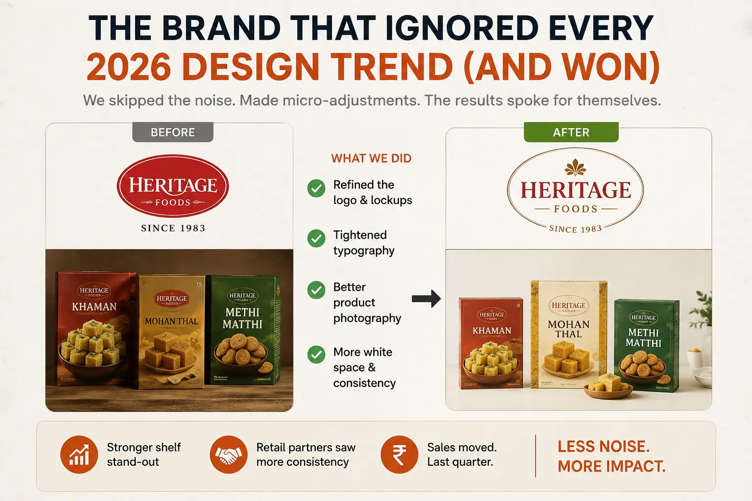
Here is a story from our work. A heritage packaged goods company from Ahmedabad wanted to “refresh their visual identity.” It had been in business since the ’80s and had the same logo for 20 years. They showed us 15 trending design references: AI-generated gradients, 3D renders, very specific colour palettes. All very 2026.
We said no to all of it, and suggested something smaller.
We made small adjustments: tighter typography, better logo lockups, better photography and more consistent white space. We kept what already worked and refined the rest. Their retail partners hardly noticed a change. But the pack stood out better on the shelf.
That taught me that graphic design trends in 2026 are like seasoning. A pinch improves the dish, and too much ruins it.
Why most design trends fail in India, and what works instead
Graphic design trends usually come from Western design blogs and TikTok. They bring lots of air, lots of white space and a lot of “coolness”. That works for luxury brands in metros. For everyone else it often feels hollow and risky. It is the kind of design that looks nice while nobody buys anything.
We follow trends closely. We also spend time on retail shelves, at trade shows and in distributor offices. The trends that win with Indian audiences are different from what design blogs celebrate.
Strong contrast. Readable typography even at small sizes. Colours that pop. Clear product storytelling. None of this is “trendy”. But it is practical, and it is what helps sales. The brands that get noticed are often not the ones with the prettiest Dribbble portfolios. They are the ones with the clearest messages and the strongest visual hierarchy. That clarity separates packaging design that wins on a retail shelf from packaging that looks great in a mockup but disappears among dozens of competing products.
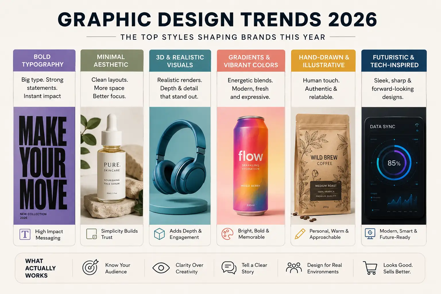
Six design trends that are working in 2026
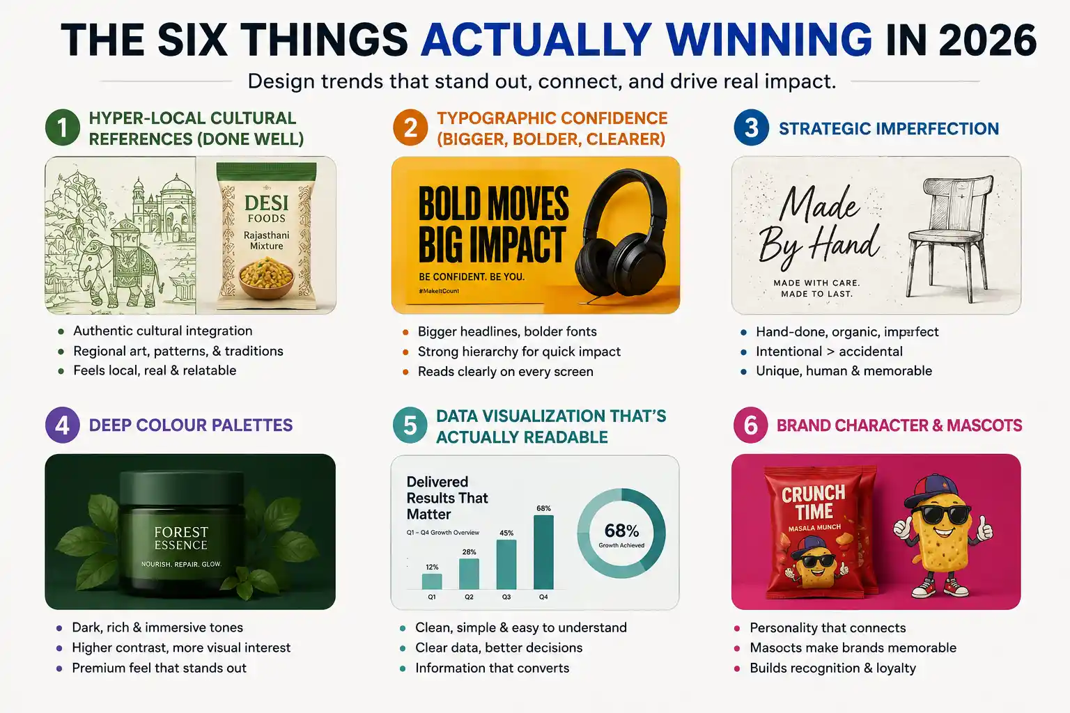
The design trends that stand out in 2026 make a brand feel relevant, recognisable and easy to understand. Looking modern comes second. These six approaches help brands get noticed and remembered. They range from culturally rooted visuals to bolder typography and intentional imperfections.
1. Hyper-local cultural references, done well
Skip the surface-level “we added some Diwali colours” kind. Go for real, thoughtful cultural detail. A food brand we worked with used regional hand-drawn illustrations instead of vector art. The brand felt specific and honest.
Rajasthan crafts, Delhi street art patterns and Kerala boat designs work because they feel authentic. Customers see the brand and think “this understands my world”. That beats any global design trend. But you have to get it right, because bad cultural references feel cheap. If you go this route, spend time understanding the culture. Do not just Google “traditional Indian patterns”. The same authenticity helps influencer marketing work in regional markets. A creator who really understands local culture shows it in a way polished design cannot copy.
2. Typographic confidence: bigger, bolder, clearer
Minimalism is still around, but the sweet spot in 2026 is what I call “confident typography”. It means bigger headlines, bolder weights and a more obvious hierarchy. It is the opposite of the wispy, small-type minimalism of 2022. The reasons are mobile screens, social media thumbnails and shoppers who scan a shelf in a couple of seconds. If your headline is elegant but invisible at that speed, it has failed.
A luxury brand we refreshed went bigger with its headline font. “That’s not minimal,” their CEO said. “No,” we said. “But it reads clearly on Instagram and on retail shelves.” Sometimes confidence beats subtlety.
3. Strategic imperfection
There is a trend toward designs that look hand-done: slightly irregular grids, hand-written typography, organic shapes instead of perfect circles. The catch is that it has to be intentional. Badly done imperfection just looks amateur. The brands that do this well spend more time and money on a design that looks rough than they would on a polished one.
A fashion brand hand-sketched its product illustrations. It took far longer than sourcing stock images, but the result looked unique. That is the commitment this trend needs.
4. Deep colour palettes
The “everything on a white background” look from 2018-2023 is cooling. Dark backgrounds such as deep navy, charcoal and even black are doing well for packaging, ads and social content. They give higher contrast and more visual interest. They are also easier on the eyes. A cosmetics brand moved its packaging from white to deep forest green, and people said it looked more premium. The product had not changed, only how the packaging spoke. On dark backgrounds, keep the text light so it stays readable.
5. Data visualisation that is readable
If your brand shares charts, infographics or any stats, this matters. The trend is moving away from confusing gradient-filled 3D charts. It is moving toward clean, readable and sometimes playful data visuals. A fintech company showed us its earlier infographics. They looked gorgeous, but nobody understood them, so we simplified them. When people need to understand something quickly, simple beats fancy.
6. Brand character and mascots
Generic icons are out and character-driven branding is in. Give the brand a personality, a mascot, something with a point of view. Not every brand needs this. But for D2C (direct-to-consumer) and other consumer-facing brands it is working. A snack brand developed a quirky character for its ads, packaging and social media. It took longer to design, but customers remembered it. It became the brand’s visual shorthand.
What did not age well from 2024
- Gradient overlays on everything. 2024 loved gradients on photographs, and by 2025 they looked dated. If you still use them, use them sparingly and on purpose.
- Heavy Y2K nostalgia. Y2K design had its moment, with bright neons, exaggerated shapes and old-computer looks. It still suits gaming and entertainment brands. For everyone else it is fading, so use a light touch.
- Ultra-minimalism on packaging. Bare product shots on white backgrounds looked clean in 2022. By 2026 they look hollow, especially on retail shelves where many other brands use the same approach.
- Over-used “inclusive” illustration styles. One specific style, with diverse characters, soft colours and inclusive messaging, became a cliché. It still stands for good values but now feels formulaic. Originality wins.
The design trends that are really just good design
Clear hierarchy. Good typography. Proper colour contrast. Consistent spacing. These are not trends. They are basic principles that never go out of style, and many brands still ignore them.
Fix those basics and you will stand out from competitors who skip them, whatever the trend. We did a brand refresh for a B2B (business-to-business) industrial company with no trendy design and no “Instagram-first” thinking. We only cleaned up the typography, organised the colours and corrected the logo proportions. Their sales team started using the materials. Distributors took the company more seriously because it looked professional, not because it looked fashionable.
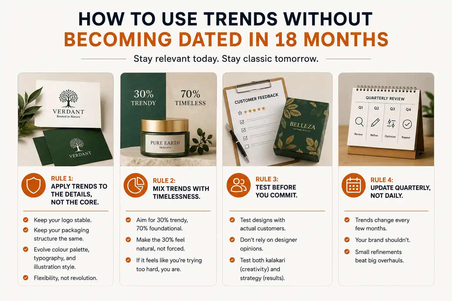
How to use trends without looking dated in 18 months
Rule 1: Apply trends to the details, not the core. Keep your logo stable and your packaging structure the same. Trend-friendly change can happen in the colour palette, typography and illustration style. You want flexibility, not a revolution.
Rule 2: Mix trends with timeless basics. A rough split of 30% trendy and 70% foundational works well. The trendy part should feel natural. If it feels like you are trying too hard, you are.
Rule 3: Test before you commit. If you are redesigning packaging or your brand identity, test the designs with real customers. Do not rely on designer opinions. We have seen beautiful designs test poorly and ordinary designs sell well. Craft and strategy both need testing.
Rule 4: Update quarterly, not daily. Trends change every few months, and your brand should not. Small refinements beat big overhauls.
How to use these trends without breaking your budget
Most brands think using trends costs a fortune. It does if you redesign everything at once, so change things gradually.
Start with one high-impact element, such as your colour palette or your typography. Make that change and live with it for two months. See what sticks, what confuses customers and what helps sales.
A real estate brand spent six months moving its packaging colours from light to dark. They tested in key markets first. The change looked risky in presentations but suited their target customers. By the national rollout they had data instead of guesses.
This takes patience. But it saves you from the nightmare redesign where you spend a large budget and the market rejects it.
What good design looks like
Good design in 2026 is honest more than “on-trend”. It looks like it was made by people who understand the product, the customer and the context. It puts craft and strategy together, with the artistry guided by the planning.
Some of our most useful work has been subtle, almost invisible adjustments to existing designs: better kerning, a refined colour palette, cleaner spacing. It is not trendy and design blogs will not award it. But it sells. Honestly, the only trend that matters is work that functions.
My advice: don’t chase design trends, chase design fundamentals. Add a pinch of trend awareness so your brand does not feel years behind. But spend most of your effort on the work that does not change: clarity, readability and a professional look. That wins in 2026 and will still win in 2028.
Start small and stay consistent
Graphic design trends in 2026 reward patience and specifics. Need a hand with your own brand? Talk to us.
Need a design that works as well as it looks?
PromotEdge has refreshed brands across many categories, so we know the difference between trendy and effective. Let’s talk about yours.