
-
Author: Satesh Shaw
-
Updated Date: Nov-08-2024
-
Views: 2 Min Read
It is known that mobile phones have transformed from a luxury to a necessity. Hence, its users have also grown from 400 million in 2000 to about 6.95 billion in 2020. Adding to this, researchers and website development companies such as PromotEdge in Kolkata have analysed that 75-85% users prefer using their mobile phones for using the internet. However, it does not undermine the importance of desktops when it comes to website-viewing, considering all formal and official work is still done through them.
In 2010 Ethan Marcotte coined a term which is now demanded, albeit, very rightfully demanded by clients across the globe.
It is, Responsive Website Design.
As the name suggests, it is all about having a website that is designed in a way that it responds to the device it is accessed from. Ours is a Web Development Company in Kolkata that specialises in just that!
For instance, while commuting, you come across a billboard with a company name that you haven’t heard of. What will you do?
Press one button on your phone, type a few words and search. Right?
When you try navigating it you will get a disrupted view, if that company’s website is designed for laptops only.
Now, think of this happening with your company’s website.
Hence, a responsive web design equally helps both parties on either side of the phone screen, the developer and the viewer. The best way to ensure quality is associating with a Website Development Company. If you are looking for someone in Kolkata, look no further and if you are looking for someone in India, look no further again.
What is Responsive Web Design all about-
Ethan Marcotte in his work drew a remarkable comparison with responsive architecture. He spoke of the practicality of physical spaces that can respond to the presence of people passing through them, using installations, structures and sensors that in turn adjust according to the people in a room. Similarly, instead of disconnected designs for every other device, an optimal viewing experience through flexible and adaptive designs is the way towards development.
Our patience is becoming sleeker by the day just as our devices. It is only understandable for more and more people to prefer phones for accessing any kind of information.
Think for yourself, how much time do you spend browsing on your phone vs. any other device?
Or, do you only use a particular device to access different websites?
Or, do you not access the same website from different devices according to your convenience?
We are sure your answers to the above questions tell you how important Responsive Web Design is.
Keep reading for interesting observations and details on the same from the leading web development company in Kolkata.
AIMS OF RESPONSIVE WEB DESIGN
Firstly, adapting to different resolutions on devices ranging from PCs, Smartphones, Tablets, without quality degradation.
Secondly, optimum viewer experience using the same URL or code.
Thirdly, website content to render depending on the screen size of the device used to view it, such that users won’t need to manually resize.
HOW ARE THESE AIMS ACHIEVED
There are different kinds of devices then under such categories of devices are subcategories with varying orientations and sizes. Additionally, if you think about mobile phones, most of them have both portrait and landscape modes and the user can switch to any mode at any time. Then on PCs, there are times when a person does not maximise the browser to its maximum size.
Designing to complement all such situations sounds like a lot but there are only three components that can make or break it.
Flexible Layouts-
Fluid grids are imperative! Web Development Companies use flexible grids because then columns can rearrange themselves automatically to fit the size of the screen or browser window. Be it a 14 inch laptop screen or a 5.8 inch phone screen, be it landscape mode or portrait mode, a consistent look throughout all devices is obtained.
Flexible Media-
Flexible media essentially negates the problem of the visible area being narrower than the image width or height. It is done by delivering the maximum size to the image, that is, 100%. By not determining a particular number or ratio to the width and height, the browser resizes the image accordingly.
Media Queries-
Media Queries assist webpage content to adapt to different screen sizes and helps customize its appearance for different devices. A specialised web development company is your way forward.
All that being noted, there are still complications in the process and a long road ahead to work on solutions to provide a direct and efficient user experience to viewers. It is still worthy to note that the evolution of Web Development over the years has led to Responsive Web Design, which is a move in the right direction.
Author Details
Latest Posts
-
 03 / Apr
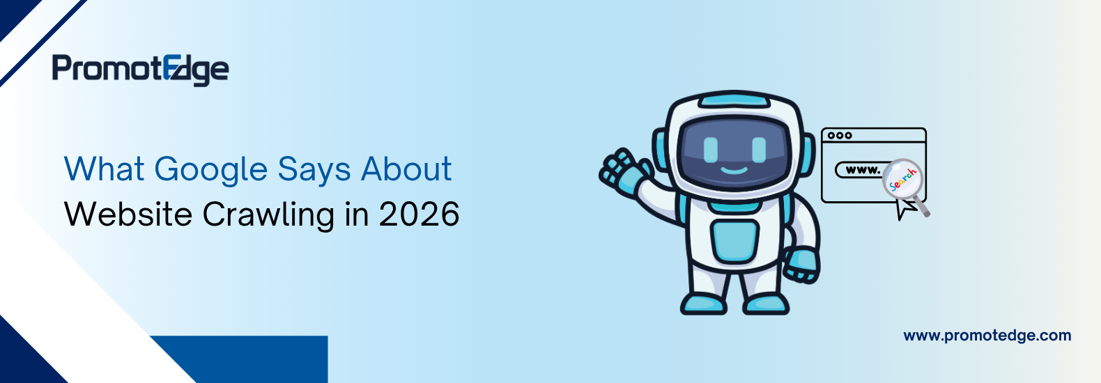
Digital Marketing What Google Says About Website Crawling in 2026
03 / Apr
Digital Marketing What Google Says About Website Crawling in 2026 -
19 / Mar
-
18 / Feb
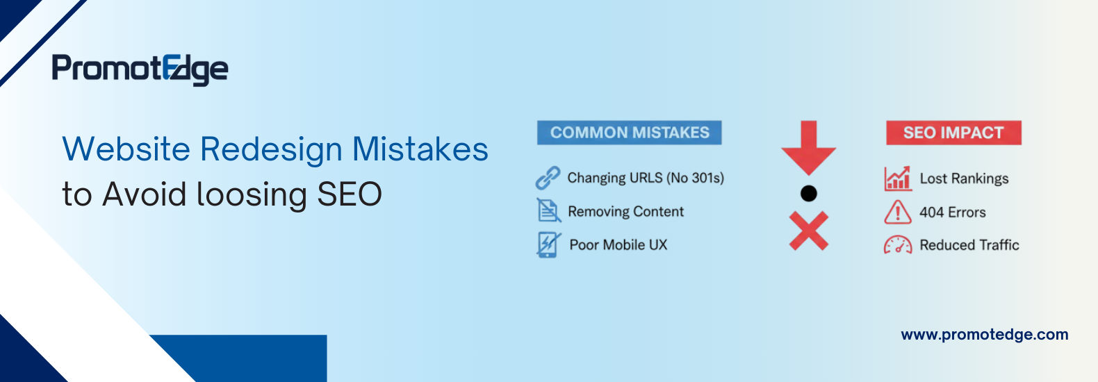
Web Solution 12 Website Redesign Mistakes to Avoid Losing SEO
-
11 / Feb
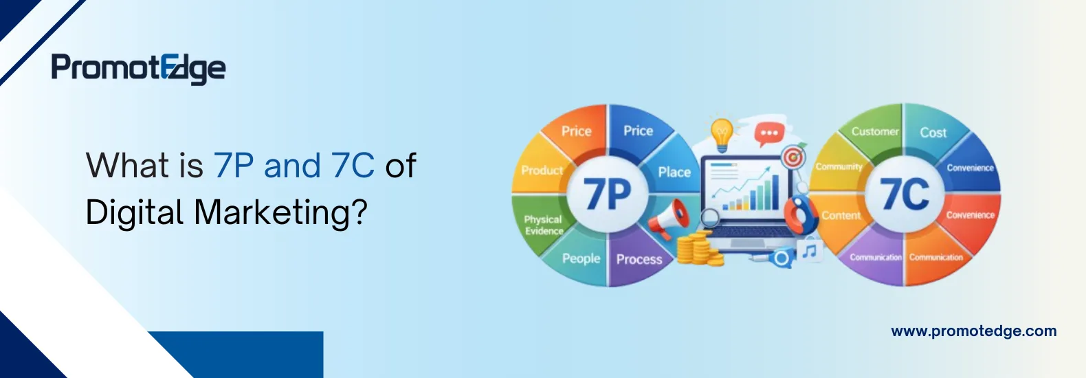
Digital Marketing What is 7P and 7C of Digital Marketing?
-
22 / Jan

Blogs


