
-
Author: Anindita Barik
-
Updated Date: Aug-04-2026
-
Views: 2 Min Read
Website UX for Lead Generation is about removing every barrier that stops qualified visitors from becoming enquiries. This guide explains nine practical UX improvements that can increase lead generation, including writing a clear above-the-fold value proposition, simplifying enquiry forms, improving Core Web Vitals, optimising the mobile experience, adding trust signals near CTAs, and measuring the right conversion metrics. It also explains how AI-driven search is changing visitor behaviour and why businesses should focus on qualified enquiries rather than traffic alone to improve website performance and conversion rates.
Website UX for lead generation is the work of removing every reason a qualified visitor decides not to contact you. Nielsen Norman Group’s eyetracking study of more than 130,000 fixations found that people spend about 57% of their page-viewing time above the fold, so most of your case for enquiring has to land in the first screen.
That is a narrower job than UX in general, and the difference is what most guidance on this topic skips. You are optimising one decision: should I hand these people my details? Everything on the page either supports that decision or competes with it.
I have seen B2B sites with healthy traffic sit at a 0.4% enquiry rate for years. The cause was almost never the visual design. It was a nine-field form, a hero that described the company instead of the offer, and a contact page that took four seconds to respond to a tap.
What website UX for lead generation really means
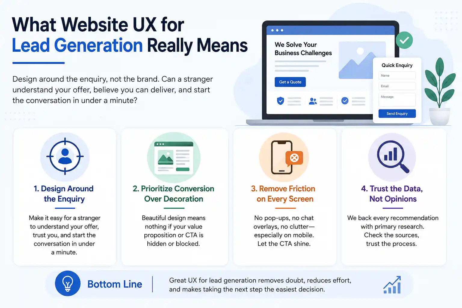
It means designing around the enquiry rather than around the brand. A site can win design awards and still fail this test. The agenda is simple: can a stranger understand your offer, believe you can deliver it, and start the conversation in under a minute?
This is where visual design and conversion design part ways. An animated hero that pushes your value proposition below the fold is a net loss even when the client loves it. So is a chat bubble covering the button on a 360px screen. Visual hierarchy resolves that conflict.
One warning about the advice you will find elsewhere. Almost every article on this subject tells you to keep forms short without ever saying how short, and quotes page-speed statistics that contradict each other. Every number below is linked to primary research so you can check it.
Where enquiries leak, and which fix applies
Work out where the drop-off actually sits before changing anything. The table below maps the symptom to its usual cause. It saves you from redesigning a page whose real problem lives three steps later.
| Symptom | Usual cause | Fix |
|---|---|---|
| High traffic, almost no form starts | Offer unclear above the fold, or four CTAs competing | 1 and 2 |
| People start the form but abandon it | Too many fields, or an unexplained phone requirement | 3 |
| Mobile converts at a third of desktop | Tap targets, wrong keyboard types, no call button | 5 |
| Enquiries arrive but quality is poor | No qualifying signal anywhere in the flow | 7 |
| Bounce spikes on one template only | LCP or INP failure specific to that template | 4 |
| Enquiries rarely turn into calls | Slow follow-up and a dead-end thank-you page | 9 |
The 9 fixes, ordered by effort against payoff
These nine improvements are ranked from the highest return for the least effort to changes that require more work but can deliver significant long-term gains.
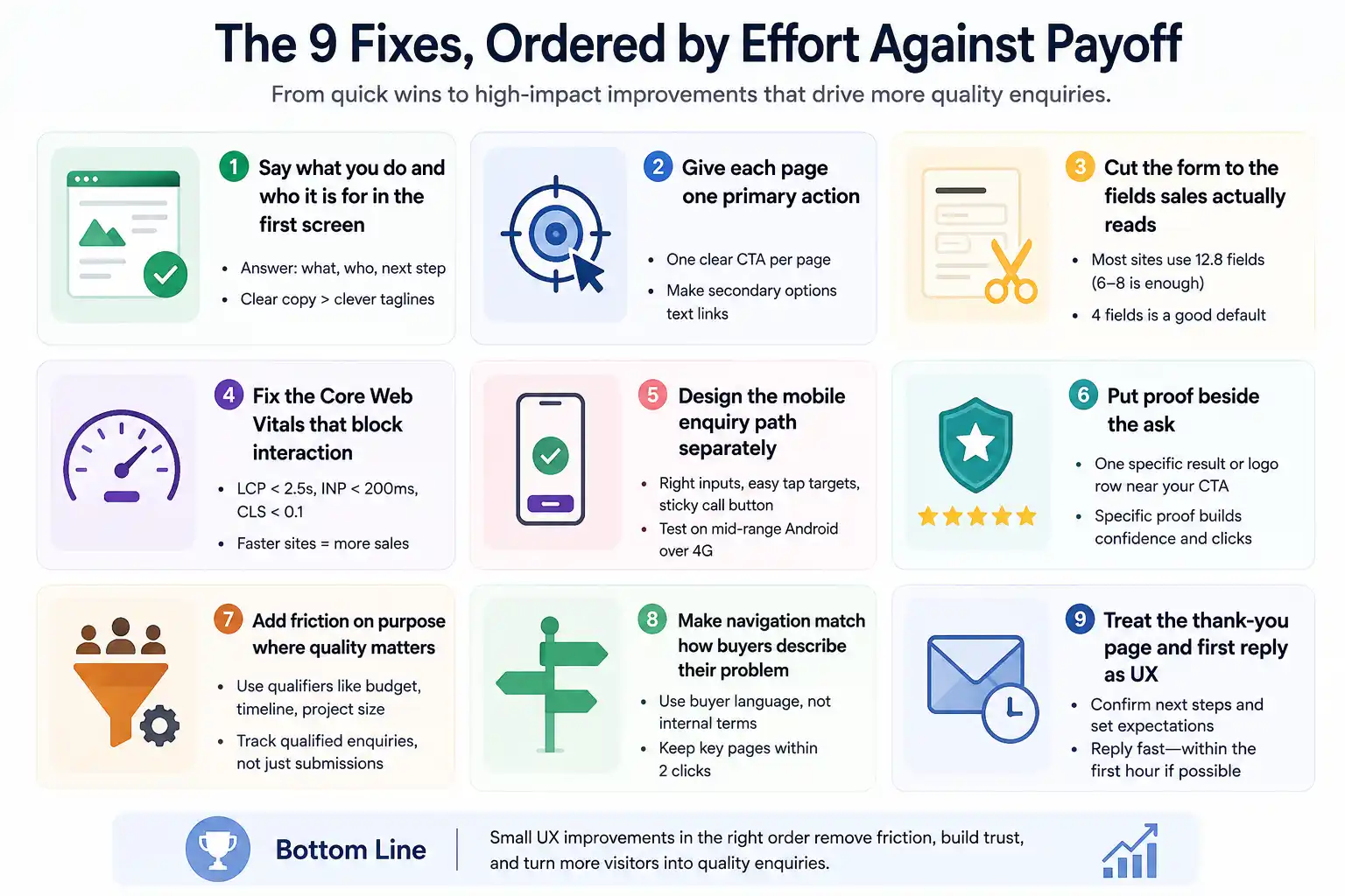
1. Say what you do and who it is for in the first screen
Your website only needs to answer three questions on the first screen: what you do, who it’s for, and what visitors should do next. Vague taglines like “Partners in Progress” sound nice, but they don’t tell people whether you’re the right fit for their problem. Instead, use a simple sentence your customers would actually say.
Here’s a quick test. Cover everything below the first screen of your website and ask someone who doesn’t know your business what you do. If they can’t answer within a few seconds, your message isn’t clear enough. In many cases, fixing the copy has a bigger impact on enquiries than redesigning the entire website.
2. Give each page one primary action
Most lead pages try to do everything at once: request a quote, download a guide, book a call, subscribe. Too many CTAs compete for attention, and all of them end up performing worse. Pick one primary action for the page and turn the rest into simple text links.
Secondary paths still matter, they just need to stay in the background. On a dedicated landing page, the enquiry is the button and the case study is the hyperlink. Never give two buttons the same level of importance.
3. Cut the form to the fields sales actually reads
Here’s a number nobody else gives you. Baymard Institute found that large websites use an average of 12.8 form fields when 6 to 8 would do, with 26% of users abandoning simply because the form felt too long. Enquiry forms have the same problem and even fewer excuses.
Sit with your sales team and go field by field. Ask which ones they actually read before the first call. Company size, budget band, and “How did you hear about us?” almost never survive that question. Four fields is a good default: name, work email, company, and message.
4. Fix the Core Web Vitals that block interaction
Google’s thresholds are pretty clear: LCP under 2.5 seconds, INP under 200 milliseconds, and CLS under 0.1, measured at the 75th percentile of real users. INP replaced First Input Delay as a Core Web Vital in 2024, but a lot of advice on page speed still hasn’t caught up.
INP is the one that can quietly cost you enquiries because it measures the delay after someone clicks your button. The business impact isn’t just theory either. Vodafone Italy improved its LCP by 31% and saw an 8% increase in sales. If you’re working on page speed, start with your highest-traffic service page template, not the homepage.
5. Design the mobile enquiry path separately
Mobile isn’t just a desktop squeezed onto a smaller screen. Tap targets need enough spacing, phone fields should use the right input type so the numeric keypad appears, and a sticky call button makes sense on pages where buyers may simply want to speak to someone.
Test on a mid-range Android over 4G, not the latest iPhone connected to office Wi-Fi. Responsive design fixes the layout. It doesn’t automatically fix the enquiry experience, and those are two different things.
6. Put proof beside the ask
Testimonials sitting on a separate page do nothing for someone hovering over your form. Bring one specific client result, a recognisable logo row, or a named quote into the same section as your call to action.
Specificity beats volume. “Cut cost per lead by 38% in four months for a steel fabricator” does far more than twelve generic five-star reviews because it shows buyers what happened for a business like theirs. Good proof answers the question in their head before they click the button, thereby boosting page engagement.
7. Add friction on purpose where quality matters
Most advice says to make your forms as short and simple as possible. That’s true—until your sales team starts spending half the day replying to enquiries that were never a good fit.
A single dropdown asking about project size, timeline, or budget can filter out low-quality enquiries without putting off serious buyers. Just don’t measure success by the number of form submissions accumulated in the dashboard. Track qualified enquiries instead. You might get fewer leads, but you’ll spend more time talking to people who are actually ready to buy.
8. Make navigation match how buyers describe their problem
Internal vocabulary has a habit of finding its way into website menus. Labels like “Solutions”, “Capabilities”, and “Verticals” make perfect sense to your team, but not to someone visiting your site for the first time. Use the same words your buyers use when they describe what they need.
The second problem is depth. If someone has to click through three or four pages to find a service, there’s a good chance they’ll stop looking. Good website navigation makes the right page easy to find. If people have to work too hard to get there, many won’t bother.
9. Treat the thank-you page and the first reply as UX
This is where most enquiries lose momentum, yet very few pages ranking for this term talk about it. Harvard Business Review found that firms contacting a prospect within the first hour were far more likely to qualify that lead than those that waited longer.
Give the thank-you page a job. Confirm what happens next, say who will get in touch, and include one relevant case study to read in the meantime. Then make the response time real. A great form followed by a reply 36 hours later is still a missed opportunity.
What changes when your traffic arrives from AI search
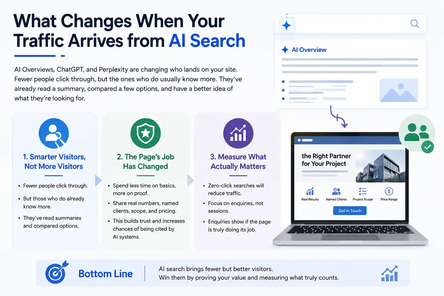
AI Overviews, ChatGPT, and Perplexity are changing who lands on your site. Fewer people click through, but the ones who do usually know more. They’ve already read a summary, compared a few options, and have a better idea of what they’re looking for. Most pages ranking for this keyword still assume every visitor is starting from scratch.
That changes the job of the page. You spend less time explaining the basics and more time proving why you’re the right choice. Real numbers, named clients, project scope, and price ranges become much more valuable. They’re useful for visitors, and they’re also the kind of information AI systems are more likely to reference for a brand to get cited.
It also changes how you measure performance. Zero-click searches will probably reduce your traffic, even if enquiries stay the same or increase. Pay closer attention to enquiries than sessions. They’re a much better measure of whether the page is actually doing its job.
How to measure whether a UX fix increased enquiries
Set the baseline before you change anything. You need four numbers: enquiry rate by template, form start rate, form completion rate, and qualified enquiries as a share of the total. Without them, it’s difficult to know whether a change actually worked or just looked better.
Track form starts as a separate GA4 event from submissions. The gap between the two tells you whether people are losing interest in the offer or giving up on the form. It’s one of the most useful ways to understand what’s happening, yet it’s something many websites never set up.
Give each change three to four weeks before judging the results, and always compare like-for-like periods. Watch bounce rate by template alongside enquiries, and check field Core Web Vitals in Search Console instead of relying only on lab tools, which can paint a more optimistic picture than real user data.
The KPIs worth reporting are cost per qualified enquiry and enquiry-to-opportunity rate. Session counts are not a UX outcome and should not appear in that report.
Where to start from this week?
Take your highest-traffic service page. Baseline the four numbers, rewrite the hero, cut the form to four fields, and check INP on a real phone. That sequence takes about a week and tells you whether the rest of the list deserves a budget.
If the template fights you at every step, the constraint is the build rather than the design. That is the point at which a website design and development rebuild earns its cost, and not a moment earlier.
Frequently asked questions about website UX for lead generation
-
How long before UX changes affect lead generation?
Ans.Form and CTA changes usually show up within two to four weeks on a page with reasonable traffic. Speed and navigation work takes six to eight weeks, because it also changes how the page is found and crawled. -
How many fields should a B2B enquiry form have?
Ans.Four is a workable default: name, work email, company and message. Add a fifth qualifying field only if your sales team is already turning away unqualified enquiries. Every extra field costs completions. -
Does website UX affect SEO rankings as well as enquiries?
Ans.Yes, on both counts. Core Web Vitals are a documented page experience signal, and engagement patterns shape how a page performs over time. Conversion work and SEO overlap far more than they compete. -
Should I redesign the whole site or fix pages one at a time?
Ans.Fix pages one at a time unless the template itself is the constraint. A full redesign resets your data and hides which change caused which result. Rebuild only when the CMS blocks the fixes above. -
What is the most common UX mistake that costs enquiries?
Ans.Asking for too much, too early. A long form on a page that has not yet made its case is the most common pattern among the UI and UX mistakes we audit, and it is also the cheapest one to correct.
Author Details

Latest Posts
-
 18 / Aug
Google Search Console Google Search Console For Social Media: How To Track Instagram, Tiktok, X And Youtube
18 / Aug
Google Search Console Google Search Console For Social Media: How To Track Instagram, Tiktok, X And Youtube -
 05 / Aug
SEO vs GEO vs AEO SEO vs GEO vs AEO: A Simple 2026 Comparison for Businesses
05 / Aug
SEO vs GEO vs AEO SEO vs GEO vs AEO: A Simple 2026 Comparison for Businesses -
 31 / Jul
Uncategorized How to Build a 90-Day Digital Marketing Plan That Works
31 / Jul
Uncategorized How to Build a 90-Day Digital Marketing Plan That Works -
 17 / Jul
Website Redesign 7 Real Signs Your Business Website Needs a Redesign in 2026
17 / Jul
Website Redesign 7 Real Signs Your Business Website Needs a Redesign in 2026 -
10 / Jul






-
How long before UX changes affect lead generation?
Ans.Form and CTA changes usually show up within two to four weeks on a page with reasonable traffic. Speed and navigation work takes six to eight weeks, because it also changes how the page is found and crawled. -
How many fields should a B2B enquiry form have?
Ans.Four is a workable default: name, work email, company and message. Add a fifth qualifying field only if your sales team is already turning away unqualified enquiries. Every extra field costs completions. -
Does website UX affect SEO rankings as well as enquiries?
Ans.Yes, on both counts. Core Web Vitals are a documented page experience signal, and engagement patterns shape how a page performs over time. Conversion work and SEO overlap far more than they compete. -
Should I redesign the whole site or fix pages one at a time?
Ans.Fix pages one at a time unless the template itself is the constraint. A full redesign resets your data and hides which change caused which result. Rebuild only when the CMS blocks the fixes above. -
What is the most common UX mistake that costs enquiries?
Ans.Asking for too much, too early. A long form on a page that has not yet made its case is the most common pattern among the UI and UX mistakes we audit, and it is also the cheapest one to correct.