
-
Author: Anindita Barik
-
Updated Date: Jun-04-2026
-
Views: 2 Min Read
Responsive web design ensures your website automatically adapts to any screen size — mobile, tablet, or desktop — using CSS media queries and flexible layouts. In India, over 80% of web traffic comes from mobile devices, making a mobile-first approach essential. A responsive site improves Google SEO rankings through Core Web Vitals, reduces bounce rates, and delivers faster load times even on 3G networks — helping businesses convert more visitors without building or maintaining separate desktop and mobile versions.
Responsive web design is the practice of building websites that look and work beautifully across every device — from smartphones and tablets to laptops and desktops. By leveraging flexible grids, fluid images, and CSS media queries, your layout automatically adapts to any screen size without the need for separate device-specific versions. The result is a single, seamless solution that delivers a consistent and polished experience for every user, everywhere.
Instead of building separate desktop and mobile versions, a single responsive site automatically reflows content, resizes elements, and reorganizes navigation based on the viewport, delivering a seamless experience to all users. With over 60% of global web traffic now coming from mobile devices, designing desktop-first is no longer viable; a mobile-first, responsive approach is the modern standard that improves usability, boosts SEO rankings, reduces maintenance overhead, and future-proofs your site against the ever-growing variety of screen sizes and devices.
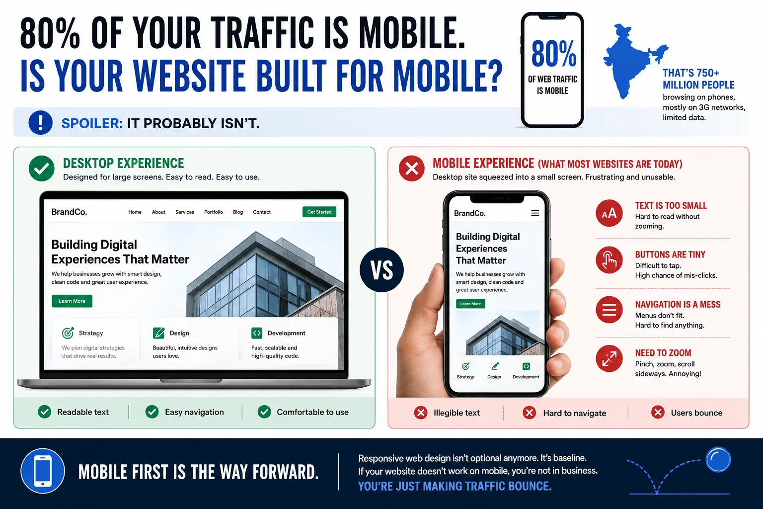
80% Of Your Traffic Is Mobile. Is Your Website Built For Mobile?
Spoiler: it probably isn’t.
I was debugging a website last month. Beautiful desktop site. Looked good on a 24-inch monitor. On mobile? Buttons were tiny. Text was illegible. Navigation menu was a mess. You had to zoom to click anything. Nightmare.
The founder was confused. “I tested it in Chrome.” Yeah, Chrome on your 15-inch laptop. Not Chrome on a phone.
In India, 80% of web traffic is mobile. That’s 750+ million people accessing the web via phone. Most of them on 3G networks, limited data. And most websites are built as desktop-first, then “mobile-optimised” (usually means slapped into a responsive framework without thinking).
That’s backwards. You should be building for mobile first. Everything else is bonus.
Responsive web design isn’t optional anymore. It’s baseline. If your website doesn’t work on mobile, you’re not in business. You’re just making traffic bounce.
What Is Responsive Web Design (And Why You Need It)
Responsive web design means one website that adapts to any screen size. Desktop, tablet, mobile. Same code. Different layouts based on screen width.
How? CSS media queries. Breakpoints.
A header that’s two columns on desktop becomes one column on mobile. A navigation menu that’s horizontal on desktop becomes vertical (hamburger menu) on mobile. Images scale. Buttons get bigger. Spacing adjusts.
The alternative is building three separate sites: desktop, tablet, mobile. That’s maintenance hell. More bugs. More cost. Duplication everywhere. Don’t do that.
Responsive design says: write the code once, layout changes based on screen size. It’s the right approach.
But here’s where it gets messy: most brands say “we’re responsive” and then deliver a site that technically works on mobile but looks cramped, loads slowly, and converts terribly. Responsive doesn’t automatically mean “good on mobile.” It just means “adapts.” Bad responsive design is still bad.
Mobile-first responsive design means: build for mobile first. Make it fast on 3G. Make it usable with a thumb. Then enhance for tablet and desktop. That’s different. That’s better.
The Mobile-First Approach (For Indian Networks)
Most web design and development services is desktop-first: build for big screen, then shrink for mobile.
Mobile-first is opposite: build for small screen, then expand.
Why? Constraints force better decisions. When you’re designing for a 375px-wide phone on a 3G network, you prioritise content. No bloat. No unnecessary animations. No auto-playing videos. Just what matters.
Then when you expand to tablet and desktop, you can add enhancements. More whitespace. Two-column layouts. Richer interactions. But the core experience works on mobile.
For India this is critical. The “typical” Indian web user is on a Rs 4,000-8,000 phone with 2G/3G connection. If your site takes 10 seconds to load, they’re gone. They went to a competitor who loads in 3 seconds.
Mobile-first forces you to optimise. Images compressed. Code minified. HTTP requests minimal. Animations skipped on slow networks. All because you started with mobile constraints.
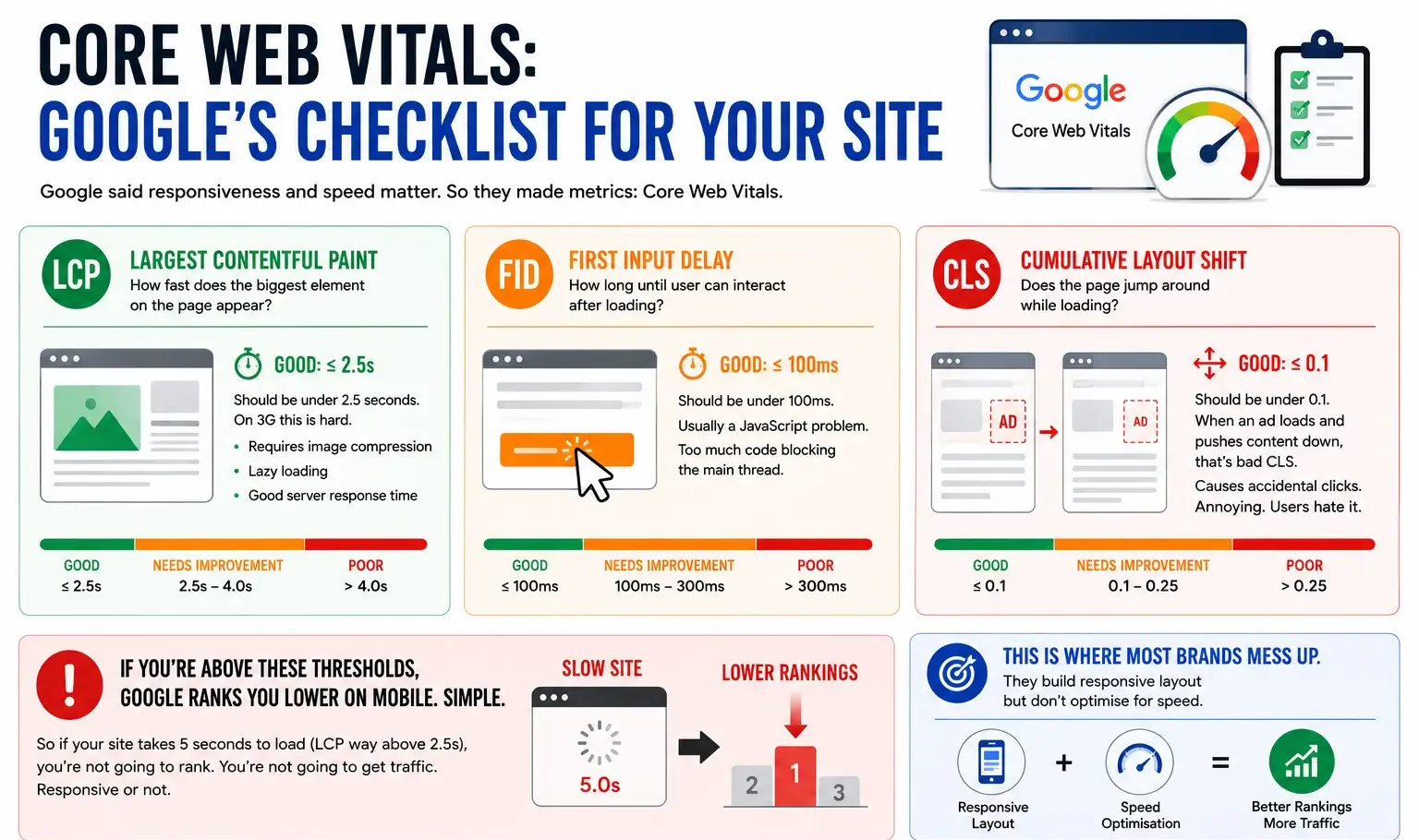
Core Web Vitals: Google’s Checklist For Your Site
Google said responsiveness and speed matter. So they made metrics: Core Web Vitals.
-
LCP (Largest Contentful Paint):
How fast does the biggest element on the page appear? Should be under 2.5 seconds. On 3G this is hard. Requires image compression, lazy loading, good server response time.
-
FID (First Input Delay):
How long until user can interact after loading? Should be under 100ms. Usually a JavaScript problem. Too much code blocking the main thread.
-
CLS (Cumulative Layout Shift):
Does the page jump around while loading? Should be under 0.1. When an ad loads and pushes content down, that’s bad CLS. Causes accidental clicks. Annoying. Users hate it.
If you’re above these thresholds, Google ranks you lower on mobile. Simple. So if your site takes 5 seconds to load (LCP way above 2.5s), you’re not going to rank. You’re not going to get traffic. Responsive or not.
This is where most brands mess up. They build responsive layout but don’t optimise for speed. Site technically works on mobile but is so slow it’s unusable.
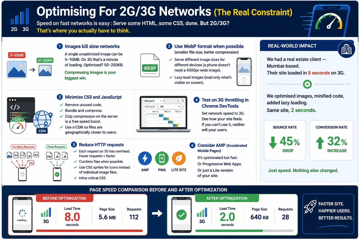
Optimising For 2G/3G Networks (The Real Constraint)
- Speed on fast networks is easy : Serve some HTML, some CSS, done. But 2G/3G? That’s where you actually have to think.
- Images kill slow networks : A single unoptimized image can be 5-10MB. On 3G that’s a minute of loading. Optimised? 50-200KB. Compressing images is your biggest win.
- Use WebP format when possible (smaller file size, better compression) : Serve different image sizes for different devices (a phone doesn’t need a 4000px wide image). Lazy-load images (load only what’s visible on screen).
- Minimize CSS and JavaScript : Remove unused code. Bundle and compress. Gzip compression on the server is free speed boost. Use a CDN so files are geographically closer to users.
- Test on 3G throttling in Chrome DevTools : Set network speed to 3G. See how your site feels. If you can’t use it, neither will your users.
- Reduce HTTP requests : Each request on 3G has overhead. Fewer requests = faster. Combine files when possible. Use CSS sprites for icons instead of individual image files. Inline critical CSS.
- Consider AMP (Accelerated Mobile Pages) : It’s opinionated but fast. Or Progressive Web Apps. Or just a Lite version of your site.
We had a real estate client — Mumbai-based. Their site loaded in 8 seconds on 3G. We optimised images, minified code, added lazy loading. Same site, 2 seconds. Bounce rate dropped 45%. Conversion rate went up 32%. Just speed. Nothing else changed.
Breakpoints: The Boundaries Of Responsive Design
Breakpoints are the screen sizes where your layout changes.
Classic breakpoints:
Mobile: 320-480px (small phones)
Tablet: 481-768px
Small Desktop: 769-1024px
Large Desktop: 1025px+
But this is outdated thinking. There’s no “mobile” size anymore. Phones range 320px to 430px. Tablets 480px to 850px. Laptops 1366px to 2560px. Designing for “mobile” as one size is wrong.
Instead: Design for the content. Where does the layout break? That’s your breakpoint. If text is unreadable at 600px, add a breakpoint at 600px. Don’t force content into predefined breakpoints.
Also, consider touch targets. Buttons need to be at least 44×44 pixels on mobile. Spacing between interactive elements matters. A desktop button at 20×20 pixels is unusable on touch.
Testing Your Responsive Design (Properly)
Don’t just look at it on your phone and call it done.
Test on actual devices. Different phones render differently. iPhone 12 and OnePlus 9 are both “mobile” but render slightly different. Emulators are useful but real devices are better.
Test on slow networks. Use Chrome DevTools throttling (3G slow, 3G fast, 4G). See how your site performs.
Test on different orientations. Portrait and landscape. Some phones feel completely different in landscape.
Test with touch. Some interactive elements work with mouse but are annoying with thumb on touch.
Use tools: Google Lighthouse (audit tool), WebPageTest (speed testing), BrowserStack (cross-device testing). These show you what’s broken.
Check Core Web Vitals. Google’s PageSpeed Insights shows your actual metrics. If you’re failing LCP or FID, fix that before worrying about design details.
SEO And Mobile Responsiveness
Google indexes mobile-first now. If your site doesn’t work on mobile, Google basically can’t see it. Your SEO is dead.
Responsive design + fast loading = better SEO. Core Web Vitals are a ranking factor. Non-responsive site = lower rankings, effectively no organic traffic.
Also, mobile-friendly design means lower bounce rate, higher time-on-site, more engagement. All positive SEO signals. Understanding the impact of bounce rate on SEO is key to appreciating why speed and responsiveness are inseparable from search rankings.
So responsive design isn’t just UX. It’s fundamental for search visibility in 2026.
Build Mobile-First, Enhance Later
Start with HTML that works everywhere.
Add CSS for mobile (your base styles).
Add media queries for tablet and desktop (enhancements).
Add JavaScript for interactions (progressive enhancement).
Test. Optimise. Done.
This approach ensures your site works on any device, any network. And usually ends up being faster than desktop-first because you’re forced to think about constraints.
Jugaad to strategy — use the constraints of mobile to build something better.
| Approach | Best for | Watch out for |
|---|---|---|
| DIY | Small teams, tight budgets | Slow ramp-up, trial-and-error |
| Freelancer | Specific project bursts | Inconsistency, limited ownership |
| Agency | Ongoing work, senior input | Higher retainer, less control |
Quick checklist before you start:
- Define the one thing you want: leads, sales, awareness — pick one.
- Baseline your numbers: write down where you are today.
- Pick a 90-day window: nothing moves in 2 weeks.
- Agree on success metrics: with whoever is paying the bill.
- Set up proper tracking: GA4, UTMs, call tracking.
- Review monthly: kill what doesn’t work, double down on what does.
The Bottom Line
If you take one thing from this: responsive web design stop building desktop websites rewards patience and specificity, not volume or clever tricks. Start small, measure honestly, fix what breaks, and compound what works. The brands doing this well in India aren’t smarter — they’re just consistent. Need a hand with this for your business? Talk to us.
Is Your Website Actually Responsive?
We audit websites for mobile-responsiveness and speed. Most brands say they’re responsive but load in 7+ seconds on 3G. Let’s audit yours.
FAQs
-
What is responsive web design?
Ans.A website that adapts to any screen size. Same codebase, different layouts for mobile/tablet/desktop. CSS media queries handle the sizing. Not three separate sites. One site that responds to screen width. -
Why care if 80% traffic is mobile?
Ans.Because if your site looks like garbage on mobile, 80% of traffic bounces. Gone. Conversion rate for poor mobile UX is 40% lower than desktop. You are throwing away revenue. -
How do I optimise for 2G/3G?
Ans.Compress images aggressively. Lazy-load. Minimize code. Enable gzip compression. Use CDN. Test on 3G throttling in Chrome DevTools. Core Web Vitals: LCP under 2.5s, FID under 100ms, CLS under 0.1. If you are above that, users bounce.
Author Details
Latest Posts
-
 24 / Jul
Content Management System Headless CMS: What It Is and When Your Business Needs One
24 / Jul
Content Management System Headless CMS: What It Is and When Your Business Needs One -
23 / Jul
Website Security Website Security: Essential Guide to Protecting Your Business Site
-
21 / Jul
-
20 / Jul
Social Media Social Media Design: Sizes, Formats & Best Practices
-
18 / Jul


Related Knowledge


