-
Author: Milan Shyamal
-
Updated Date: Jun-15-2026
-
Views: 2 Min Read
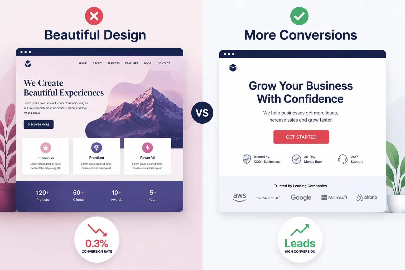
A few years back, a premium furniture brand from Mumbai came to us. Their homepage was — and I’m being honest — absolutely stunning. Art direction was flawless. Photography? Magazine quality. The copy was poetic. Honestly, if there was a design award for “best website nobody buys from,” they would’ve won it.
Their conversion rate was 0.3%. Zero point three percent.
Visitors loved the site. Stayed for minutes. Clicked around. Then left without doing a single thing. No form. No call. No email. Nothing.
That experience changed how I think about design. Because beautiful doesn’t always mean converting. A landing page isn’t your brand’s gallery. It’s a sales tool. Different thing entirely.
So let’s find out how you can use your landing page as a sensible lead generation medium.
What Actually Is Landing Page Optimization?
It’s adjusting a page — every element, every word, every colour — so that more of the people who land on it actually do what you want them to do. Fill a form. Click a button. Make a call. Seems obvious. It’s not obvious to most people because they’re busy being clever instead of being clear.
A landing page is a conversation with someone who’s already interested. Not someone browsing randomly. Someone who clicked an ad, clicked a link, or Googled your solution. They’re primed. Your job is to not screw it up. And you’d be surprised how often we screw it up.
The Three Things Every High-Converting Page Needs
Message Match (The Rule Nobody Follows)
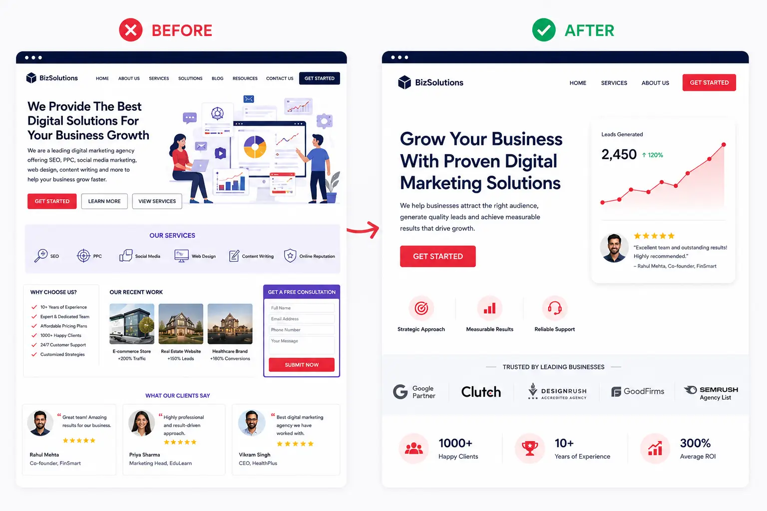
You run an ad saying “Get leads for your clinic in Delhi.” Someone clicks. They land on a page that says “Welcome to Our Digital Marketing Agency.” Nope. Your page headline needs to echo the ad headline. Not exactly — but close enough that the visitor thinks they’re in the right place.
We tested this with a B2B SaaS client in Bangalore. Their ad promised “Cut admin time in half.” Their landing page title? “Enterprise Workflow Management Platform.” Same thing, right? Not to the person who just clicked a promise about time. Changed the headline to “Cut Your Admin Time in Half — Here’s How.” No other changes. Conversion rate jumped from 2.1% to 3.4%. Not earth-shattering. But on 1000 visitors a month, that’s 13 extra leads. Over a year, 156 leads you were leaving on the table.
Clear, Single CTA
I’ve seen landing pages with five buttons. “Contact us.” “Sign up.” “Book a demo.” “Download guide.” “Call now.” Guess what happens? People don’t click any of them. One call to action. One. That’s your job. Everything else is supporting that one thing. If you can’t decide which is most important, talk to your sales team. They’ll tell you which actually converts.
For real estate, it’s usually “Schedule a site visit” or “Get price.” For SaaS, it’s “Start free trial.” For educational institutes, it’s “Request admission form.” Only one. Make it obvious. Make it big. Put it where people can’t miss it.
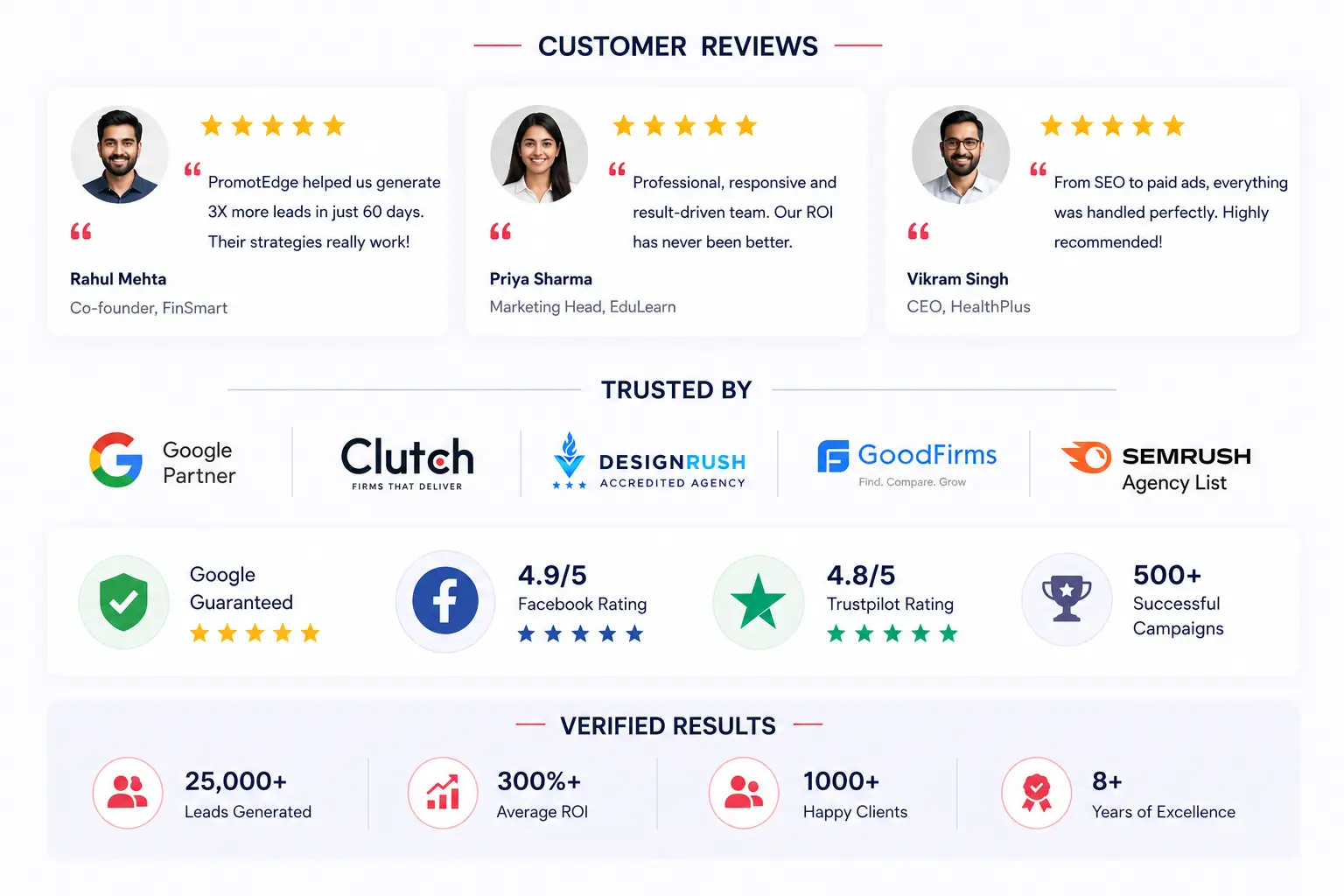
Social Proof (But Make It Real)
A generic “5-star rating” badge doesn’t cut it anymore. People have learned to ignore those. What works? Actual customer logos if you have them. Client testimonials with names and photos — actual photos, not stock images. Review counts from real platforms.
A logistics startup from Jamshedpur had these stunning testimonials locked away on a hidden testimonials page. Nobody was seeing them. We moved three specific quotes — one from a manufacturing manager, one from a retail ops person, one from a logistics director — to the landing page. Each with name, title, company, and a real photo from LinkedIn. Conversion rate went from 4.7% to 6.2%. Because now people could see “Oh, actual operations people use this, not just the founder’s friends.”
Design Elements That Actually Matter
Forget about “trendy.” Think about utility. White space looks empty to designers. Feels clean to visitors. A cramped page feels scary. Breathing room helps.
Form fields — ask only what you absolutely need. “Name,” “Email,” “Company” is usually enough for first contact. Don’t ask for phone, location, job title, and budget all at once. You’ll get 30% fewer submissions.
Form placement matters. Above the fold? Maybe if you’re drowning in organic traffic and can afford to lose some. For paid ads, put the form lower — after you’ve made your case. Let them get interested first. Then ask them to commit.
Headline size and hierarchy. Biggest text = most important message. If your headline is small and your benefits are small, people won’t know what the page is about in 3 seconds. You’ve lost them.
Colours. Use your brand colours — ours are #e94560 for that pop of pink and #1a1a2e for dark, professional backgrounds. Test whether your CTA button stands out. A button that blends in doesn’t get clicked. Doesn’t matter if it’s perfectly designed.
The A/B Testing That Actually Works
Most teams run A/B tests wrong. They change everything, run it for two weeks, look at the results, and declare victory. Or defeat. That’s chaos.
Here’s how it should work.
First: decide what to test. One thing only. Not “new headline AND new button colour.” Just the headline. Or just the button. Change one variable.
Second: run it for at least two weeks, or until you get 100+ conversions per variation. Whichever takes longer. Statistical significance matters. A test with 20 conversions is luck. A test with 500 is data.
Third: measure the right metric. If you’re optimising for leads, measure leads. Not clicks. Not form starts. Completed submissions.
We ran a test for a coaching business about eight months back. Tested two headlines over four weeks. Version A: “Coaching for Growth” — got 6 leads per 100 visitors. Version B: “From Confusion to Clarity in 90 Days” — got 7.2 leads per 100 visitors. That’s a 20% increase. Seems great, right? But then Google pushed an algorithm update, traffic shifted, and the next month? Both headlines performed identically again. So we kept Version B (because maybe) but didn’t bet the farm on it.
The Mistakes We See Constantly
Mistake One: Too Much Copy
Detailed, comprehensive, 1000-word landing pages tend to convert worse than tight, focused ones. Not always. But usually. People don’t read landing pages. They scan. So make your points snappy. Short paragraphs. Subheadings. Bullets. White space does the work.
Mistake Two: Unclear About Your Offer
What are you actually asking them to do? “Get started”? “Sign up”? “Request a demo”? And why should they care? The page should answer: 1) What is this? 2) Why does it matter? 3) What do I do now? If it doesn’t answer all three in the first 10 seconds, you need to rewrite it. Everything else is secondary.
Mistake Three: Not Mobile-Friendly
30-40% of your traffic is mobile. If your form doesn’t work on mobile, if your page is slow on 4G, if your CTA button is tiny — you’re throwing away conversion. Full stop. Test on actual phones. Not just your designer’s iPhone Pro.
Mistake Four: Overthinking The Design
Animation, parallax scrolling, custom fonts, fancy layouts. These things look impressive in a portfolio. They usually hurt conversion. Faster, simpler, clearer pages convert better. I’d rather have an ugly page with 8% conversion than a beautiful page with 2%. Every single time.
Tools That Actually Help (You Don’t Need Many)
Google Forms, Typeform, Unbounce. That’s your starting three. Unbounce gives you A/B testing built in, which is nice if you’re serious. Leadpages does the same thing.
For heatmaps (seeing where people click, scroll), Hotjar shows you videos of actual user sessions. Useful for spotting problems you didn’t know existed.
Google Analytics 4 is free. It tells you conversion rate and helps you identify where people drop off.
That’s it. You don’t need a SaaS stack. You need clarity and measurement. Everything else is distraction.
When Your Landing Page Strategy Should Actually Change
If conversion rate drops suddenly — and I mean 25%+ drop in a week — something’s broken. Either technical (page is slow, form doesn’t work, mobile is broken) or external (Google update, campaign shifted, traffic source changed). Debug it immediately.
If your conversion rate stays flat for three months despite multiple tests, the problem might be traffic quality, not the page. Who are you sending? Are they actually interested? Or just curious clickers? Sometimes a mediocre page with good traffic beats a perfect page with terrible traffic.
If you’re getting tons of form starts but zero follow-up meetings, the page worked — but the offer or your sales process is wrong. That’s a different problem entirely. Landing page did its job. Something else failed.
The landing page is one part of the funnel. It can only do so much.
Building For Conversion Is Actually Simpler Than It Looks
Most people overcomplicate it. They want their landing page to be a masterpiece. It doesn’t need to be. It needs to be clear, fast, and focused on one thing. Everything else is noise that probably hurts you.
At PromotEdge, we’ve optimised landing pages for real estate, education, healthcare, manufacturing, SaaS, coaching. The principles are identical. Remove friction. Match the message. Make the ask clear. Test one thing. Measure results. Repeat.
We also work across web solutions, UI/UX design, and conversion optimization to make sure everything works together. If you’re ready to optimise a page that’s currently underperforming, let’s talk. We’ll audit your current page, identify the biggest opportunities, and build a test plan. No fluff. Just what works.
| Approach | Best for | Watch out for |
|---|---|---|
| DIY | Small teams, tight budgets | Slow ramp-up, trial-and-error |
| Freelancer | Specific project bursts | Inconsistency, limited ownership |
| Agency | Ongoing work, senior input | Higher retainer, less control |
Quick checklist before you start:
- Define the one thing you want: leads, sales, awareness — pick one.
- Baseline your numbers: write down where you are today.
- Pick a 90-day window: nothing moves in 2 weeks.
- Agree on success metrics: with whoever is paying the bill.
- Set up proper tracking: GA4, UTMs, call tracking.
- Review monthly: kill what doesn’t work, double down on what does.
The Bottom Line
If you take one thing from this: landing page optimization convert more visitors into leads rewards patience and specificity, not volume or clever tricks. Start small, measure honestly, fix what breaks, and compound what works. The brands doing this well in India aren’t smarter — they’re just consistent. Need a hand with this for your business? Talk to us.
Ready to Improve Your Conversion Rate?
We’ve optimised landing pages for 100+ brands across India. Let’s audit yours and build a test plan that actually works.
FAQs About Landing Pages
Author Details
Latest Posts
-
 15 / Jun
-
03 / Apr
Digital Marketing What Google Says About Website Crawling in 2026
-
19 / Mar
-
18 / Feb
Web Solution 12 Website Redesign Mistakes to Avoid Losing SEO
-
11 / Feb
Digital Marketing What is 7P and 7C of Digital Marketing?
Blogs