-
Author: Anindita Barik
-
Updated Date: Aug-12-2026
-
Views: 2 Min Read
Banner design for events is about creating visuals that grab attention, communicate one clear message, and drive people toward action. This guide explains how to design event banners that work in real-world environments, covering typography, visual hierarchy, colour contrast, copy, CTAs, materials, imagery, sizing, and pre-print testing. Learn how to avoid common banner mistakes and create designs that stand out from a distance, attract booth traffic, and support lead generation at trade shows, exhibitions, conferences, and corporate events.
Event banner design is the process of creating bold, clear visuals that attract attention and communicate your event’s key message quickly. A strong banner design uses compelling headlines, readable typography, relevant imagery, brand elements, and a clear visual hierarchy.
Effective event banners do more than look attractive—they guide people toward action. Whether used for conferences, exhibitions, launches, or promotional events, the design should be easy to understand from a distance, consistent with the brand, and focused on the event’s purpose, date, location, or call to action. Banner design is one of the most practical applications of creative designing — where aesthetics and conversion mechanics have to work together under real-world constraints that a screen mockup will never reveal.
That Moment When Your Banner Completely Disappears
February 2024. Agriculture equipment trade show in Nashik. One of our manufacturing clients — solid reputation, been working together three years — brought a banner. Cost them 75,000 rupees. Five design revisions. Looked stunning in digital.
At the venue? Nobody saw it.
People walked past every few seconds and didn’t register it. The colours didn’t punch in daylight. The typography was too delicate. Too many competing elements. It looked like we’d designed for a magazine, not for humans moving through real space at real speed.
They redesigned in four days. Bolder colours, simpler layout, one clear message. Another 40,000 rupees. But at that same event, they got 23 qualified leads from booth traffic. The first banner? We stopped counting when it became embarrassing.
Why Banners Fail — The Real Reasons
We design on monitors. LED-lit, colour-calibrated, perfect. Then you hang it under fluorescent lights in a gym with competing visuals everywhere. Everything changes instantly.
Colours that seemed vibrant look muted. Typography that looked clear gets lost. Subtle gradients? Gone. This gap between screen and reality is where most banners die. They’re optimised for laptops, not for trade shows.
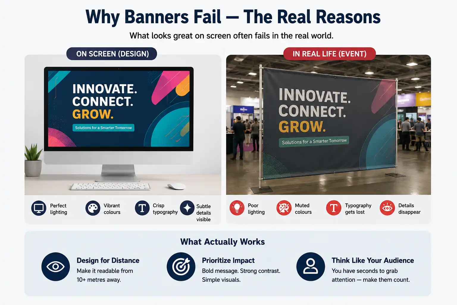
Physical banner design is a different discipline. Not web design. Not traditional print. It’s… visual communication from distance, competing with dozens of other stimuli, processed by a human brain that isn’t even trying to read your banner.
You need impact more than beauty. Sometimes the most effective banner looks crude up close. From ten metres away? Clear, striking, stops people cold.
The Three-Second Rule
Someone walks past your booth. You have three seconds. Four if they’re slightly interested. No time for storytelling. No time for nuance. One message. That’s your window.
A tech client wanted to feature eight different products. Each one explained. We said no. Not possible in three seconds. They fought us. Then we showed them data from three previous campaigns. Single-message banners outperformed complex ones by 3:1. They picked one product line. The booth got 31% more foot traffic that quarter.
Typography — The Overlooked Killer
Here’s what seems obvious but trips up everyone: text gets smaller at distance. I know that sounds silly. But designers often treat banner text like website text or print brochures. You can’t. The math is completely different.
Rule: if someone can’t read your headline from 8-10 metres away, it’s too small. Body copy? 3-4 metres max. Most people don’t bother with body copy anyway.
A textile exporter from Surat insisted on beautiful, thin serif fonts. Elegant in mockup. At the event, unreadable from across a room. We switched to bold sans-serif. They hated it in preview. “Too loud,” they said. At the actual event, from three metres away, it worked perfectly. That’s when they understood: the design that looks good on screen and the design that works in reality aren’t always the same thing.
Font choice matters more than colour choice. A good sans-serif in black on white beats a fancy serif in clever colours. Save cleverness for moments where people actually look carefully.
Hierarchy Is Everything
Headline five to six times larger than supporting text. Supporting text. Small details. Progressive sizing. This creates visual flow — someone’s eye knows where to look first, second, third.
Bad banners have everything fighting equally. Logo, message, CTA, company name — all the same visual weight. Pick one thing to dominate. Everything else supports it.
Colour Theory for the Real World
Complementary colours matter, psychological associations matter. But there’s something more basic: contrast. Can people actually see your banner in sunlight?
Beautiful midnight blue logo on navy background? Invisible. Bright orange on red? Also invisible. High contrast is non-negotiable. That’s the first rule.
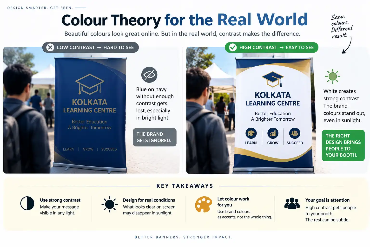
An educational institute in Kolkata had deep blue and gold brand colours. Gorgeous on their website. For trade shows, pure blue and gold didn’t have enough daylight contrast. We added white, making the blue pop and gold shine. Same brand colours, arranged for visibility instead of elegance. Once they were there, conversion rates improved.
Your brand colours don’t have to dominate the banner. They can be accents. The dominant colour should be whatever creates maximum contrast. Think of your banner as a tool to pull people to your booth. Once they’re there, subtle branding happens naturally. The consistency between your banner colours and the wider brand identity design system is what makes your presence feel cohesive across a trade show floor — visitors should recognise your brand before they read a single word.
Copy That Pulls People In
Your text has to do three things in order: grab attention, communicate clearly, drive action. Most people try to do all three at once, which is why banner copy usually fails.
Break it down. Headline (attention). Subheading (clarity). Call to action (what next). Don’t be clever. “Beautiful designs for ambitious brands” is clever. Nobody at a trade show has energy for clever. “Web Design for Faster Growth” is clear. It says what you do and why it matters.
A software client wanted to use a pun. It was… not good. “But it’s memorable,” they argued. Yes. Memorably confusing. We offered three alternatives focused on what the software actually does. All four got tested at the event. The pun got the fewest booth visits. The clear, benefit-focused headlines won by wide margin.
Banner copy should never require explanation. If someone’s confused about what you do in the first 2-3 seconds, you’ve failed. The goal isn’t being witty. The goal is being understood instantly.
Call to Action Placement
Bottom-right or bottom-left. That’s where eyes land after reading the main message. Make it visible, clear, actionable. If someone has to think about the next step, you’ve lost them.
Size, Material, Reality
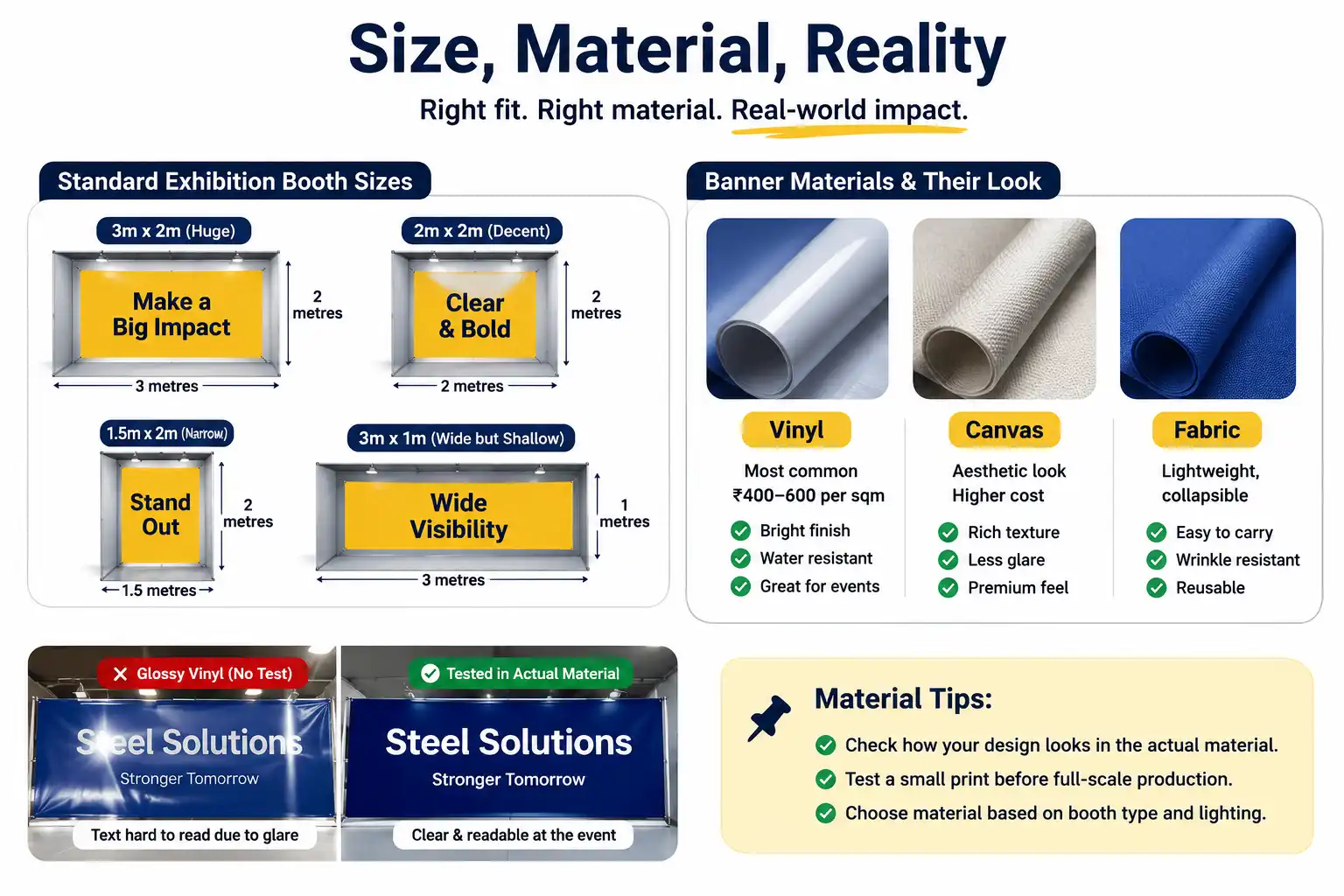
Your design looks great. But practical constraints exist. Your booth is 3 metres wide. You need a banner that fits. Standard exhibition booth sizes: 3m x 2m (huge), 2m x 2m (decent), 1.5m x 2m (narrow, vertical orientation), 3m x 1m (wide but shallow).
Material matters. Vinyl (most common, 400-600 rupees per sqm), canvas (aesthetic, pricier), fabric (lightweight, collapsible). Each material prints differently, renders colours differently. High-value clients? Print a small test version in the actual material before printing full size.
A steel company insisted on glossy vinyl. Brilliant in sample. At the event, bright lights created glare that made text hard to read. Should’ve tested. Hindsight and all.
Photography and Images — Keep It Simple, Really
If you’re using a photograph, it needs to be striking from distance. Professional product photography, high-impact lifestyle image, clear action shot. Avoid images that need context. Avoid visual overload.
A manufacturing facility wanted to show production complexity. Intricate photograph of machinery mid-operation. Dozens of metal parts, movement. Beautiful in mockup. At the event, from 3+ metres away? Visual noise. People couldn’t distinguish anything meaningful.
We replaced it with the finished product and customer benefit. Simple, clear. That redesigned banner pulled 40% more enquiries. That experience changed my entire approach to photography for banners. Simpler is almost always better. Actually, simpler is always better.
If you’re not using photography, illustration or infographic works well. Bold shapes, clear communication, visual impact. Avoid stock images. Your banner should feel specific to your brand, even using simple visuals.
Testing Before You Print
Print a small version. A3 or A2 size. Put it on a wall. Step back 3-5 metres. Is text readable? Is the message clear? Do colours work in regular lighting?
If the answer’s no to any of those, fix it. Testing costs 1,000-2,000 rupees. Reprinting the full banner costs 40,000-80,000 rupees. But people skip this step. I’ve skipped it myself, thinking I knew better. I was wrong every time.
Show the test version to people unfamiliar with your brand. Family, colleagues, whoever. If they understand the message in the first few seconds without explanation, you’re probably good. If they have questions, fix it before printing the full version.
Common Mistakes
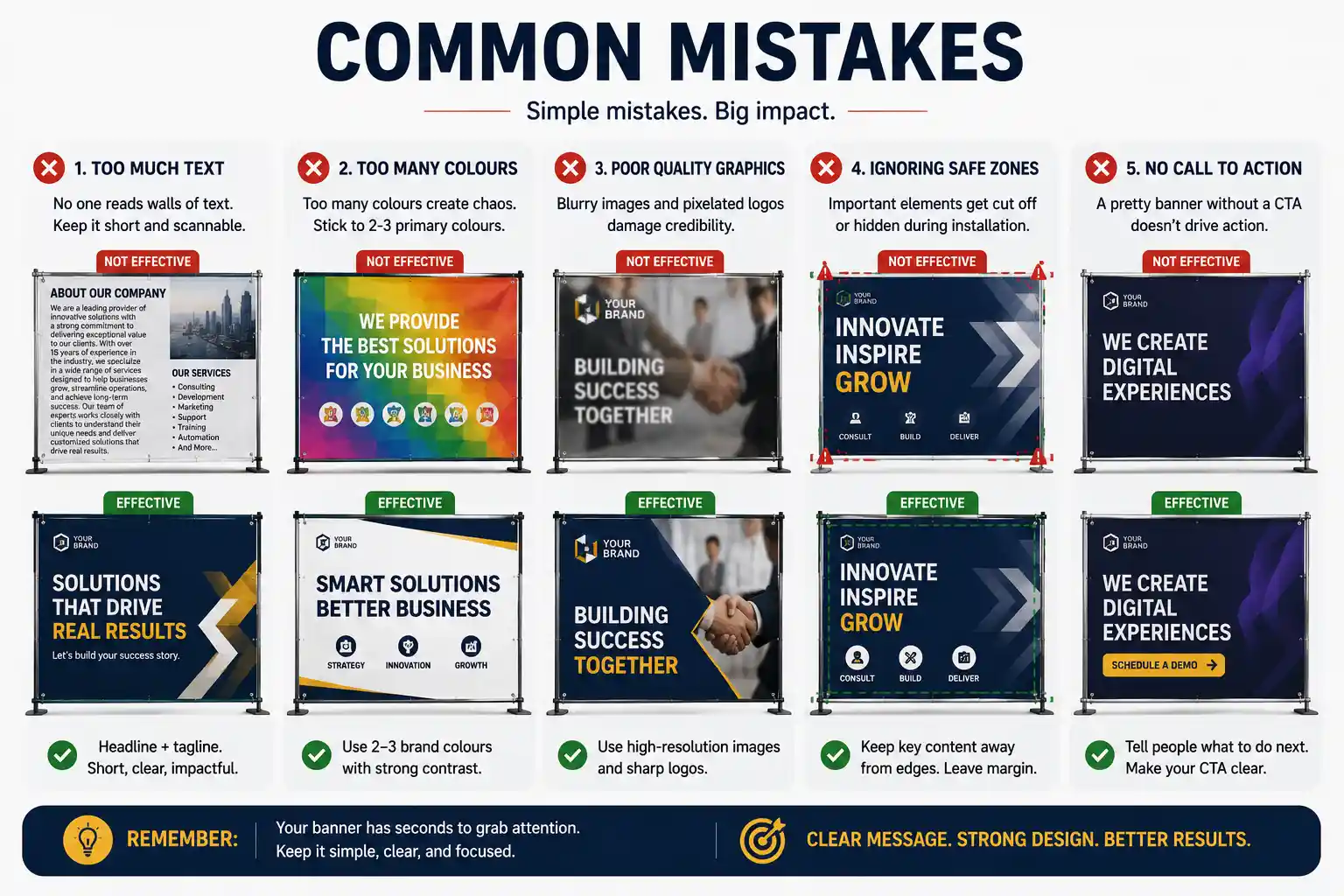
- Too much text. The number one mistake. Entrepreneurs want to cram their entire brand story onto the banner. Nobody reads that. Headline plus supporting tagline. Everything else is noise.
- Too many colours. More than three primary colours and it starts looking chaotic. Stick to brand colours if possible, but make sure they work together in daylight with adequate contrast.
- Poor quality graphics. Blurry images, pixelated logos, low-res photographs. This screams amateur. Use high-quality assets. One excellent photograph beats five mediocre ones.
- Ignoring safe zones. When banners get installed, parts get covered by booth elements, lights, installation quirks. Keep critical information — headline, main visual, CTA — away from edges. Leave margin for error.
- No call to action. Some banners are just pretty. They don’t ask people to do anything. “Enter to Win,” “Schedule a Demo,” “Learn More” — make it explicit. The CTA needs to be clear about what comes next. A banner without a CTA is the offline version of a landing page without a button — as we cover in how to build a marketing funnel that converts, every touchpoint in a customer journey needs to tell the person what to do next.
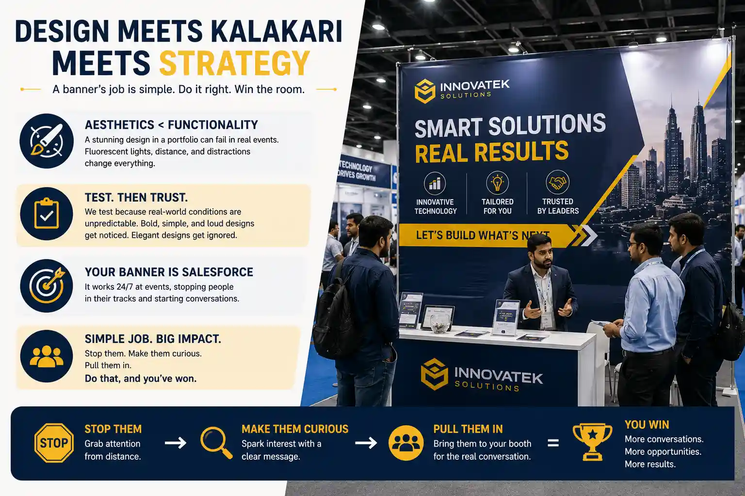
Design Meets Kalakari Meets Strategy
Banner design is this weird space where aesthetics matter less than functionality. Your designer might create something stunning in a portfolio. In a real event, with real humans and fluorescent lights and background noise? That beautiful design might fail completely.
This is why we push for testing. This is why we sometimes recommend designs that seem too bold, too simple, too loud. Because in actual conditions, those “too bold” designs work. The “elegant” designs get overlooked.
Your banner is salesforce. It’s there to stop people and pull them to your booth. Your sales team and product take over once they arrive. The banner’s job is simple: stop them, make them curious, pull them in. Do that, and you’ve won.
How We Do This at PromotEdge
Banner design is part of larger event strategy for us. Your banner doesn’t exist alone. It’s one element of your booth experience, your overall event presence, your brand communication for that occasion.
We think about: what are you trying to achieve? Lead generation? Brand awareness? Product launch? The banner design changes based on that answer. We also think about booth layout, overall visual presence, how the banner complements other design elements. And we test everything before print.
Some clients need five to six banners for the same event — different angles, rotated throughout. Others need one hero banner visible from across a large venue. We’ve worked on both, and we know what actually drives results versus what just looks good in mockups.
If you’re planning an event and need banner design that converts foot traffic into leads — trade shows, conferences, corporate events, exhibitions — that’s something we do regularly. Check out our creative design services, or if you want to talk about your specific event, reach out. We’ll give you an honest assessment of what will actually work for your situation.
| Approach | Best for | Watch out for |
|---|---|---|
| DIY | Small teams, tight budgets | Slow ramp-up, trial-and-error |
| Freelancer | Specific project bursts | Inconsistency, limited ownership |
| Agency | Ongoing work, senior input | Higher retainer, less control |
Quick check list before you start:
- Define the one thing you want: leads, sales, awareness — pick one.
- Baseline your numbers: write down where you are today.
- Pick a 90-day window: nothing moves in 2 weeks.
- Agree on success metrics: with whoever is paying the bill.
- Set up proper tracking: GA4, UTMs, call tracking.
- Review monthly: kill what doesn’t work, double down on what does.
The Bottom Line
If you take one thing from this: banner design for events creating visual impact that actually rewards patience and specificity, not volume or clever tricks. Start small, measure honestly, fix what breaks, and compound what works. The brands doing this well in India aren’t smarter — they’re just consistent. Need a hand with this for your business? Talk to us.
Need a Banner That Actually Works?
Event season is always coming. Let’s design a banner that stops people and pulls them to your booth. We handle everything from concept to print.
FAQs
-
What size should an event banner be?
Ans.Depends on your booth size and viewing distance. Exhibition booth? Usually 3m x 2m or 8ft x 4ft. Registration area? Maybe 2m x 1.5m. Smaller banners need bolder typography and fewer elements. We had a fashion client who insisted on fitting 15 product images into a 1.5m x 1m banner. Looked cluttered. You need breathing room — white space is your friend. -
What colours work best?
Ans.High contrast combinations that work in daylight. If your event is outdoors in afternoon sun, pastels are useless — the eye doesn't register them from distance. We did a Mumbai real estate event with soft beige and grey. Beautiful in mockup. Impossible to read at the actual venue. Switch to bold primary colours, strong contrasts, dark text on light or vice versa. Your brand colours should be there, but make sure they stand out in real-world conditions. -
Can I use complex images?
Ans.No. People are walking past your booth with 2-3 seconds to spare. Complex photography, intricate patterns, small details — all wasted. Use one strong image if anything. We had a manufacturing client with a beautiful photograph showing intricate machinery details. Total visibility impact at the event? Zero. We redesigned with a simplified illustration showing customer benefit. Conversion went up 40%. Simplicity works.
Author Details

Latest Posts
-
 18 / Aug
Brand Identity Design Kapferer Brand Identity Prism: Build a Consistent Brand Identity That Resonates
18 / Aug
Brand Identity Design Kapferer Brand Identity Prism: Build a Consistent Brand Identity That Resonates -
 14 / Aug
-
 13 / Aug
-
 12 / Aug
-
 11 / Aug

Related Knowledge