-
Author: Anindita Barik
-
Updated Date: Aug-24-2026
-
Views: 2 Min Read
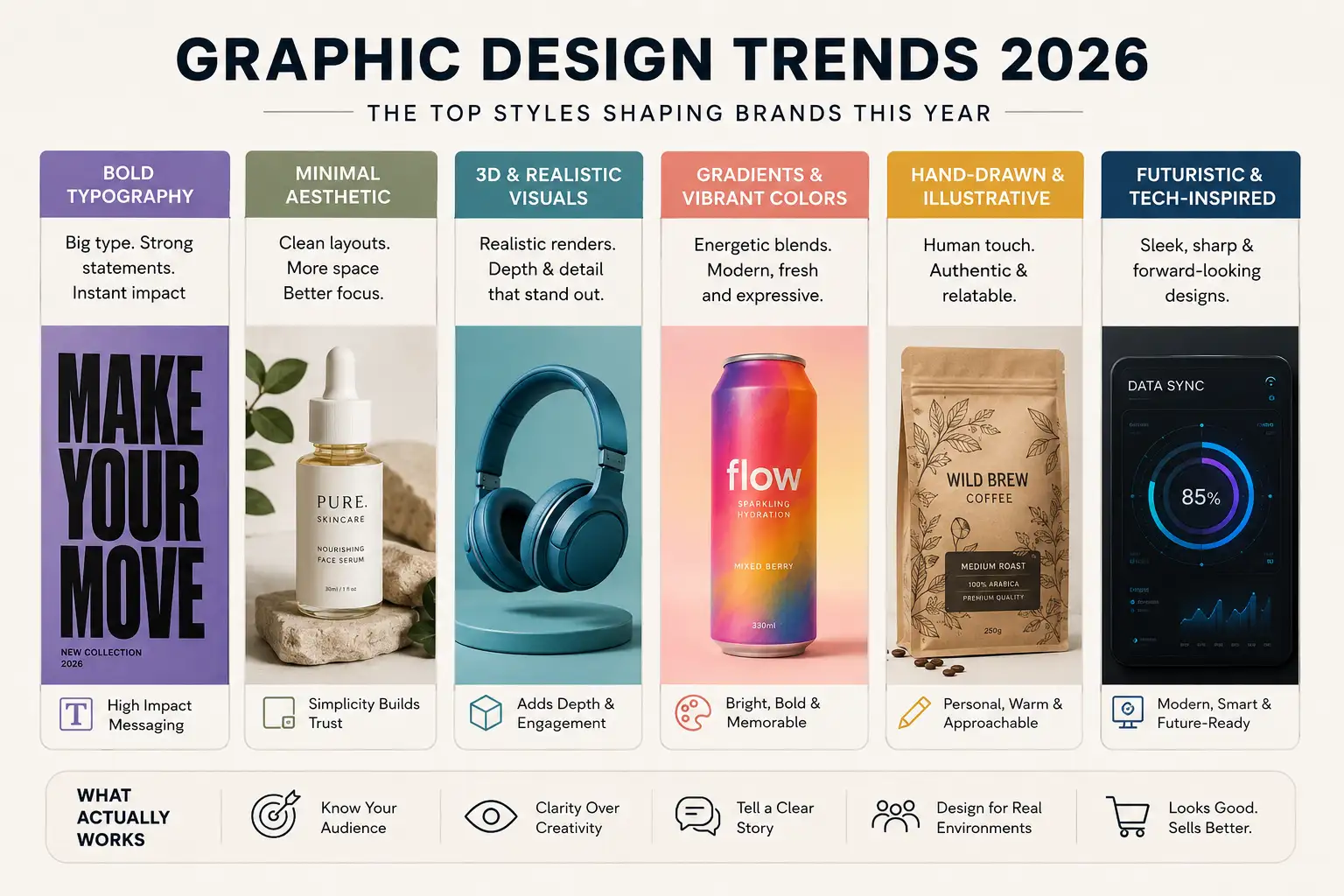
Graphic design trends 2026 are moving toward bold typography, deep colour palettes, strategic imperfection, culturally relevant visuals, readable data visualisation, and distinctive brand characters. However, the most effective designs combine these trends with timeless fundamentals such as clear hierarchy, strong contrast, consistent spacing, and easy readability. Instead of completely redesigning a brand, businesses can introduce trends gradually, test them with real audiences, and focus on visual choices that improve recognition, communication, and conversions.
Graphic design trends in 2026 are moving toward bold, expressive, and human-centred visuals rather than overly polished, generic designs. Key trends include oversized typography, vibrant colours, tactile textures, imperfect handmade elements, nostalgic styles, cinematic visuals, and more purposeful use of AI.
What actually works is not simply following every trend, but choosing styles that strengthen your brand and improve communication. AI-assisted design, distinctive typography, authentic textures, and strategic use of colour can make visuals more memorable while keeping them clear and usable.
The Brand That Ignored Every 2026 Design Trend (And Won)
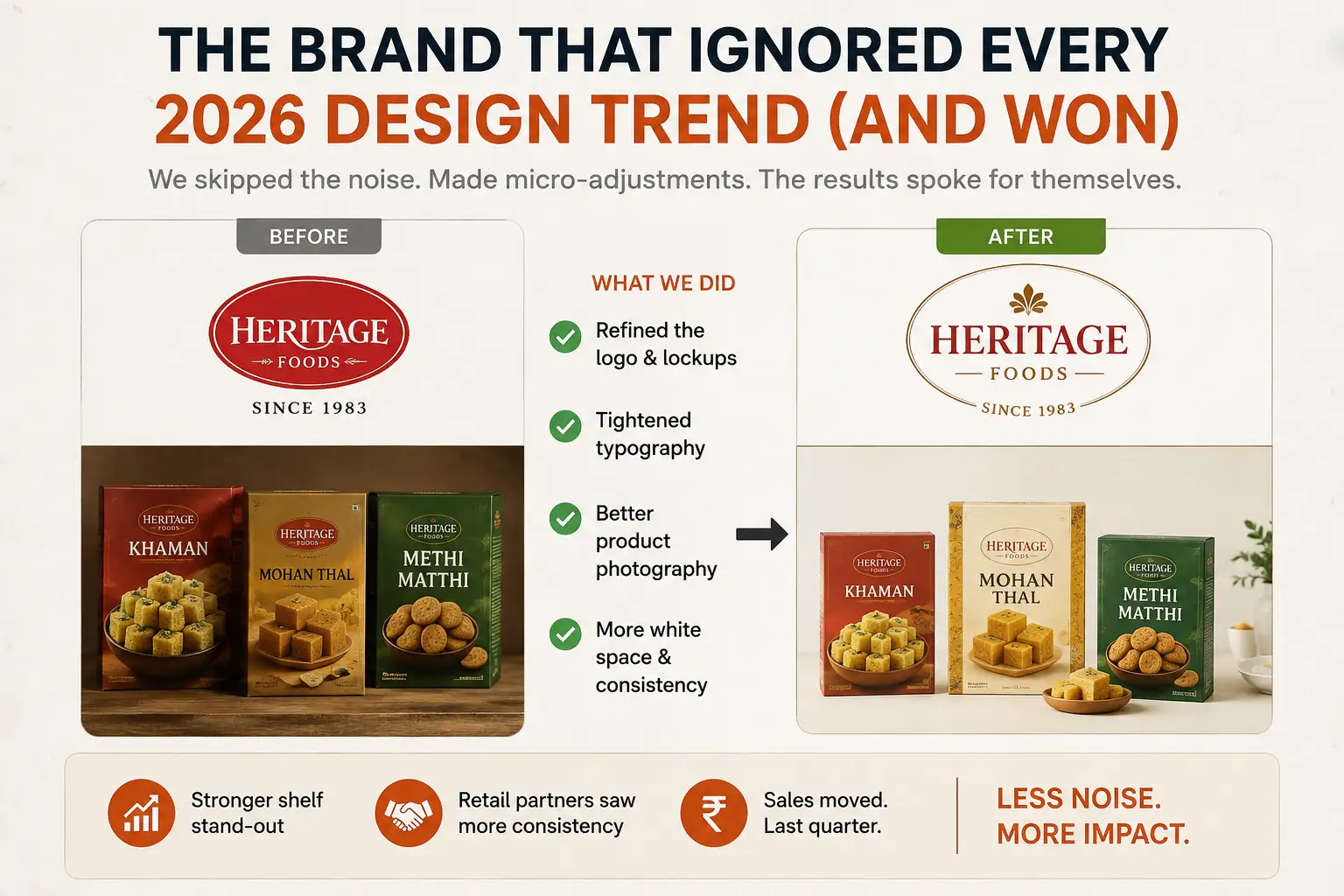
Three months ago, a heritage packaged goods company from Ahmedabad — been around since the ’80s, same logo for 20 years — wanted to “refresh their visual identity.” They showed us 15 trending design references. AI-generated gradients. 3D renders. Hyper-specific colour palettes. All very 2026.
We told them no.
Instead, we made micro-adjustments. Tightened typography. Improved the logo lockups. Better photography. More consistent use of white space. We kept 80% of what worked and refined 20%. Their retail partners didn’t even notice anything changed… but shelf stand-out improved. Sales moved. That was last quarter.
That taught me something: graphic design trends in 2026 are like seasoning. A pinch improves the dish. Too much ruins it.
Why Most Design Trends Fail in India (And What Actually Works)
Graphic design trends usually come from Western design blogs and TikTok. Lots of air, lots of white space, lots of “coolness.” They work for luxury brands in metros. For everyone else, they often feel… too hollow. Too risky. Too “looks nice, nobody buys anything.”
We follow trends closely. But we also spend time on retail shelves, trade shows, and distributor offices. And the actual trends winning with Indian audiences are different from what design blogs celebrate.
Strong contrast. Readable typography even at small sizes. Colours that pop. Clear product storytelling. These aren’t “trendy.” They’re just… practical. And they’re the stuff actually moving sales right now. The brands getting noticed aren’t always the ones with the prettiest Dribbble portfolios. They’re the ones with the clearest messages and strongest visual hierarchy. This visual clarity is what separates packaging design that wins on a retail shelf from packaging that looks great in a mockup but disappears among 50 competing products.
The Six Things Actually Winning in 2026
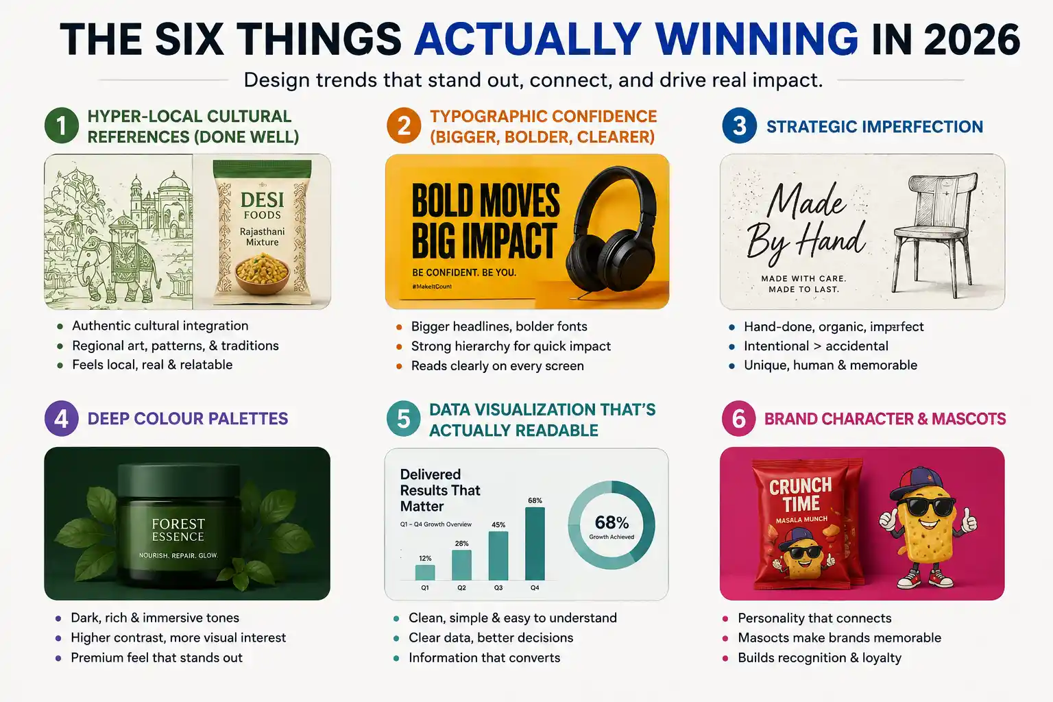
In 2026, the design trends that stand out aren’t just about looking modern—they’re about feeling relevant, recognizable, and easy to understand. From culturally rooted visuals to bolder typography and intentional imperfections, these six design approaches are helping brands create work that gets noticed and remembered.
1. Hyper-Local Cultural References (Done Well)
Not the fake, surface-level “we added some Diwali colours” kind. Real, thoughtful cultural integration. A food brand we worked with used regional hand-drawn illustrations instead of vector art. Suddenly it felt specific, honest.
Rajasthan Crafts, Delhi Street Art patterns, Kerala boat designs — these are winning because they feel authentic. Customers see a brand and think “this understands my world.” That’s stronger than any global design trend. But you have to get it right. Bad cultural references feel… aching. Cheap even. So if you’re going this route, spend time understanding the culture, not just Googling “traditional Indian patterns.” This authenticity is also what makes influencer marketing work in regional markets — a creator who genuinely understands local culture communicates it in a way that no amount of polished design can manufacture.
2. Typographic Confidence (Bigger, Bolder, Clearer)
Minimalism is technically still “a thing,” but the sweet spot in 2026 is what I’d call “confident typography.” Bigger headlines. Bolder weights. More obvious hierarchy. It’s the opposite of the wispy, 12-point minimalism of 2022. Why? Mobile screens. Social media thumbnails. Shelf scanning takes 2 seconds. If your headline is elegant but invisible at that speed, you’ve failed.
A luxury brand we recently refreshed actually went bigger with their headline font. “That’s not minimal,” their CEO said. “No,” we said. “But it reads clearly on Instagram. And it sells better on retail shelves.” Numbers don’t lie. Sometimes confidence beats subtlety.
3. Strategic Imperfection
There’s a trend toward designs that look… hand-done. Slightly irregular grids. Hand-written typography. Organic shapes instead of perfect circles. But here’s the catch: it has to be intentional. Badly executed imperfection just looks amateur. The brands winning with this are spending more time (and money) designing something that looks rough than they would on polished design.
A fashion brand did this by hand-sketching product illustrations. Took 10 times longer than sourcing stock images. Looked incredible. Felt unique. Actually moved inventory. That’s the commitment needed for this trend to work.
4. Deep Colour Palettes
The “everything on white background” trend from 2018-2023 is cooling. Dark backgrounds — deep navy, charcoal, even black — are winning for packaging, ads, social content. Higher contrast. More visual interest. Easier on the eyes for extended viewing. A cosmetics brand shifted their packaging from white to deep forest green. Competitor feedback was immediate: “That looks more premium.” Did the product change? No. The packaging communication changed everything. But you need good typography contrast on dark backgrounds. Use light text. Make it readable.
5. Data Visualization That’s Actually Readable
Charts, infographics, data stories — if your brand shares any stats, this matters. The trend is moving away from confusing gradient-filled 3D charts toward clean, readable, sometimes playful data viz. A fintech company showed us their previous infographics. Gorgeous. Nobody understood them. We simplified. Suddenly they converted. Simple > fancy when people need to understand something quickly.
6. Brand Character and Mascots
Generic icons are out. Character-driven branding is in. A personality. A mascot. Something that has a point of view. Not every brand needs this, but for D2C and consumer-facing brands, it’s winning. A snack brand developed a quirky character that showed up in their ads, packaging, and social. Took longer to design. Customers actually remembered it. It became the brand’s visual shorthand. That stickiness is worth the effort.
What Didn’t Age Well From 2024
- Gradient Overlays on Everything : 2024 loved gradients on photographs. By 2025, it started looking dated. If you’re using them, use them sparingly and intentionally now.
- Y2K Nostalgia (The Heavy Version) : Y2K design had a moment. Bright neons, exaggerated shapes, old computer aesthetics. Still applicable for gaming and entertainment brands. For everyone else? It’s fading. Use sparingly.
- Ultra-Minimalism on Packaging : Bare product shots on white backgrounds looked clean in 2022. By 2026, it looks… hollow. Especially on retail shelves where you’re competing with 50 other brands using the same approach.
- Overly “Inclusive” Illustration Styles : There’s a specific illustration style — diverse characters, soft colours, inclusive messaging — that became a cliché. Still represents values, but feels formulaic now. Originality wins.
The Design Trends That Are Actually Just … Good Design
Clear hierarchy. Good typography. Proper colour contrast. Consistent spacing. These aren’t “trends.” They’re foundational principles that never go out of style. And here’s the truth: 80% of brands ignore them.
Fix those basics and you’ll outperform 90% of your competition, regardless of trends. We did a brand refresh for a B2B industrial company. No trendy design. No “Instagram-first” thinking. Just clean typography, better colour organisation, improved logo proportions. The result? Their sales team actually used the materials. Distributors took it more seriously. Because it looked professional, not because it was fashionable. Seedha baat, no bakwaas.
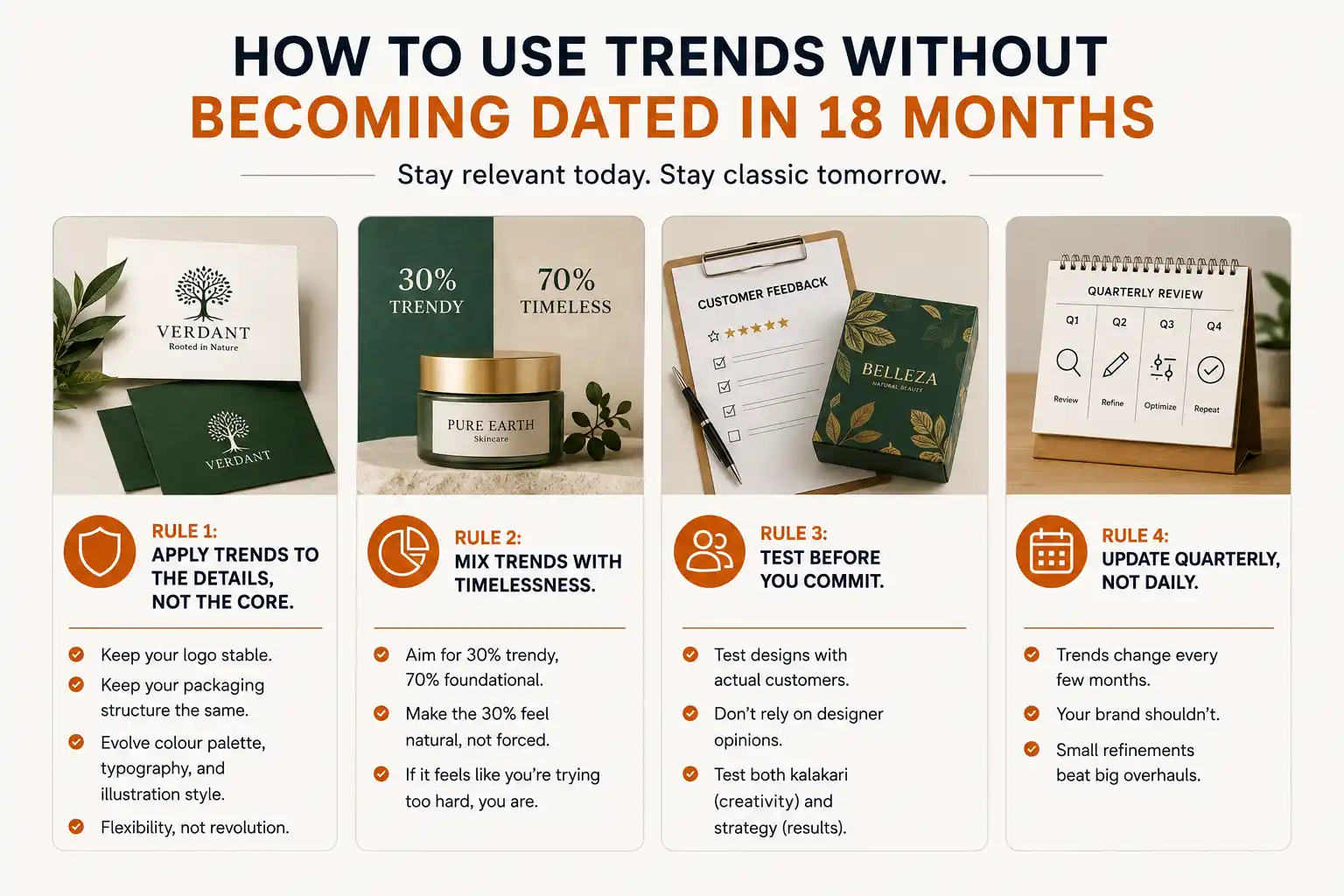
How to Use Trends Without Becoming Dated in 18 Months
Rule 1: Apply trends to the details, not the core. Your logo? Keep it stable. Your packaging structure? Same. The colour palette, typography, illustration style? That’s where trend-friendly evolution happens. You want flexibility, not revolution.
Rule 2: Mix trends with timelessness. 30% trendy, 70% foundational. That 30% should feel natural, not forced. If it feels like you’re trying too hard, you are.
Rule 3: Test before you commit. If you’re redesigning packaging or your brand identity, test designs with actual customers. Don’t rely on designer opinions. We’ve seen beautiful designs that tested poorly and ordinary designs that moved product. Kalakari + strategy means testing both.
Rule 4: Update quarterly, not daily. Trends change every few months. Your brand shouldn’t. Small refinements beat big overhauls.
How To Actually Implement These Trends Without Breaking Budget
Most brands think implementing trends costs a fortune. It does if you redesign everything at once. But smart brands evolve gradually.
Start with one high-impact element. Maybe your colour palette. Or your typography. Make that change and live with it for two months. See what sticks, what confuses customers, what actually moves product.
A real estate brand spent six months evolving their packaging colours from light to dark. They tested in key markets. The change that looked risky in presentations actually resonated with their target demographic. By the time they rolled out nationwide, they had data, not guesses.
That gradual approach takes patience. But it prevents the nightmare redesign where you spend Rs 20 lakhs and the market rejects it.
The Real Secret
The best design in 2026 isn’t “on-trend.” It’s honest. It looks like it was designed by people who understand the product, the customer, and the context. Builds kalakari + strategy — artistry meets planning. Not the other way around.
Some of the best work we’ve done has been subtle, almost invisible adjustments to existing designs. Better kerning. A refined colour palette. Cleaner spacing. Not trendy. Not award-winning on design blogs. But it sells. And honestly, that’s the only trend that matters — the trend toward work that actually functions.
So here’s my actual advice: Don’t chase design trends. Chase design fundamentals. Add a pinch of trend-awareness so your brand doesn’t feel 10 years behind. But spend 80% of your effort on the work that doesn’t change: clarity, readability, professionalism. That’s what wins in 2026. That’s what will still win in 2028 and beyond.
| Approach | Best for | Watch out for |
|---|---|---|
| DIY | Small teams, tight budgets | Slow ramp-up, trial-and-error |
| Freelancer | Specific project bursts | Inconsistency, limited ownership |
| Agency | Ongoing work, senior input | Higher retainer, less control |
Quick checklist before you start:
- Define the one thing you want: leads, sales, awareness — pick one.
- Baseline your numbers: write down where you are today.
- Pick a 90-day window: nothing moves in 2 weeks.
- Agree on success metrics: with whoever is paying the bill.
- Set up proper tracking: GA4, UTMs, call tracking.
- Review monthly: kill what doesn’t work, double down on what does.
The Bottom Line
If you take one thing from this: graphic design trends 2026 whats actually working right now rewards patience and specificity, not volume or clever tricks. Start small, measure honestly, fix what breaks, and compound what works. The brands doing this well in India aren’t smarter — they’re just consistent. Need a hand with this for your business? Talk to us.
Need a Design That Works (Not Just Looks Good)?
PromotEdge has refreshed 300+ brands across every category. We know the difference between trendy and effective. Let’s talk about yours.
FAQs
-
What design trend should I use for my brand?
Ans.The one that works for YOUR audience, not TikTok's. A luxury brand uses different trends than a D2C startup. An FMCG brand operates on different visual rules than a tech company. Before chasing trends — ask: what resonates with my specific customer? -
Are minimalist designs still relevant?
Ans.Yes and no. Minimalism is still credible for luxury and B2B. But for D2C and retail competing on crowded shelves, a little more visual interest works better. The pendulum swung from 2015-2022 'everything minimal' to 2024-2026 'some personality, please'. -
How often should I update my design?
Ans.If your design is 4+ years old and losing market share, time to refresh. But don't redesign just because something's trending. We updated a heritage FMCG brand once in 2023. Competitors keep changing theirs quarterly. Guess who looks more stable? Build something solid, update strategically every 3-5 years.
Author Details

Latest Posts
-
 25 / Aug
Video Production Corporate Video Production: A Practical Guide for Indian Brands
25 / Aug
Video Production Corporate Video Production: A Practical Guide for Indian Brands -
24 / Aug
-
 21 / Aug
Catalogue Design Catalogue Design: How to Create Catalogues That Actually Sell
21 / Aug
Catalogue Design Catalogue Design: How to Create Catalogues That Actually Sell -
 20 / Aug
-
 19 / Aug
Brand Identity Design How to Build a Brand from Scratch: The Real Playbook
19 / Aug
Brand Identity Design How to Build a Brand from Scratch: The Real Playbook
Related Knowledge