-
Author: Anindita Barik
-
Updated Date: May-19-2026
-
Views: 2 Min Read
UI/UX design in 2026 directly impacts revenue. Poor design causes high bounce rates, low conversions, and lost sales — silently costing businesses lakhs every month. Good UX removes friction, builds trust, and guides users toward action. Mobile-first design, fast load times (under 3 seconds), and streamlined checkout are non-negotiable. Every ₹1 invested in UX returns up to ₹100. Bad design doesn’t just look poor — it bleeds money. Good design prints it.
UI/UX Design in 2026 is a direct revenue driver. Poor design kills conversions, spikes bounce rates, and drives customers to competitors — costing businesses millions silently. Good design, however, removes friction, builds trust, and guides users effortlessly toward action. Every $1 invested in UX yields up to $100 in return. With users making split-second judgments, intuitive and visually compelling interfaces aren’t optional — they’re your highest-ROI business asset. In 2026, bad design doesn’t just look poor; it bleeds money. Good design doesn’t just look great — it prints it.
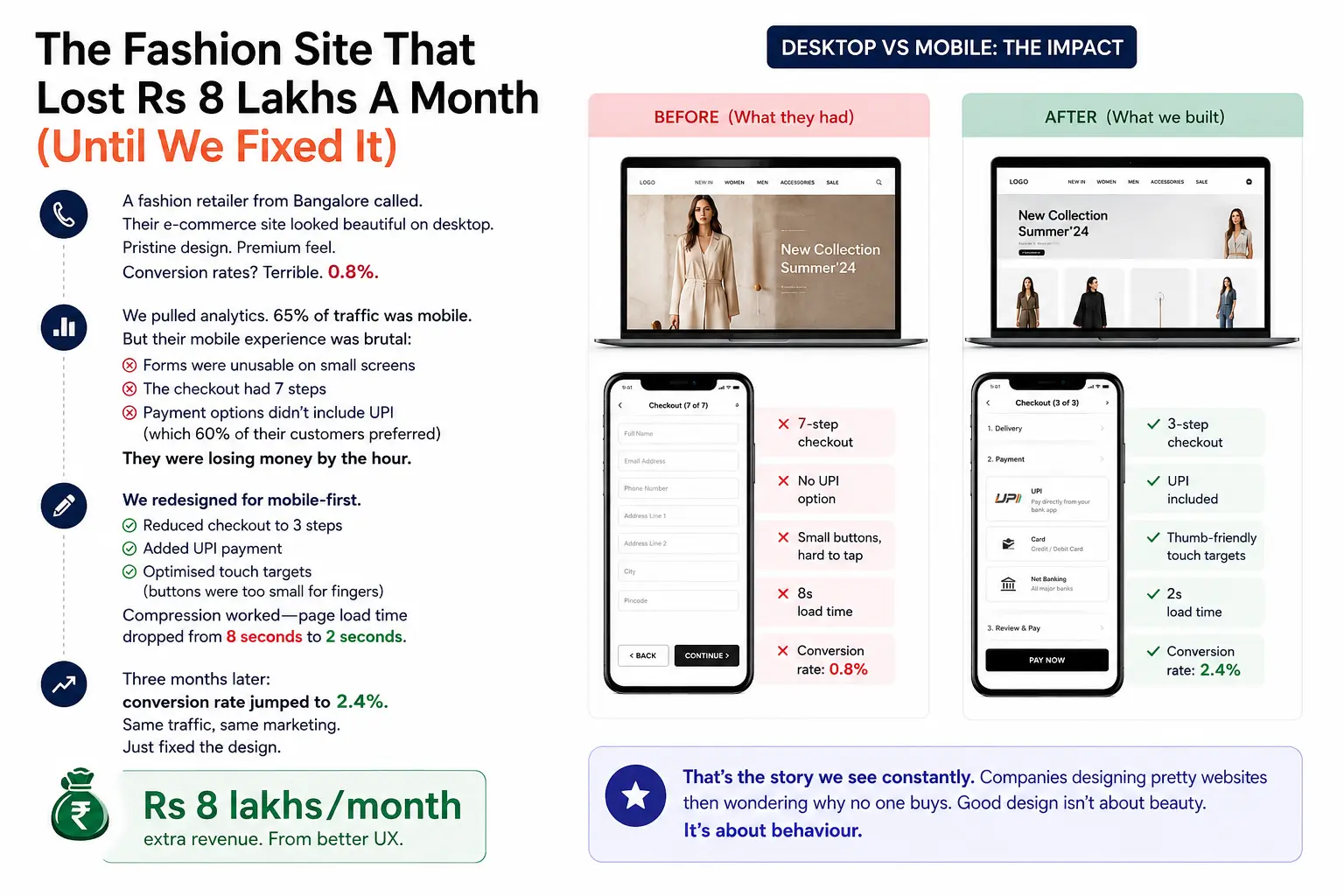
The Fashion Site That Lost Rs 8 Lakhs A Month (Until We Fixed It)
A fashion retailer from Bangalore called. Their e-commerce site looked beautiful on desktop. Pristine design. Premium feel. Conversion rates? Terrible. 0.8%.
We pulled analytics. 65% of traffic was mobile. But their mobile experience was brutal: forms were unusable on small screens, the checkout had 7 steps, payment options didn’t include UPI (which 60% of their customers preferred). They were losing money by the hour.
We redesigned for mobile-first. Reduced checkout to 3 steps. Added UPI payment. Optimised touch targets (buttons were too small for fingers). Compression worked—page load time dropped from 8 seconds to 2 seconds.
Three months later: conversion rate jumped to 2.4%. Same traffic, same marketing. Just fixed the design. Rs 8 lakhs/month extra revenue. From better UX.
That’s the story we see constantly. Companies designing pretty websites then wondering why no one buys. Good design isn’t about beauty. It’s about behaviour.
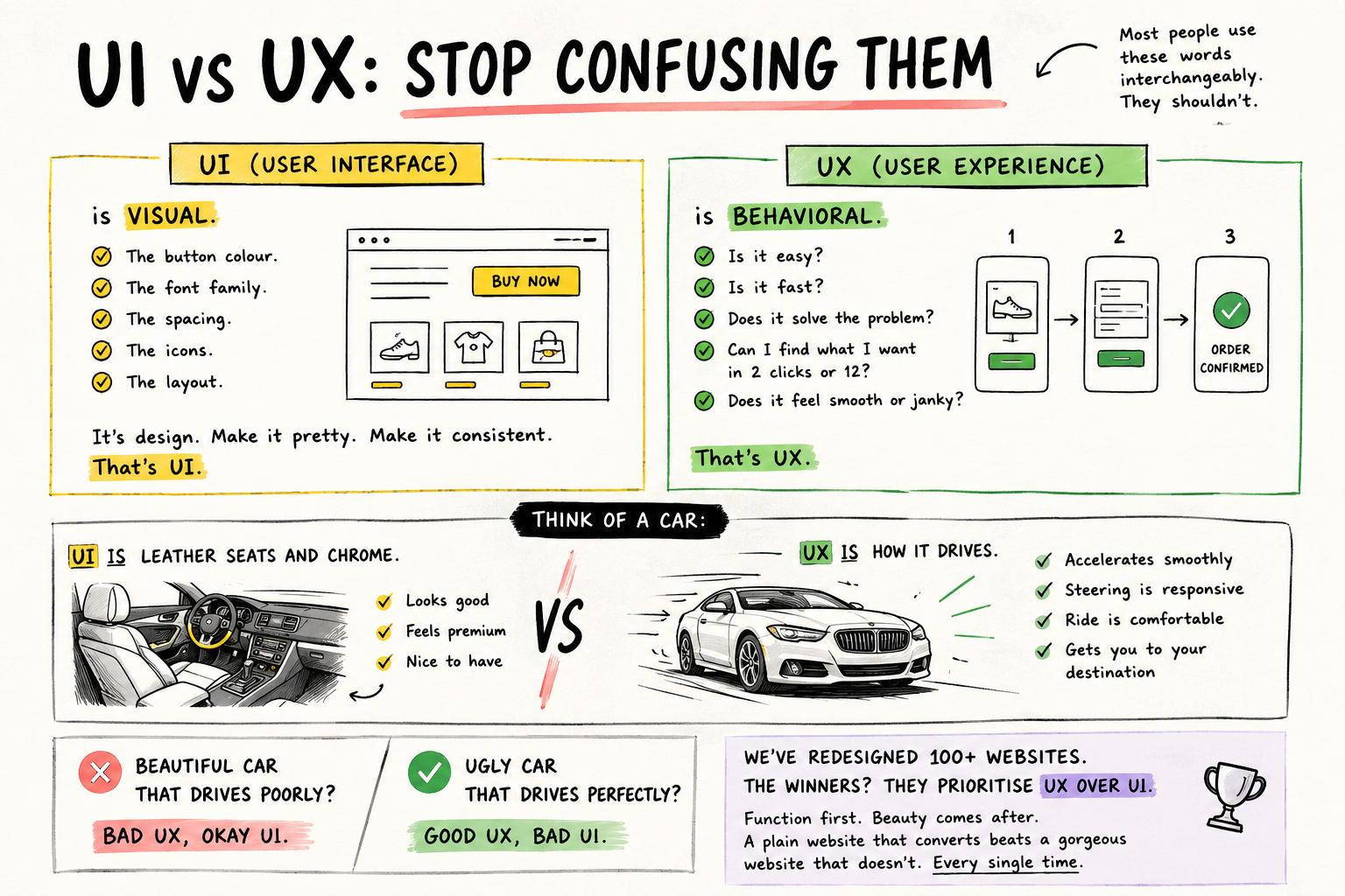
UI vs UX: Stop Confusing Them
Most people use these words interchangeably. They shouldn’t.
UI (User Interface) is visual. The button colour. The font family. The spacing. The icons. The layout. It’s design. Make it pretty. Make it consistent. That’s UI.
UX (User Experience) is behavioral. Is it easy? Is it fast? Does it solve the problem? Can I find what I want in 2 clicks or 12? Does it feel smooth or janky? That’s UX.
Think of a car: UI is leather seats and chrome. UX is how it accelerates, how responsive the steering is, how comfortable the ride feels. A beautiful car that drives poorly? Bad UX, okay UI. An ugly car that drives perfectly? Good UX, bad UI.
We’ve redesigned 100+ websites. The winners? They prioritise UX over UI. Function first. Beauty comes after. A plain website that converts beats a gorgeous website that doesn’t. Every single time.We’ve redesigned 100+ websites. The winners? They prioritise UX over UI. Function first. Beauty comes after. A plain website that converts beats a gorgeous website that doesn’t — every single time. That’s why businesses invest in professional website design and development services that focus on performance, usability, and conversions, not just aesthetics.
Why Design Directly Impacts Revenue
Conversion Rates Jump
With Better DesignThis is measurable. A checkout page with 7 steps converts worse than 3 steps. A form that asks for 10 fields converts worse than 4 fields. A page that takes 8 seconds to load converts worse than 2 seconds. These aren’t opinions. They’re patterns.
We’ve seen 30-50% conversion improvements from UX-focused redesigns. For a company doing Rs 10 lakhs/month in revenue, that’s Rs 3-5 lakhs extra. Directly from design changes.
Bounce Rates Plummet
A confusing homepage makes users leave immediately. A slow website makes them bounce. A page that doesn’t load on mobile makes them go to a competitor. High bounce rates (above 50-60%) signal design problems.
Mobile Is Non-Negotiable
85%+ of Indian users browse on phones. Your site is beautiful on desktop but unusable on mobile? You’re ignoring your majority audience. Mobile-first design isn’t fancy. It’s mandatory. Ansich baat.
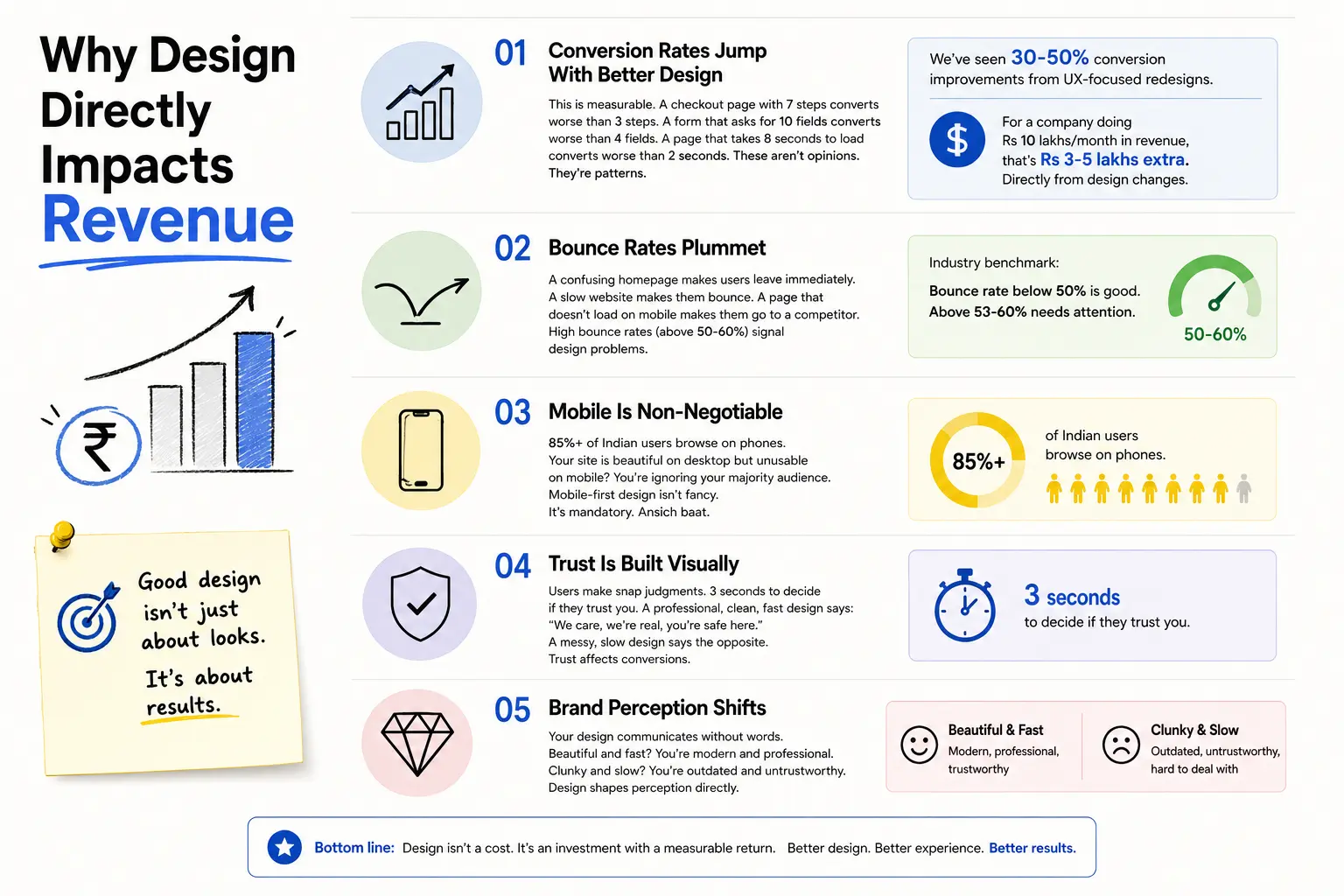
Trust Is Built Visually
Users make snap judgments. 3 seconds to decide if they trust you. A professional, clean, fast design says: “We care, we’re real, you’re safe here.” A messy, slow design says the opposite. Trust affects conversions.Understanding visual hierarchy in web design is what separates designs that build trust from those that destroy it.
Brand Perception Shifts
Your design communicates without words. Beautiful and fast? You’re modern and professional. Clunky and slow? You’re outdated and untrustworthy. Design shapes perception directly.
How We Actually Design
Step 1: Research
Most teams skip this. Don’t. We talk to actual users. What are their pain points? How do they currently use your site? Where do they drop off? What are their goals?
Analytics reveal patterns. Interviews reveal motivations. Combine both. You understand the problem before designing solutions.
Step 2: Wireframe
Sketches and boxes. No colours. No fonts. Just layout and flow. “User lands here. Sees three options. Clicks here. Form appears.” Test the logic before spending time on beautiful mockups. Many designs are pretty but broken. Wireframes catch that early.
Step 3: Prototype
Static designs hide problems. Interactive prototypes reveal them. Users click buttons. See transitions. Experience the flow. That’s when you find “wait, this button is hard to see” or “I didn’t know I could scroll down.”
Step 4: User Testing
This is gold. Get 5-10 real users. Watch them use your prototype. Don’t help them. Don’t explain. Just observe. Where do they get stuck? What’s confusing? What do they miss?
You’ll be shocked. Features you thought were obvious confuse everyone. Buttons you liked are missed. This real feedback beats 100 meetings.
Step 5: Iterate
Fix problems. Simplify confusion. Re-test. This cycle—test, learn, improve—is the entire game. Most teams skip iteration. That’s why they fail.
Step 6: Design
Only after structure and flow work do we obsess over colours and typography. Form follows function. Always. Beautiful design that doesn’t work is just expensive.
Indian UX Is Unique (Not Just English Website)
Mobile-First Isn’t Optional
85% mobile traffic is the baseline. Design for small screens first. Optimise for touch (buttons need to be 48x48px minimum—fingers are bigger than cursors). Minimize typing (mobile keyboards are slow). Simplify everything.
Speed Is Critical
Many users are on 3G. A 5MB image takes forever. Your site must load in under 3 seconds or users bounce. Every second of delay loses conversions. Compress images. Minimize code. Lazy-load content. Speed is a feature.
Regional Languages Matter
If you’re targeting Indian customers, supporting Hindi, Tamil, Telugu, Marathi isn’t optional. It’s competitive. Hinglish content resonates better than formal English. “Yeh offer sirf aaj ke liye” (this offer only for today) converts better than “limited-time offer.”
Payment Options Are Critical
Credit cards alone won’t work. Indian customers want UPI, digital wallets (PhonePe, Google Pay), net banking. Missing a payment option? You lose the sale at checkout. Offer all payment methods. This is especially critical for e-commerce portals where checkout friction directly kills revenue.
Trust Must Be Explicit
Show badges. Display security seals. Highlight “100% Secure,” “Same-Day Delivery,” “Money-Back Guarantee.” Indian customers expect reassurance. Your design should build trust actively.
Network Conditions Are Real
What if connection drops? Progressive Web Apps (PWAs) work offline and sync when connection returns. Think about spotty connectivity. Design for worst-case scenarios.
Mistakes We See Constantly
Mistake 1: Beautiful Desktop, Broken Mobile
Your site looks perfect on a 27-inch monitor. On a phone? Unusable. Buttons too small. Text too cramped. Checkout impossible. You designed for desktop, added mobile as an afterthought. This is backwards.
Mistake 2: Too Many Choices
Analysis paralysis. 50 product categories. 20 navigation links. 5 CTAs on the homepage. Users don’t know what to do. Simplify ruthlessly. Reduce options. Focus on the main action.
Mistake 3: Slow Site
Large unoptimized images. Heavy JavaScript. Auto-playing videos. Your homepage takes 10 seconds to load. Users bounce. Speed optimization is not optional. It’s UX work.
Mistake 4: No Clear Primary Action
Users land on your page but don’t know what to do next. Make one button obvious. Make your ask clear. “Contact us now” is better than vague wandering.
Mistake 5: Ignoring Mobile Payments
You accept only credit cards. Your users prefer UPI. You lose sales. Support multiple payment methods or you’re leaving money on the table.
Mistake 6: Skipping User Testing
You design in a vacuum. You think it’s obvious. Real users find it confusing. Test with actual people. Skip testing, skip insights that matter.
Case Study: A Manufacturing B2B Site
A Pune-based machinery manufacturer had a website. It had all the information. Lists of products. Technical specs. Contact form. Bounce rate was 58%. Lead form completion was 12%.
We redesigned focusing on UX:
- Removed jargon. Used clear language instead of technical specs nobody cares about.
- Reduced form from 15 fields to 5. Completion jumped to 45%.
- Added case studies and ROI calculators. Trust-building, not just info dumps.
- Optimised for mobile. 70% of traffic was mobile engineers researching on jobsites.
- Simplified navigation. Three clear paths: “Learn,” “Buy,” “Contact.”
Three months later: bounce rate dropped to 32%, form completion was 42%, qualified leads increased 3x. Same traffic, same marketing. Just better UX.
Metrics That Matter (Sabse Pehle ROI)
Don’t obsess over vanity metrics. Focus on these:
- Bounce Rate: Percentage of people who leave without doing anything. Benchmark: 40-50% average. Above 60% = problem. Track by page.
- Conversion Rate: Percentage of visitors who complete your goal (buy, sign up, submit form). E-commerce: 1-3%. Lead gen: 2-5%. This is the final metric.
- Cost Per Acquisition: How much you’re spending per customer. If your UX improves conversions, CPA drops and ROI improves.
- Pages Per Session: How many pages does a user visit? Low (1-2) suggests they’re not finding what they want. Higher is usually better.
- Time on Page: How long do users spend? Varies by type. Blog article: 2-3 minutes is good. Homepage: 10-20 seconds is fine.
- Form Completion Rate: What percentage of people who start a form finish it? If it drops 50%, your form has UX issues.
- Revenue Per Visitor: Total revenue divided by visitors. Good UX should increase this. Same traffic, more revenue = UX win.
E-Commerce vs B2B vs Services
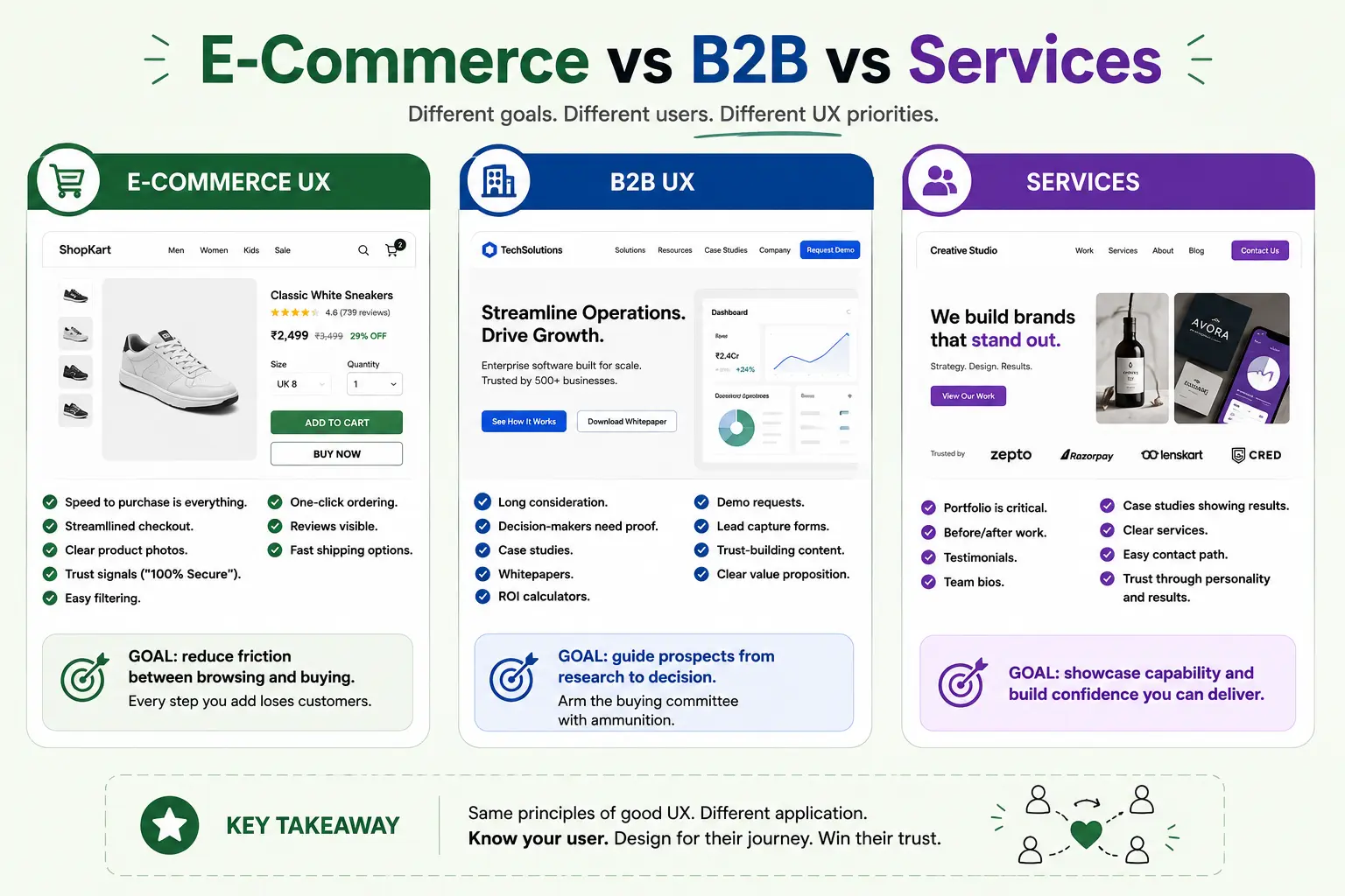
E-Commerce UX
Speed to purchase is everything. Streamlined checkout. Clear product photos. Trust signals (“100% Secure”). Easy filtering. One-click ordering. Reviews visible. Fast shipping options.
Goal: reduce friction between browsing and buying. Every step you add loses customers.
B2B UX
Long consideration. Decision-makers need proof. Case studies. Whitepapers. ROI calculators. Demo requests. Lead capture forms. Trust-building content. Clear value proposition.
Goal: guide prospects from research to decision. Arm the buying committee with ammunition.
Services
Portfolio is critical. Before/after work. Testimonials. Team bios. Case studies showing results. Clear services. Easy contact path. Trust through personality and results.
Goal: showcase capability and build confidence you can deliver.
What’s Changing in 2026
AI Personalization
Your site knows the user’s preferences. Shows relevant products. Personalizes recommendations. Not one generic experience—customised for each visitor. This is standard now.
Voice Interface
“Show me running shoes.” “Add this to cart.” Voice is growing. Design for voice, not just visual interface.
Progressive Web Apps
App-like experience on the web. Works offline. Notifications. No app download needed. Best of both worlds.
Inclusive Design
Design for all users, including people with disabilities. This isn’t compliance—good accessible design converts better. Accessible sites are faster and simpler for everyone.
Build karo, Show karo, Grow karo
Good UX isn’t accident. It’s methodical. Research. Design. Test. Iterate. Measure. Repeat. This cycle is how you win.
Start with your biggest problem. Where do you lose users? Where’s the highest bounce rate? What’s preventing conversions? Fix that first.
Design for actual users, not assumptions. Watch them use your site. Let data guide decisions. Test changes. Track impact. ROI-First thinking applies to design too.
Your website is your digital storefront. You wouldn’t open a physical store with broken lighting and confusing layout. Don’t do that online. Invest in UX. It returns money. Need expert help? Partner with a trusted UI/UX design agency in Kolkata to turn your vision into a high-converting experience.
Quick checklist before you start:
- Define the one thing you want: leads, sales, awareness — pick one.
- Baseline your numbers: write down where you are today.
- Pick a 90-day window: nothing moves in 2 weeks.
- Agree on success metrics: with whoever is paying the bill.
- Set up proper tracking: GA4, UTMs, call tracking.
- Review monthly: kill what doesn’t work, double down on what does.
The Bottom Line
If you take one thing from this: UI/UX Design 2026 bad design costs money good design prints i rewards patience and specificity, not volume or clever tricks. Start small, measure honestly, fix what breaks, and compound what works. The brands doing this well in India aren’t smarter — they’re just consistent. Need a hand with this for your business? Talk to us.
Your Site Losing Customers?
We’ve redesigned 100+ websites. Let’s audit yours and identify quick wins. Could be Rs 2-5 lakhs in extra revenue hiding in your design.
FAQs
-
UI and UX are the same thing, right?
Ans.Nope. UI is the paint job—buttons, colours, fonts. UX is the drive—does it work? Is it fast? Does it solve problems? You can have beautiful UI with terrible UX (pretty but broken). You can have plain UI with great UX (works perfectly). In our world, UX wins every single time because UX converts. -
How much can better design actually improve sales?
Ans.We've seen 30-50% conversion improvements from redesigns alone. Same traffic, same marketing spend. Just fixed the design. An e-commerce site doing Rs 10 lakhs/month gets Rs 3-5 lakhs extra from a proper UX overhaul. That's not small. -
Do I really need to design for mobile in India?
Ans.Absolutely. 85%+ of Indian users are mobile-first. Your site not working on phones? You're losing the majority of customers. This isn't optional. It's survival. Mobile-first design isn't a trend—it's the baseline.
Author Details
Latest Posts
-
 17 / Jul
Instagram Marketing Instagram Reels Marketing: How Brands Are Growing Through Short Videos
17 / Jul
Instagram Marketing Instagram Reels Marketing: How Brands Are Growing Through Short Videos -
16 / Jul
AI Marketing Tools AI Marketing Tools for Indian Businesses: Complete Guide 2026
-
15 / Jul
Meta Business Suite Meta Business Suite Guide: Manage Facebook & Instagram Marketing Efficiently
-
14 / Jul
-
13 / Jul
Twitter Marketing X (Twitter) Marketing: How Brands Can Stay Relevant in 2026