-
Author: PromotEdge
-
Updated Date: Feb-09-2026
-
Views: 2 Min Read
Summary: Visual hierarchy in web design is the arrangement of elements like text, images, and buttons to guide users’ attention and improve usability. By using size, color, spacing, and layout, designers highlight key actions and make content easy to navigate. A strong visual hierarchy enhances user experience (UI/UX) and drives engagement on any website.
Ever clicked on a website and you automatically knew where to start first? That is not magic. It is a visual hierarchy in web design. And today we are about to open up this secret sauce of awesome website design. Ready? Chalo shuru karte hain! (Let’s get started!)
What is visual hierarchy in web design?
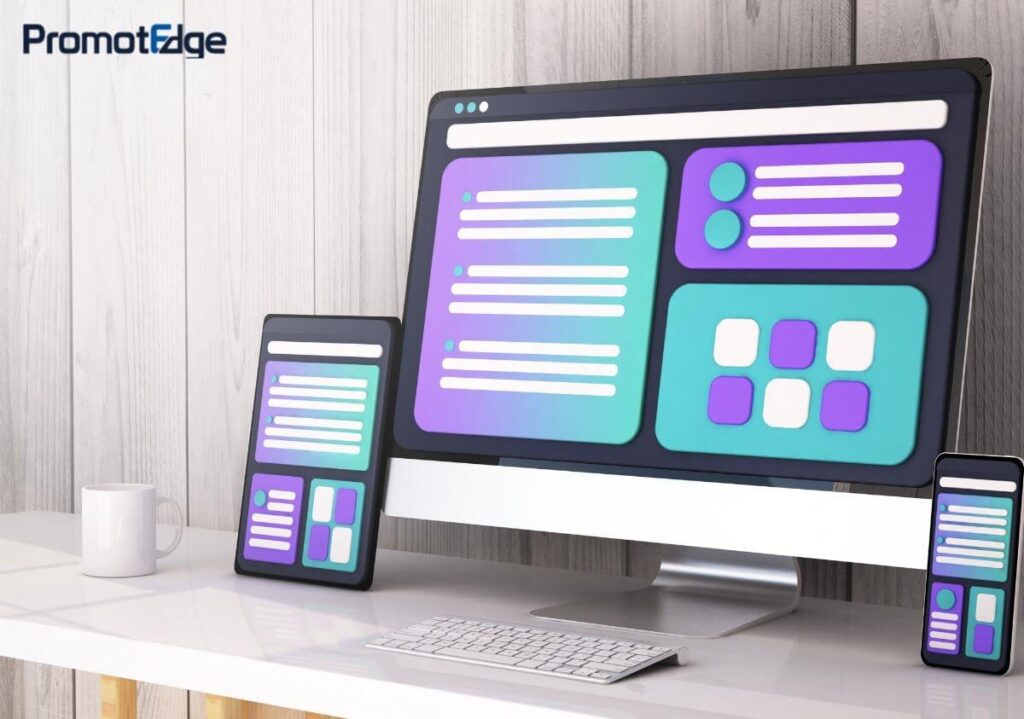
Visual hierarchy in web design is the science (and art) of organising things such as text, images, buttons, and spaces. It is done so that the eye is led through a page naturally. Unorganized ones generally give pain to the eyes. It is how we determine what grabs attention pehle (first), and what can wait.
From color and font sizes to spacing and layout, all is part of the visual system of guidance. You are either a design student or a startup founder. Whatever the case, you are smarter at the digital game for knowing it. Your reader scrolls more quickly than you realize. Pinning down the visual flow could be your best kept secret. A simple design can establish trust before your first word is consumed. And ultimately, it’s not about appearances—it is about nudging action.
Why is visual hierarchy in Web Design important in UX/UI?
Let us keep it real. Users do not read websites. They scan. You need to tell them where to look and what to do. Or else, they will just bounce. That is where visual hierarchy comes in—it is your unobtrusive guide. It informs what is important and reduces what is not. With a proper hierarchy, users linger and interact more. It is the difference between an effective site and one that simply looks nice. Visual hierarchy in web design helps to improve UX (User Experience) and UI (User Interface) by:
- Directing attention to key actions (like Buy Now or Sign Up): Visual hierarchy in web design guides users’ eyes to the most important elements first. This increases the chances they will click on CTAs and take desired actions.
- Making content easy to digest: Breaking up information with easy-to-read headings, bullet points, and images allows users to scan content fast. It makes reading overall more fun and less daunting.
- Establishing trust by looking pro: Well-organised layout with high visual hierarchy creates a much clean, professional look. Users are more likely to trust and interact with a site that appears well-planned and intentional.
- Saving time for users (and time = money): It is essential to inform the users precisely what to do and where. That is how you cut their effort down. A faster, smoother experience means happier and satisfied visitors and better conversions majority of the time.
Without a solid UX visual hierarchy, even the most beautiful site in the world is of no practical use. It only becomes very confusing and difficult to decipher and this confusion can be a big buzzkill for conversions.
How to create visual hierarchy in web design?
You do not need a design degree. Just remember these simple tactics that even a solid web design company in Kolkata swears by:
- Size matters – Make headlines BIG and important buttons STAND OUT. People notice large elements first.
- Color is the New King – Use contrasting colors to always highlight CTA (call-to-action) buttons. Like a red button on a white background.
- Spacing and grouping – Related items should be close together (like family). White space is your bestie!
- Typography – Different fonts and styles help organise content. Think of bold headings vs. regular paragraph text.
- Z-pattern or F-pattern layout – Users scan like an F or Z. Place your important info accordingly.
And if you are feeling overwhelmed, hire a custom web design agency. These pros know how to use these tricks for every screen size and audience type.
Principles of visual hierarchy in web design in UX/UI
Let us go into some fundamental web design principles that make or break UX visual hierarchy:
- Contrast: Use color, size, or style to make key elements pop. Contrast = clarity.
- Balance: Do not overload one side of the page. Imagine a thali (platter)—sab kuch evenly placed hota hai na? (Everything is evenly placed, right?)
- Scale: Larger = more important. Use wisely.
- Alignment: Clean alignment = cleaner look = less confusion.
- Proximity: Items that belong together should stick together. Do not separate the biryani from the raita!
Understanding these principles helps any web design and development company craft sites that actually work, not just look good.
Best examples of visual hierarchy in web design
Wanna see this stuff in action? Here are a few epic examples:
- Apple: Their landing pages always feature a giant product image, followed by clean text and CTA buttons. Simple, effective, iconic.
- Spotify: Bold colors and huge headlines guide you immediately. You know exactly what to do: click and vibe!
- Airbnb: Perfect use of white space, contrast, and images to guide you step-by-step.
A good web design firm studies such giants and adapts similar patterns for different clients and cultures.
What are web design principles?
These are the golden rules that guide any web development company. Consider them your North Star when designing a site:
- Make it simple: A clean, uncluttered design grabs the concentration of the users on what is most important. Simplicity further lowers cognitive load and streamlines navigation.
- Make consistent layouts: Consistent layouts promote familiarity, which generates trust and enhances user experience. It also makes your site appear more professional and simpler to use.
- Optimise for speed: A quick-loading site retains users and enhances your SEO position. Slow websites tend to result in high bounce rates and missed opportunities.
- Make it mobile-first: Most users access it with their phones. So, mobile design guarantees an optimal experience on any device. Mobile-first design also enhances accessibility and engagement.
- Focus on navigation: Clear, intuitive navigation is always better. Users do not usually get frustrated as they quickly find what they need. Good navigation, in most cases, reduces drop-offs and boosts conversions.
- Do Not forget accessibility: Accessible design guarantees everyone, including people with disabilities, can use your site. It is not just ethical. It is often legally required and improves overall usability.
The web design principles act like the 7 chakras of web design. Align them, and your site becomes zen.
Which web design agency offers custom UI/UX solutions?
If you are looking for that one custom web design agency that “gets” your vibe and your goals, go for one that:
- Has a solid UX/UI portfolio
- Understands your industry
- Offers design and development under one roof
- Knows how to optimize for conversions, not just looks
Plenty of top-notch web design firm options are out there, especially if you are seeking a web design company in India. Indian agencies offer creative, cost-effective, and custom UI/UX solutions that compete globally.
Pro tip: Ask for their best case studies and UX flow demos. Let their work speak.
Wrapping it up: Final Words from Your Design Mentor
Bhai (Friend), now you understand the trick behind every addictive, scroll-worthy website: visual hierarchy of web design. It is more than colors and typography. It is a strategy. It is an emotion. It is what transforms visitors into fans and fans into buyers.
Do not worry about making it perfect right from day one. Even the best web design and development company in the world hones layouts over time. Whether you are creating a blog, an e-commerce site, or your brand’s first ever digital footprint, utilize these UX visual hierarchy tools and web design principles to help you along.
And agar kuch zyada ho gaya toh? (And if it gets too much?) Dial up a web design company or reliable web development company in your vicinity, preferably a web design company in India, to assist you in creating that digital magic.
Now go for it to overhaul that homepage, update your CTA button, experiment with font weights. Trust us, it will be appreciated by the users and Google.
Are you prepared to take your website to the next level? PromotEdge, a leading web design company in India, offers custom UI/UX solutions backed by smart web design principles and strong UX visual hierarchy. Whether you are building from scratch or redesigning, our expert team crafts websites that not only look great but drive real results.
FAQs
-
How does visual hierarchy in web design help?
Ans.It tells people what to focus on first. This makes sites more accessible and stops individuals from getting lost or bouncing off. -
What are the main parts of the UX visual hierarchy?
Ans.Big text, big colours, robust spacing, and clean layout. These guide the eyes and tell people what to do next. -
Why choose a web design company in India for this?
Ans.Indian web design firms have brilliant, innovative, and budget-friendly websites. They know how to implement visual hierarchy to ensure that websites are great-looking and function well. -
What tools help create visual hierarchy in web design?
Ans.Designers use tools like Figma, Adobe XD, and Sketch to structure layouts, apply typography, and manage color contrast to establish clear visual hierarchy. -
Can visual hierarchy improve website conversions?
Ans.Yes. A strong visual hierarchy draws attention to calls-to-action (CTAs), simplifies navigation, and enhances user experience, which often leads to higher engagement and conversions.
Blogs
Journey into Ideas Unveiling Tomorrow's Insights Today.

-
How does visual hierarchy in web design help?
Ans.It tells people what to focus on first. This makes sites more accessible and stops individuals from getting lost or bouncing off. -
What are the main parts of the UX visual hierarchy?
Ans.Big text, big colours, robust spacing, and clean layout. These guide the eyes and tell people what to do next. -
Why choose a web design company in India for this?
Ans.Indian web design firms have brilliant, innovative, and budget-friendly websites. They know how to implement visual hierarchy to ensure that websites are great-looking and function well. -
What tools help create visual hierarchy in web design?
Ans.Designers use tools like Figma, Adobe XD, and Sketch to structure layouts, apply typography, and manage color contrast to establish clear visual hierarchy. -
Can visual hierarchy improve website conversions?
Ans.Yes. A strong visual hierarchy draws attention to calls-to-action (CTAs), simplifies navigation, and enhances user experience, which often leads to higher engagement and conversions.
