-
Author: Anindita Barik
-
Updated Date: May-19-2026
-
Views: 2 Min Read
Brand guidelines sit in a drawer because they’re built as reference documents, not usable systems. To make them work: keep them under 30 pages, create pre-branded templates, assign a design reviewer, train your team with short videos, and explain the why behind every rule. Accessibility and enforcement are everything.
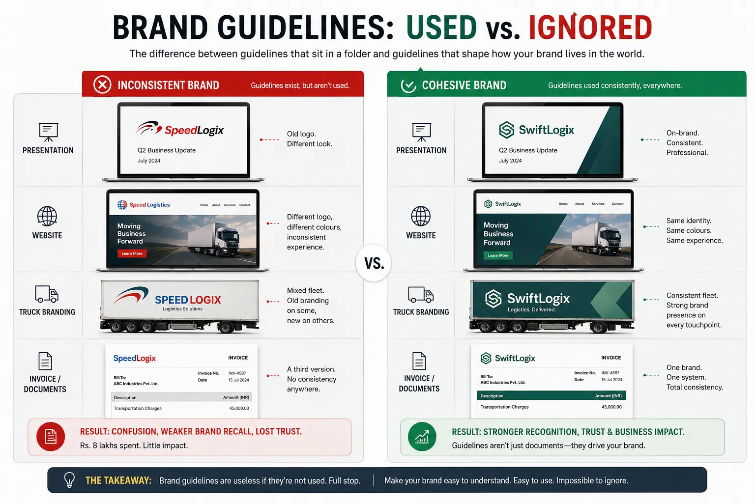
2022. A logistics company from Pune hired a big-name design agency. Rs 8 lakhs. Brand redesign, new logo, new colours, comprehensive brand guidelines. Looked fantastic on the presentation deck.
Six months later, I visited their office. PowerPoint presentations had the old logo. Their website was halfway updated. Truck branding was mixed — some new, some old. Invoices had a third version.
I asked the CEO about the guidelines. She pulled up a 200-page PDF on her laptop. “We got this. We haven’t really… used it yet.”
Rs 8 lakhs of work, essentially ignored.
That’s not the design agency’s fault. That’s a business problem. And it’s incredibly common.
Brand guidelines are useless if they’re not used. Full stop. This article is about the difference between guidelines that sit in a folder and guidelines that actually shape how your brand lives in the world.
What Brand Guidelines Actually Are (It’s Not A Rulebook)
Most people think brand guidelines are rules. Logo must be this size. Colours must be exactly this RGB. Never do this, never do that.
That’s a reference manual. It’s useful for consultants to point to. It’s not useful for your team.
Real brand guidelines are a system. They explain why the brand exists, what it stands for, who it’s for, how it should show up. Then they give tools — templates, examples, decisions made in advance — so people can make choices without overthinking.
Think of it like… a restaurant kitchen. The recipes (guidelines) aren’t there to restrict chefs. They’re there so every plate that goes out tastes consistent. A chef can still be creative. But there are certain fundamentals — salt levels, cook times, plating style — that stay constant.
Bad guidelines say: “Never deviate from the standard recipe.”
Good guidelines say: “Here’s why we cook this way. Here’s what matters most. You have freedom in the details.”
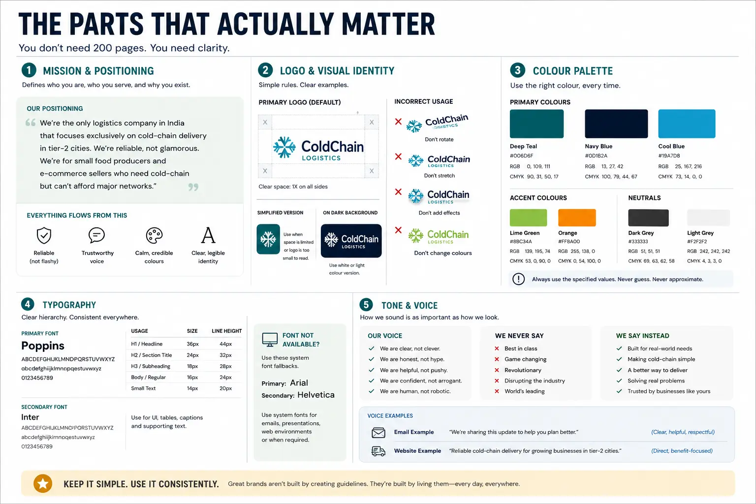
The Parts That Actually Matter
You don’t need 200 pages. You need clarity.
1. Mission and Positioning
What’s the brand for? Not a flowery mission statement. Real positioning.
Example: “We’re the only logistics company in India that focuses exclusively on cold-chain delivery in tier-2 cities. We’re reliable, not glamorous. We’re for small food producers and e-commerce sellers who need cold-chain but can’t afford major networks.”
Everything else — logo, colours, tone of voice — flows from that. If you’re “reliable,” your brand voice is trustworthy (not try-hard funny). Your colours probably aren’t neon (builds reliability). Your logo is clear and legible (not trendy).
Skip this part and you’ll end up with a beautiful brand that looks nothing like who you actually are.
2. Logo and Visual Identity
Logo. Logo don’t-do-this stuff. Clear space rules (how much empty space around the logo). Size minimums. How it looks on different backgrounds.
But here’s the trap: designers love creating 10 different ways to use the logo. Logo horizontal. Logo vertical. Logo with tagline. Logo without tagline. Logo monochrome. Logo on gradient.
That’s not helpful. That’s confusing.
Better approach: “Logo default use case is this. If you can’t fit it, use this simplified version. If it’s on a dark background, use white or light colour. Don’t rotate it. Don’t stretch it. Don’t add effects.”
Simple rules. Clear examples.
3. Colour Palette
Your primary colour. Secondary colours. Accent colours. Neutral (greys). What they’re used for.
And here’s critical: RGB, hex, and CMYK values. Not just “blue.” Actual numbers. Because one designer’s “blue” on their Mac might be totally different from another designer’s “blue” on a Windows laptop.
We had a FMCG client once with brand red #d32f2f on digital but a totally different shade of red (#c41c3b) on print. Years of inconsistency because someone copied the hex code wrong once and nobody caught it.
4. Typography
Primary font. Secondary font. What they’re used for. Sizes. Line heights.
And crucially: what to do if you’re in an environment where your perfect font isn’t available. A web designer can’t use a paid font everywhere. So what’s the fallback? (Usually a system font like Arial or Helvetica, but better to specify.)
5. Tone and Voice
How does your brand sound? Formal or casual? Funny or serious? Technical or simple?
And examples. “We never say X, we say Y instead.” Here’s a few sample sentences in your brand voice.
This is the part that’s hardest to enforce but most impactful. A brand voice makes you recognisable and memorable. But it’s also the easiest to abandon when someone’s in a rush and just writes an email.
The Part Designers Never Talk About — Enforcement
Here’s what kills brand guidelines: nobody enforces them.
You hand over a beautiful PDF. Everyone says “yep, got it.” Then three months later, someone’s used the old logo on a presentation and nobody noticed until the client called to complain.
Real enforcement isn’t about punishing people. It’s about making the right thing the easy thing.
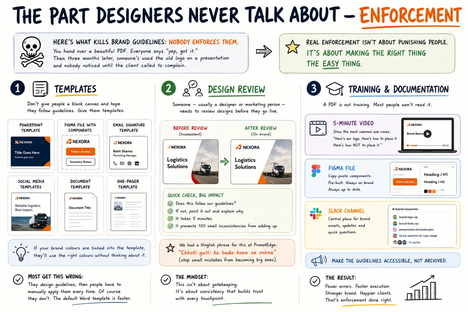
1. Templates
Don’t give people a blank canvas and hope they follow guidelines. Give them templates.
PowerPoint template with brand fonts and colours pre-loaded. Figma file with components. Email signature template. Social media templates.
If your brand colours are baked into the template, they’ll use the right colours without thinking about it.
Most of our clients get this wrong. They design guidelines, then people have to manually apply them every time. Of course they don’t. The default Word template is faster.
2. Design Review
Someone — usually a designer or marketing person — needs to review designs before they go live. Not as a final approval, but as a quick brand check.
“Does this follow our guidelines?” If not, point it out and explain why. It takes 5 minutes. It prevents 100 small inconsistencies from adding up.
We had a Hinglish phrase for this at PromotEdge: “Chhoti galti ko bada hone se rokna” (stop small mistakes from becoming big ones).
3. Training and Documentation
A PDF is not training. Most people won’t read it.
Better: a 5-minute video showing the most common use cases. “Here’s our logo. Here’s how to place it. Here’s how NOT to place it.”
Or a Figma file where you can literally copy-paste components. Or an internal Slack channel with brand assets and questions.
Make the guidelines accessible, not archived.
When Brand Guidelines Change (And How To Actually Roll It Out)
You’ve been using your brand for five years. Now you’re redesigning.
Don’t go cold turkey. You’ll look broken and inconsistent for six months while old assets phase out.
Better approach: rolling transition.
Month 1: New guidelines go live. All new materials use new brand.
Month 2-3: Update high-visibility stuff (website, business cards, major social assets).
Month 4-6: Everything else (old PDFs, presentations, internal templates).
Old logo still exists in the guidelines during this period — for reference, so people know why the change happened.
This approach feels slower. But customers don’t see a broken, confused brand. And your team doesn’t have to change everything overnight.
Common Mistakes That Kill Brand Guidelines
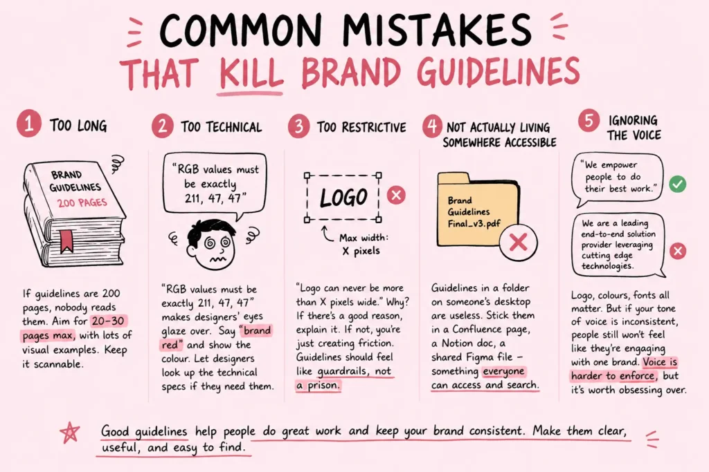
- Too long : If guidelines are 200 pages, nobody reads them. Aim for 20-30 pages max, with lots of visual examples. Keep it scannable.
- Too technical : “RGB values must be exactly 211, 47, 47” makes designers’ eyes glaze over. Say “brand red” and show the colour. Let designers look up the technical specs if they need them.
- Too restrictive :“Logo can never be more than X pixels wide.” Why? If there’s a good reason, explain it. If not, you’re just creating friction. Guidelines should feel like guardrails, not a prison.
- Not actually living somewhere accessible : Guidelines in a folder on someone’s desktop are useless. Stick them in a Confluence page, a Notion doc, a shared Figma file — something everyone can access and search.
- Ignoring the voice : Logo, colours, fonts all matter. But if your tone of voice is inconsistent, people still won’t feel like they’re engaging with one brand. Voice is harder to enforce, but it’s worth obsessing over.
The Brand Guideline Audit (How To Know If Yours Are Actually Working)
If you already have guidelines, run this audit:
Can your team find them in 10 seconds? If the first answer is “uhhh, I think someone has it,” your guidelines are lost.
Are they using them? Look at your last 10 pieces of marketing collateral. Do they all follow the guidelines? If not, the guidelines aren’t clear or aren’t accessible.
When guidelines change, does your team know? If you updated fonts last quarter and half your team is still using the old ones, you don’t have communication.
Do people understand WHY the guidelines exist? Ask a random team member why you use this logo, this font, this colour. If they can’t explain it, the guidelines are rules, not a system.
If you fail these audits, it’s not a design problem. It’s a process problem. Fix that first, before redesigning.
| Approach | Best for | Watch out for |
|---|---|---|
| DIY | Small teams, tight budgets | Slow ramp-up, trial-and-error |
| Freelancer | Specific project bursts | Inconsistency, limited ownership |
| Agency | Ongoing work, senior input | Higher retainer, less control |
Quick checklist before you start:
- Define the one thing you want: leads, sales, awareness — pick one.
- Baseline your numbers: write down where you are today.
- Pick a 90-day window: nothing moves in 2 weeks.
- Agree on success metrics: with whoever is paying the bill.
- Set up proper tracking: GA4, UTMs, call tracking.
- Review monthly: kill what doesn’t work, double down on what does.
The Bottom Line
If you take one thing from this: your brand guidelines sit in a drawer and how to actually ma rewards patience and specificity, not volume or clever tricks. Start small, measure honestly, fix what breaks, and compound what works. The brands doing this well in India aren’t smarter — they’re just consistent. Need a hand with this for your business? Talk to us.
Ready To Turn Your Guidelines Into Actual Brand Consistency?
We’ve built brand systems for 250+ Indian companies. Most have guidelines sitting unused. We specialize in making them live — templates, enforcement, team buy-in, the whole system.
FAQs
-
How long does it take to develop brand guidelines?
Ans.Depends on scope. Basic guidelines — 4-6 weeks. Comprehensive with all assets and variations — 8-12 weeks. The work isn't just writing rules. It's designing systems, creating examples, testing them with your team. We've seen clients rush this in 2 weeks, then spend the next year fixing inconsistencies. The slow way is faster. -
What if guidelines kill creativity?
Ans.Then they're badly written. Good guidelines set the frame (logo, colours, tone) but leave space for creative execution. Bad guidelines: 'Logo must be exactly 100px wide.' Good guidelines: 'Logo must be clearly visible and never distorted. Minimum size 80px for digital, 1 inch for print.' Flexibility within the rules, not rules that strangle the work. -
How do I actually get my team to follow guidelines?
Ans.Make it easy, not hard. A PDF nobody reads won't work. What works: templates (Figma, PowerPoint, Canva) pre-branded, short video tutorials, a Slack bot flagging violations, and regular audits. Also explain WHY the guidelines exist. Teams follow rules they understand.
Author Details
Latest Posts
-
 26 / Jun
-
25 / Jun
-
24 / Jun
-
23 / Jun
-
22 / Jun
Digital Marketing Best Digital Marketing Tools For Indian Businesses 2026


Related Knowledge