-
Author: Satesh Shaw
-
Updated Date: May-05-2026
-
Views: 2 Min Read
A landing page converts more leads than a homepage because it removes distractions, matches the ad’s promise, and focuses on one action. With a clear headline, fast load speed, minimal form fields, and one CTA, conversion rates can improve by 6x without increasing ad spend.
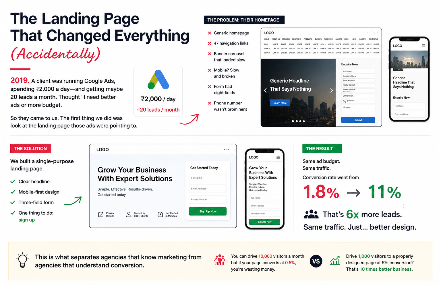
The Landing Page That Changed Everything (Accidentally)
2019. A client was running Google Ads, spending ₹2,000 a day—and getting maybe 20 leads a month. Thought “I need better ads or more budget.”
So they came to us. The first thing we did was look at the landing page those ads were pointing to.
It was a disaster. Their homepage. Generic. 47 navigation links. A banner carousel that loaded slow. Mobile? Slow and broken. The form had eight fields. Their phone number wasn’t prominent.
We built a single-purpose landing page. Clear headline. Mobile-first design. Three-field form. One thing to do: sign up.
Same ad budget. Same traffic. Conversion rate went from 1.8% to 11%.
That’s 6x more leads. Same traffic. Just… better design.
This is what separates agencies that know marketing from agencies that understand conversion. You can drive 10,000 visitors a month but if your page converts at 0.5%, you’re wasting money. Drive 1,000 visitors to a properly designed page at 5% conversion? That’s 10 times better business.
Why Your Homepage Is Probably Losing You Money
Most businesses send ad traffic to their homepage.
This is insane.
A homepage is designed for browsers. People who’ve never heard of you, want to explore, read about your company, look at your whole product line.
A landing page is designed for converters. People you’ve already paid to reach via ads. They’re there for one reason. Your job is to not confuse them.
For example: a SaaS company was running Facebook ads with the headline, “Save 20 hours a week with our software.” They sent people to their homepage.
The homepage went on about their founding story, their team, their mission, and their integrations. You had to scroll through all of that before you finally reached “Get a 14-day free trial” buried at the bottom.
Conversion rate: 0.9%.
We built a landing page that literally opened with that headline. “Save 20 hours a week. Here’s how.” One CTA. Three-minute read. Then the form.
Conversion rate: 12.8%.
Same company. Same product. Different pages. 14x improvement.
Five Things Every Landing Page Needs
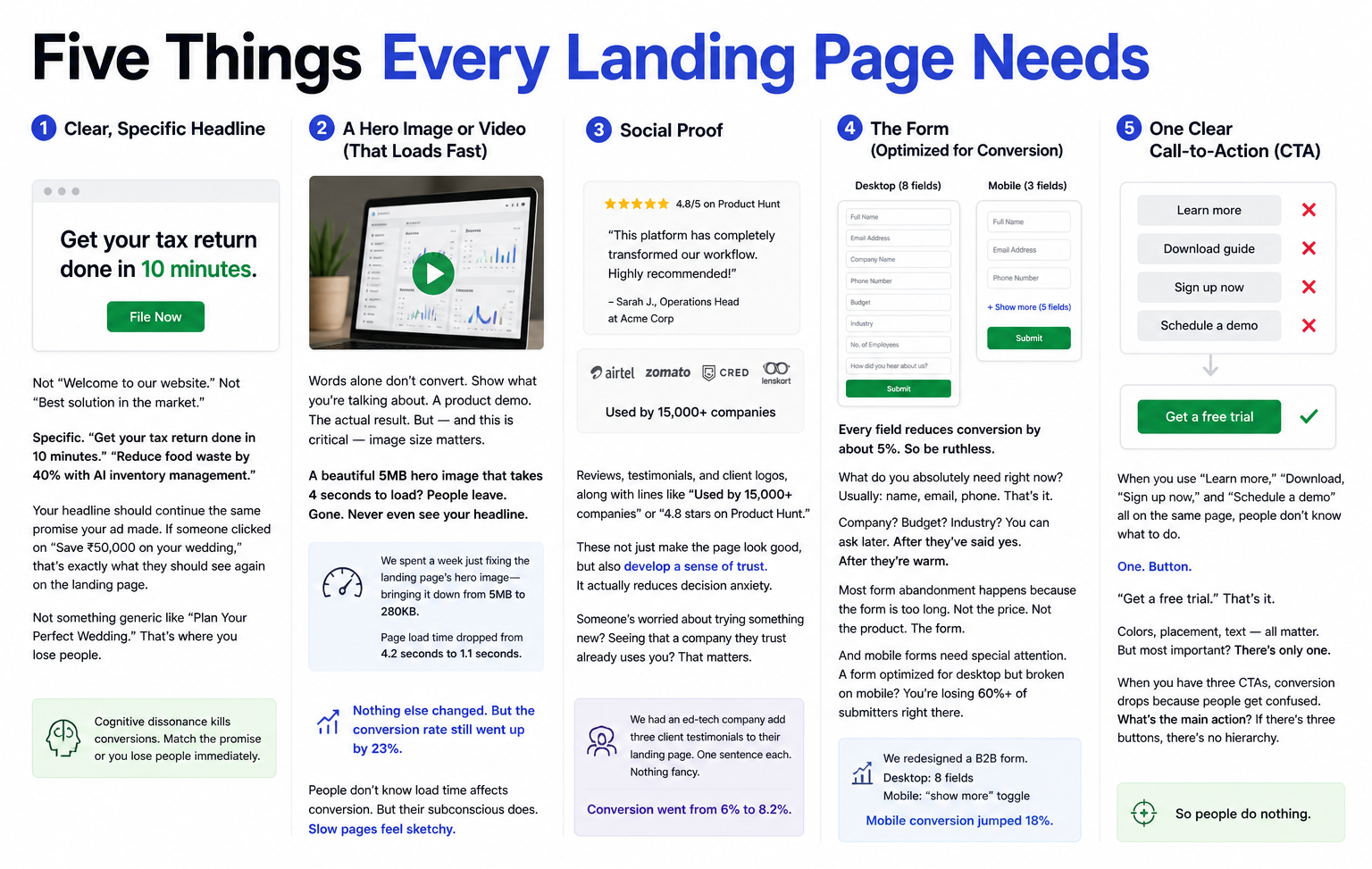
1. Clear, Specific Headline
Not “Welcome to our website.” Not “Best solution in the market.”
Specific. “Get your tax return done in 10 minutes.” “Reduce food waste by 40% with AI inventory management.”
Your headline should continue the same promise your ad made. If someone clicked on “Save ₹50,000 on your wedding,” that’s exactly what they should see again on the landing page.
Not something generic like “Plan Your Perfect Wedding.” That’s where you lose people.
Cognitive dissonance kills conversions. Match the promise or you lose people immediately.
2. A Hero Image or Video (That Loads Fast)
Words alone don’t convert. Show what you’re talking about. A product demo. The actual result. But — and this is critical — image size matters.
A beautiful 5MB hero image that takes 4 seconds to load? People leave. Gone. Never even see your headline.
We spent a week just fixing the landing page’s hero image—bringing it down from 5MB to 280KB. Page load time dropped from 4.2 seconds to 1.1 seconds.
Nothing else changed. But the conversion rate still went up by 23%.
People don’t know load time affects conversion. But their subconscious does. Slow pages feel sketchy.
3. Social Proof
Reviews, testimonials, and client logos, along with lines like “Used by 15,000+ companies” or “4.8 stars on Product Hunt.”
These not just make the page look good, but also develop a sense of trust. It actually reduces decision anxiety. Someone’s worried about trying something new? Seeing that a company they trust already uses you? That matters.
We had an ed-tech company add three client testimonials to their landing page. One sentence each. Nothing fancy. Conversion went from 6% to 8.2%.
4. The Form (Optimized for Conversion)
Every field reduces conversion by about 5%. So be ruthless.
What do you absolutely need right now? Usually: name, email, phone. That’s it.
Company? Budget? Industry? You can ask later. After they’ve said yes. After they’re warm.
Most form abandonment happens because the form is too long. Not the price. Not the product. The form.
And mobile forms need special attention. A form optimized for desktop but broken on mobile? You’re losing 60%+ of submitters right there.
We redesigned a B2B form. Desktop: name, email, company, phone, budget, industry = 8 fields. Mobile? We hid the less important fields behind a “show more” toggle. Mobile conversion jumped 18%.
5. One Clear Call-to-Action (CTA)
When you use “Learn more,” “Download,” “Sign up now,” and “Schedule a demo” all on the same page, people don’t know what to do.
One. Button.
“Get a free trial.” That’s it. Colors, placement, text — all matter. But most important? There’s only one.
When you have three CTAs, conversion drops because people get confused. What’s the main action? If there’s three buttons, there’s no hierarchy. So people do nothing.
The Mobile Piece (That Everyone Ignores Until It’s Too Late)
70% of your traffic is mobile. But most landing pages are designed on desktop first.
So on mobile they’re a disaster. Form fields stacked weirdly. Images too large. Buttons hard to tap. Text too small. People try to convert and… bounce.
We had a real estate client. Landing page looked amazing on desktop. Mobile? Images weren’t scaling. Form was horizontal. Buttons were small. Mobile conversion: 2%. Desktop: 8%.
We rebuilt mobile-first. Tested on actual phones. Made the form vertical. Big buttons. Text sized for reading on a small screen. Mobile conversion jumped to 7%. Desktop actually stayed at 8% (small variations).
The weird part? Desktop experiences improved because we forced ourselves to be more focused. Can’t fit 47 elements on mobile, so we cut it to 10. Those 10 matter more.
Mobile-first design isn’t a trend. It’s how the internet works now.
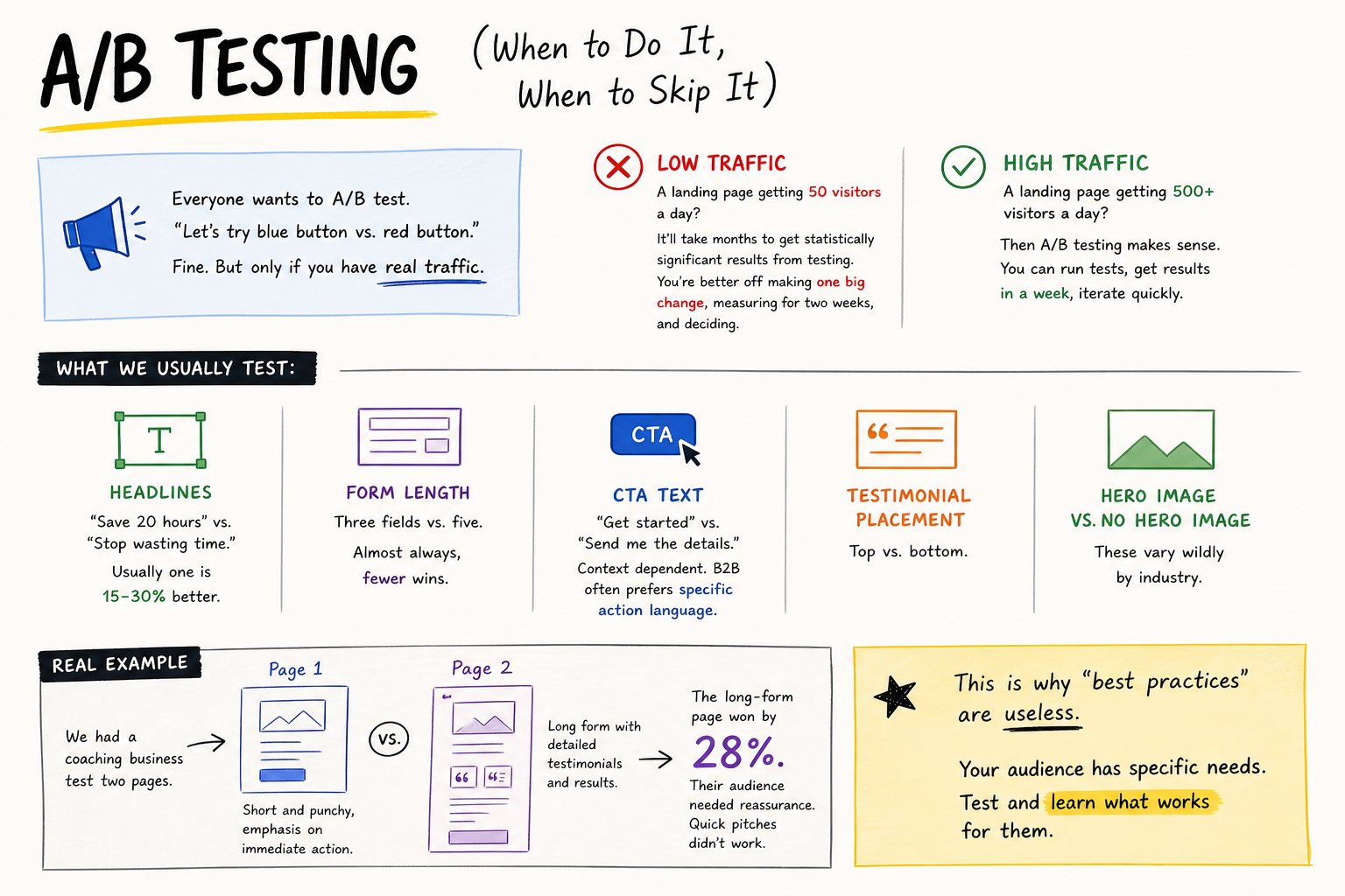
A/B Testing (When to Do It, When to Skip It)
Everyone wants to A/B test. “Let’s try blue button vs. red button.”
Fine. But only if you have real traffic.
A landing page getting 50 visitors a day? It’ll take months to get statistically significant results from testing. You’re better off making one big change, measuring for two weeks, and deciding.
A landing page getting 500+ visitors a day? Then A/B testing makes sense. You can run tests, get results in a week, iterate quickly.
What we usually test:
Headlines. “Save 20 hours” vs. “Stop wasting time.” Usually one is 15-30% better.
Form length. Three fields vs. five. Almost always, fewer wins.
CTA text. “Get started” vs. “Send me the details.” Context dependent. B2B often prefers specific action language.
Testimonial placement. Top vs. bottom. Hero image vs. no hero image. These vary wildly by industry.
We had a coaching business test two pages. Page 1: short and punchy, emphasis on immediate action. Page 2: long form with detailed testimonials and results. The long-form page won by 28%. Their audience needed reassurance. Quick pitches didn’t work.
This is why “best practices” are useless. Your audience has specific needs. Test and learn what works for them.
The Speed Piece (That Kills More Conversions Than You Realise)
A landing page loads in 1 second? Users convert at rate X.
Same page loads in 3 seconds? Conversion drops about 40%.
This isn’t opinion. It’s measurable across thousands of pages.
So what kills speed?
Unoptimized images. Tracking scripts. Too many fonts. Auto-playing video. Ads loading slowly.
We had a client’s landing page loading in 3.8 seconds. Conversion rate: 4.2%. We spent one day fixing images, deferring non-critical JavaScript, and removing unnecessary scripts. Load time: 1.3 seconds. Conversion rate: 6.1%.
That’s a 45% improvement. Same page. Just faster.
Check your page speed on Google PageSpeed Insights. If it’s taking more than 2.5 seconds on mobile, fix it. Because right now, you’re money is at stake.
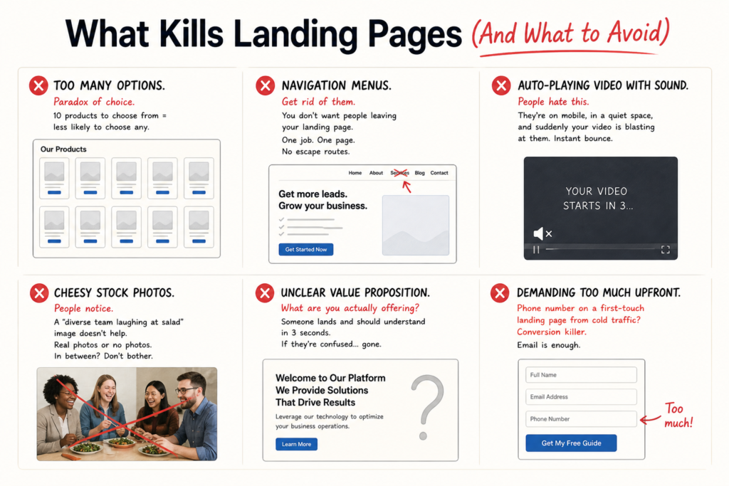
What Kills Landing Pages (And What to Avoid)
- Too many options. Paradox of choice. 10 products to choose from = less likely to choose any.
- Navigation menus. Get rid of them. You don’t want people leaving your landing page. One job. One page. No escape routes.
- Auto-playing video with sound. People hate this. They’re on mobile, in a quiet space, and suddenly your video is blasting at them. Instant bounce.
- Cheesy stock photos. People notice. A “diverse team laughing at salad” image doesn’t help. Real photos or no photos. In between? Don’t bother.
- Unclear value proposition. What are you actually offering? Someone lands and should understand in 3 seconds. If they’re confused… gone.
- Demanding too much upfront. Phone number on a first-touch landing page from cold traffic? Conversion killer. Email is enough.
The Template Trap (And When Builders Actually Help)
Unbounce, Leadpages, ConvertKit… they all have templates.
Templates are fine for learning. But they’re also fine for looking like everyone else.
The best landing pages we’ve built were custom. Designed specifically for that audience. That product. That value prop.
But honest reality: a well-optimized template will outperform a beautifully designed landing page that doesn’t follow conversion psychology. So if you’re starting, use a template. Get conversions. Then later, when you have a budget, build custom.
We use template builders (mostly) for speed. But customise aggressively. Remove all the extra nav. Keep only what matters. Add specific copy. Make it feel less like a template.
A landing page that converts well at 4% will always beat a landing page that looks prettier but converts at 1.2%.
Real Numbers From Real Pages (Not Case Studies, Just Data)
A D2C fitness product. First page: generic “Learn more” landing page. Conversion: 2.1%.
Redesigned: specific benefit-driven headline, three testimonials, five-field form, hero video. Conversion: 7.8%.
A B2B SaaS company. First page: feature-heavy. Conversion: 1.9%.
Redesigned: problem-focused. “Is your team wasting 15 hours a week on manual processes?” Then solution. Conversion: 5.2%.
An e-learning platform. First page: “Sign up now.” Conversion: 3.1%.
Redesigned: sample lesson embedded, student testimonial, then form. Conversion: 9.4%.
Pattern? Reduce friction. Show value. Match promise. Remove distractions. Every time, conversion improves.
Why This Matters (And Why We’re Obsessed)
A 2% conversion rate on 10,000 monthly visitors gives you 200 leads. Push that to 5% on the same 10,000 visitors, and you’re looking at 500 leads.
Same traffic budget. 250% more leads.
Now put a value to it—if one lead is worth ₹10,000, that’s ₹3 lakh in additional revenue every month. That adds up to ₹36 lakh in a year. From a landing page redesign.
That’s why we obsess over page speed. Form fields. Headline clarity. Mobile optimization. These aren’t vanity details. They’re revenue drivers.
Most businesses understand this in theory, but they don’t act on it. It gets dismissed as design work—something they feel isn’t their responsibility. But it literally is. It’s directly tied to your ROI.
So check your landing pages. Actually try to convert on mobile. Count your form fields. Test your load time. See what’s broken. Then we can help fix it. Let’s talk about your conversion strategy.
FAQs
-
What's a good conversion rate for a landing page?
Ans.Depends on the action. Newsletter signup? 10-15% is decent. Product purchase? 2-5%. Form for B2B leads? 5-20%. The key is knowing your baseline. A B2B form at 3% converting Rs 50 lakh deals is better than a newsletter signup at 20% converting to nothing. Conversion rate matters less than what the conversion is worth. -
How many form fields should I have?
Ans.Less than you think. Every additional field reduces conversion about 5-10%. Name and email? 25% conversion. Add company? Down to 18%. Add budget? Down to 8%. So just ask for what you absolutely need right now. Company and budget details? Ask after they've already said yes. After they're warm to you. -
Does mobile design really matter?
Ans.Yes. 65-70% of traffic is mobile. A page that works on desktop but breaks on mobile? You're losing 60%+ of conversions right there. Plus Google ranks mobile-unfriendly pages lower. Design mobile first. Then add desktop features. Not the other way around.
Author Details
Latest Posts
-
 24 / Jun
-
23 / Jun
-
22 / Jun
Digital Marketing Best Digital Marketing Tools For Indian Businesses 2026
-
20 / Jun
-
19 / Jun
Online Reputation Management Online Reputation Management: Protect Your Brand on the Internet


Related Knowledge